The selected showcase of Marc Damm, a designer and creative catalyst turning ideas into meaningful solutions for brands, services, and products people connect with.
Marc is a designer with a strong human point of view. As creative catalyst he translates ideas in bold strategic and meaningful design solutions that stick. He teaches, serves on juries, and writes about design. Check out his book.
One half of DUO.
Clients include
University of Arts Linz • Vienna Museum of Science and Technology • European Organization for Nuclear Research (CERN) • ORF – Austrian Broadcasting Corporation • Wolf Theiss • Natural History Museum Vienna • NRK – Norwegian Broadcasting Corporation • EXPO 2020 DUBAI • Ars Electronica Solutions • Haydn Society Vienna • GAZE • ORF – Austrian Broadcasting Corporation • Schneider Cosmetics • Neudoerfler
Say hi! info@marcdamm.com
Portrait by John Booth
SERVICES
→ Creative Consulting
→ Art Direction and Design
→ Strategy and Conception
→ Ideation and Atmosphere
→ Exhibition Design
→ Editorial Design
→ Wayfinding and Spatial Design
→ Packaging and Display
→ Naming and Verbal Branding
→ Web and Digital Experiences
STATUS
Co-Founder / Design Director
DUO.WTF
Visiting Professor / Lecturer
Dept. for Communication Design
University of Applied Sciences Salzburg
Member
Typographic Society Austria
PREVIOUS PRACTICE
Bleed, Vienna—Oslo
Studio Dumbar/DEPT®, Rotterdam
Kerndesign, Vienna
Bueronardin, Vienna
BUERO X, Vienna
Fuhrer, Vienna
TALKS AND LECTURES
From Startup Unicorns to Queer Cultural Centers: Strategic Brand Building — AGPRO Business Lounge, 2025
The Human Design Lab #III
Shifting Dialogues — Contemporay foundation and perspectives on Brand and Identity Design. University of Applied Sciences Salzburg, 2025
The Human Design Lab #II
A Matter of Feeling — Design beyond artifact-creation, as practice for intangible experiences. University of Applied Sciences Salzburg, 2025
The Human Design Lab #I
Collecting Meaning — Turning everyday objects into meaningful encounters. University of Applied Sciences Salzburg, 2023
Creating Memories (against Dystopia) — Creativity Rules Festival, Salzburg, 2023
Safety Distance
Forward Festival Vienna, 2021
Behind the Looking Glass
University of Applied Arts Vienna, 2020
Designed in Commission by …
Book release and presentation, 2014
AWARDS AND RECOGNITIONS
From Startup Unicorns to Queer Cultural Centers: Strategic Brand Building — AGPRO Business Lounge, 2025
Shifting Dialogues (The Human Design Lab #III) — Contemporay foundation and perspectives on Brand and Identity Design. University of Applied Sciences Salzburg, 2025
A Matter of Feeling (The Human Design Lab #II) — Design beyond artifact-making, as practice for creating intangible experiences. University of Applied Sciences Salzburg, 2025
Collecting Meaning (The Human Design Lab #I) — Turning everyday objects into meaningful encounters. University of Applied Sciences Salzburg, 2023
Creating Memories (against Dystopia) — Creativity Rules, Salzburg, 2023
Safety Distance — Forward Festival Vienna, 2021
Behind the Looking Glass — University of Applied Arts Vienna, 2020
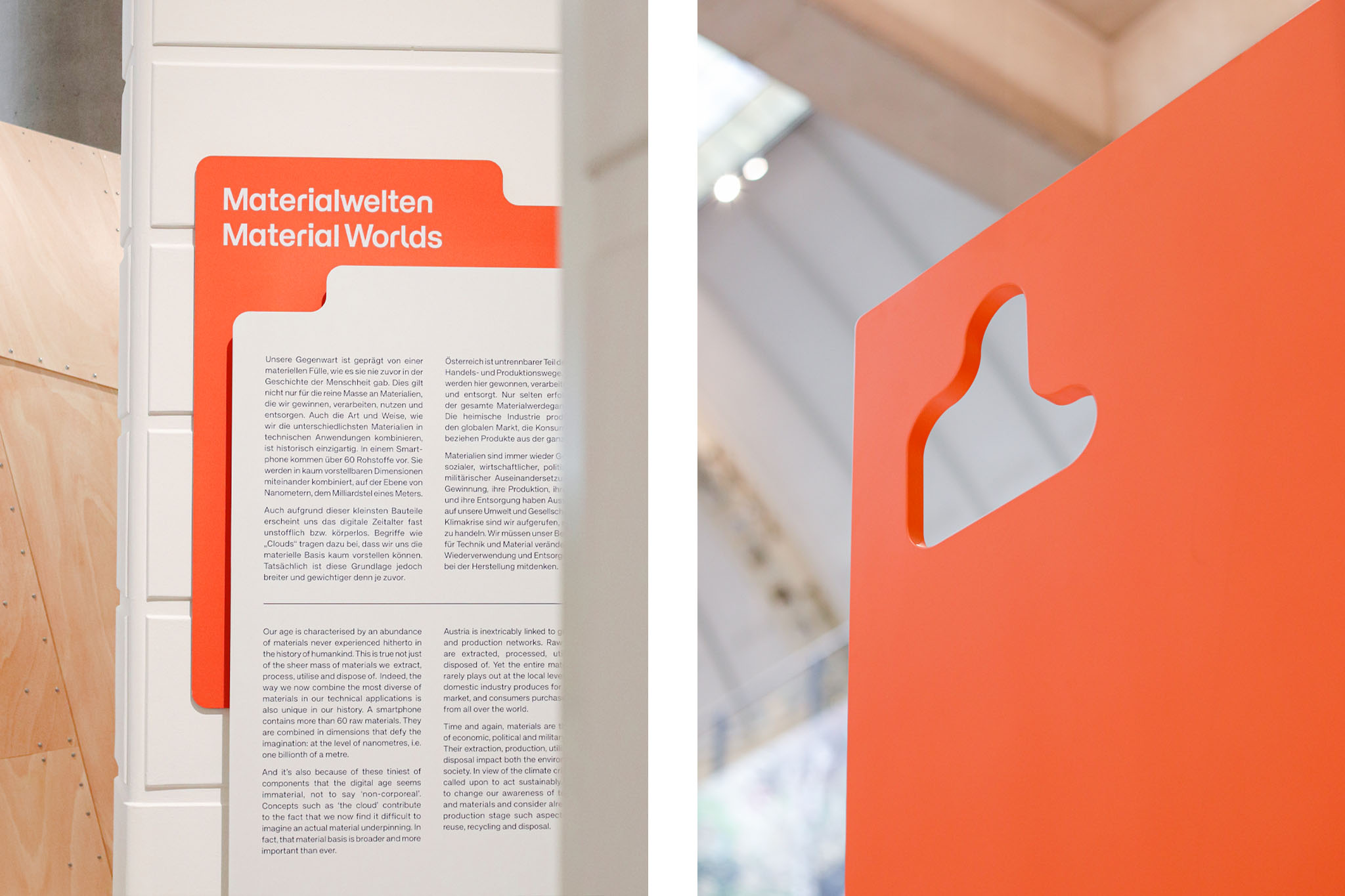
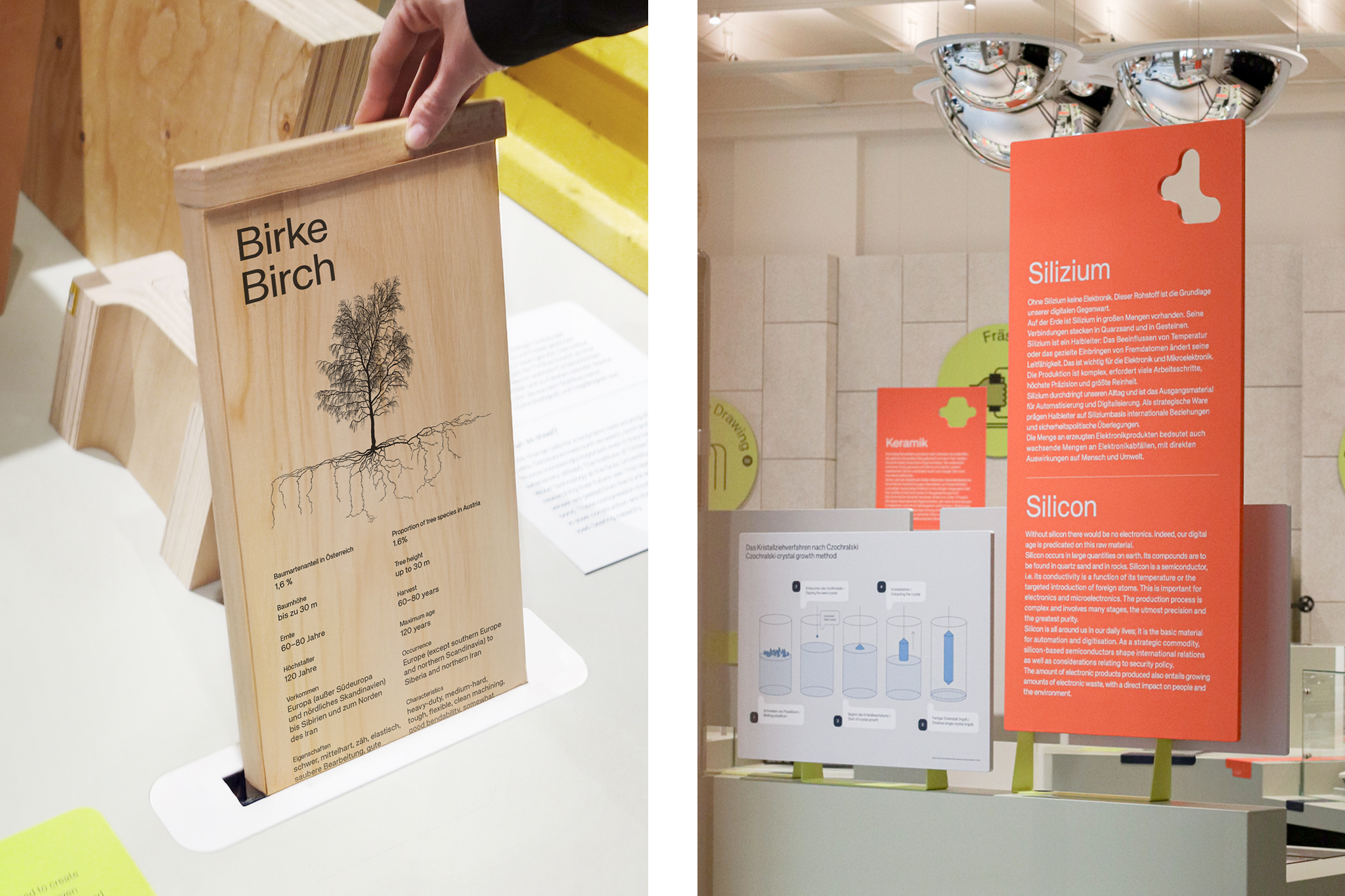
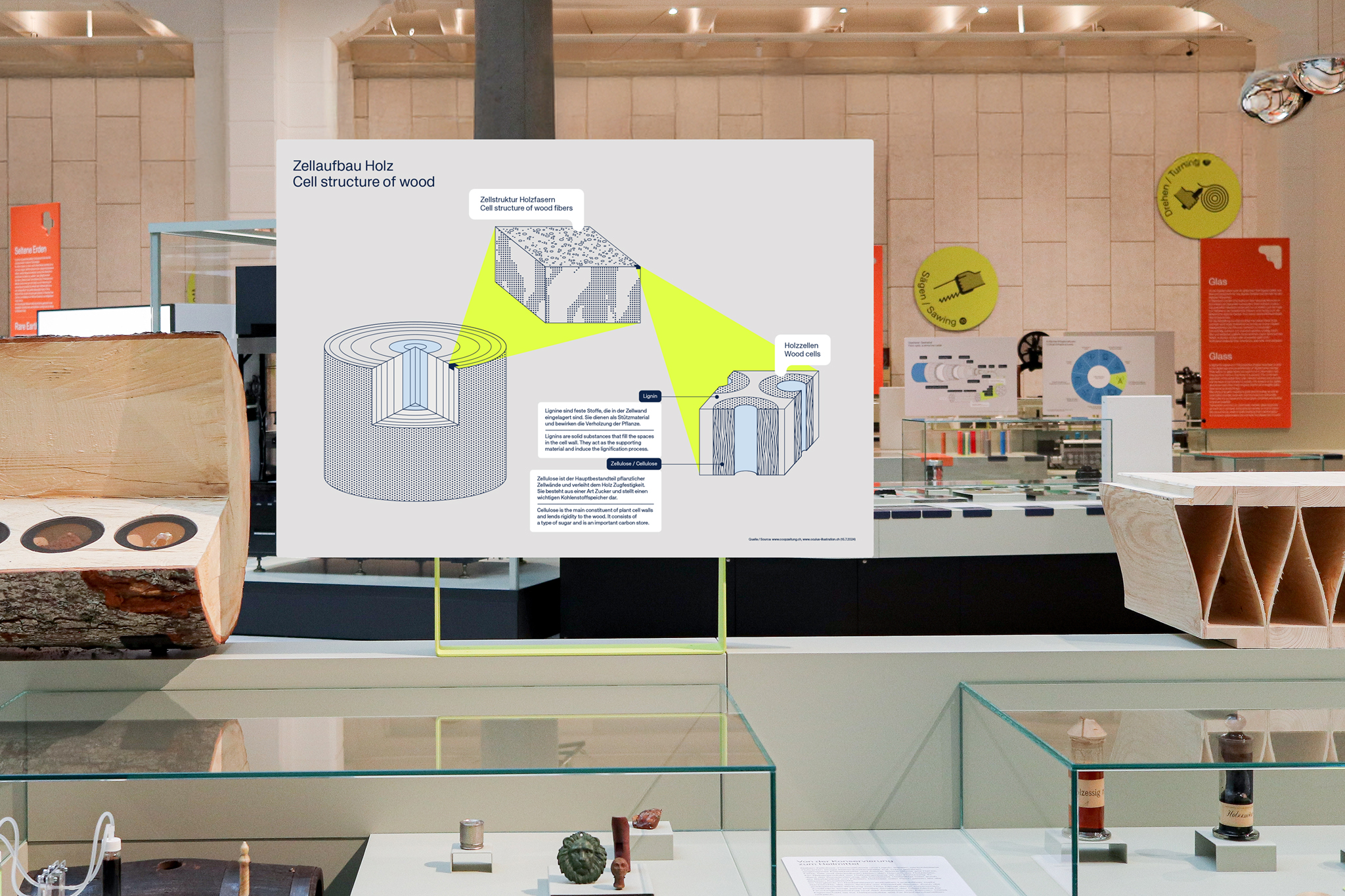
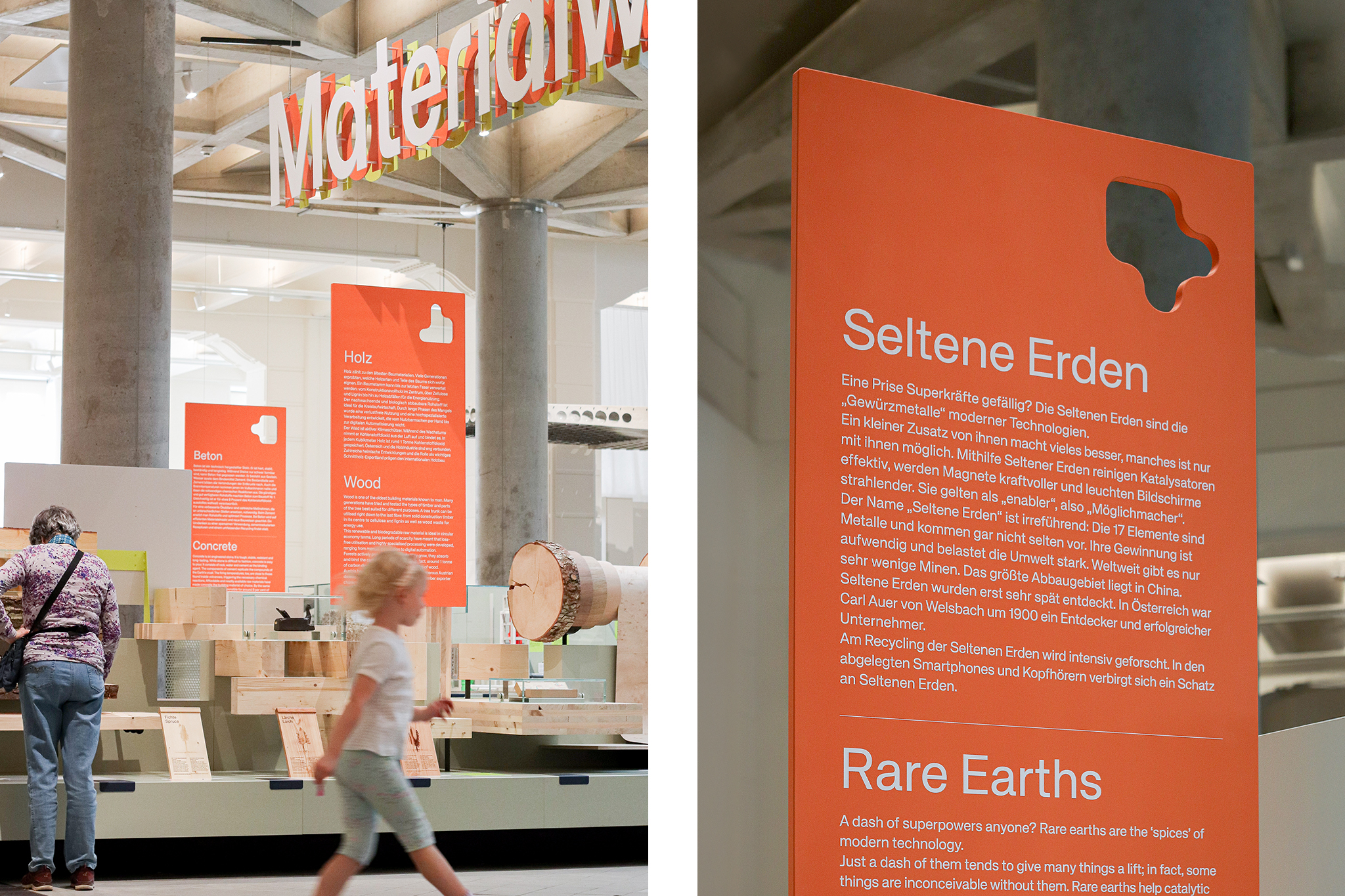
MATERIAL WORLDS
Exhibition Design
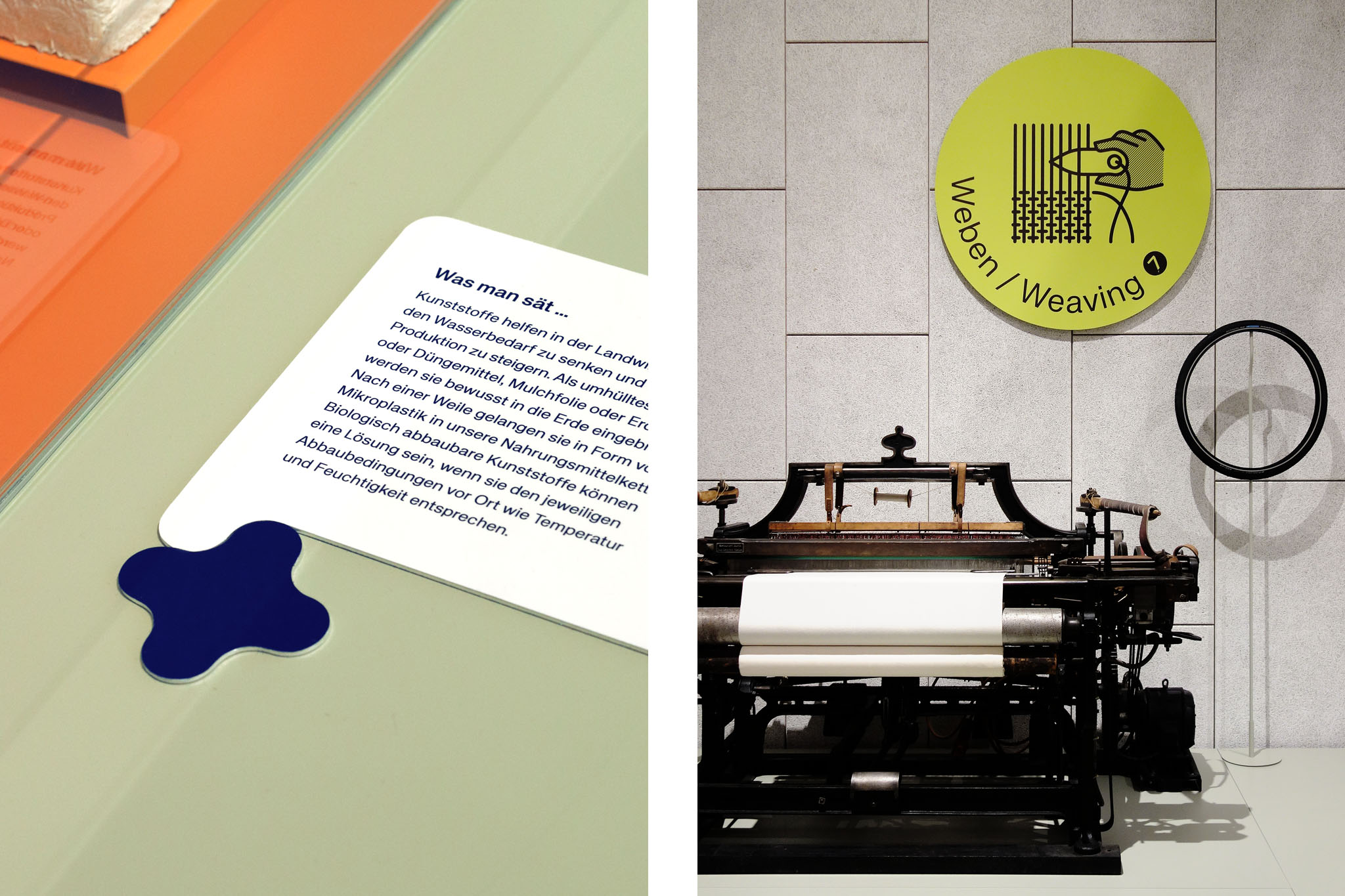
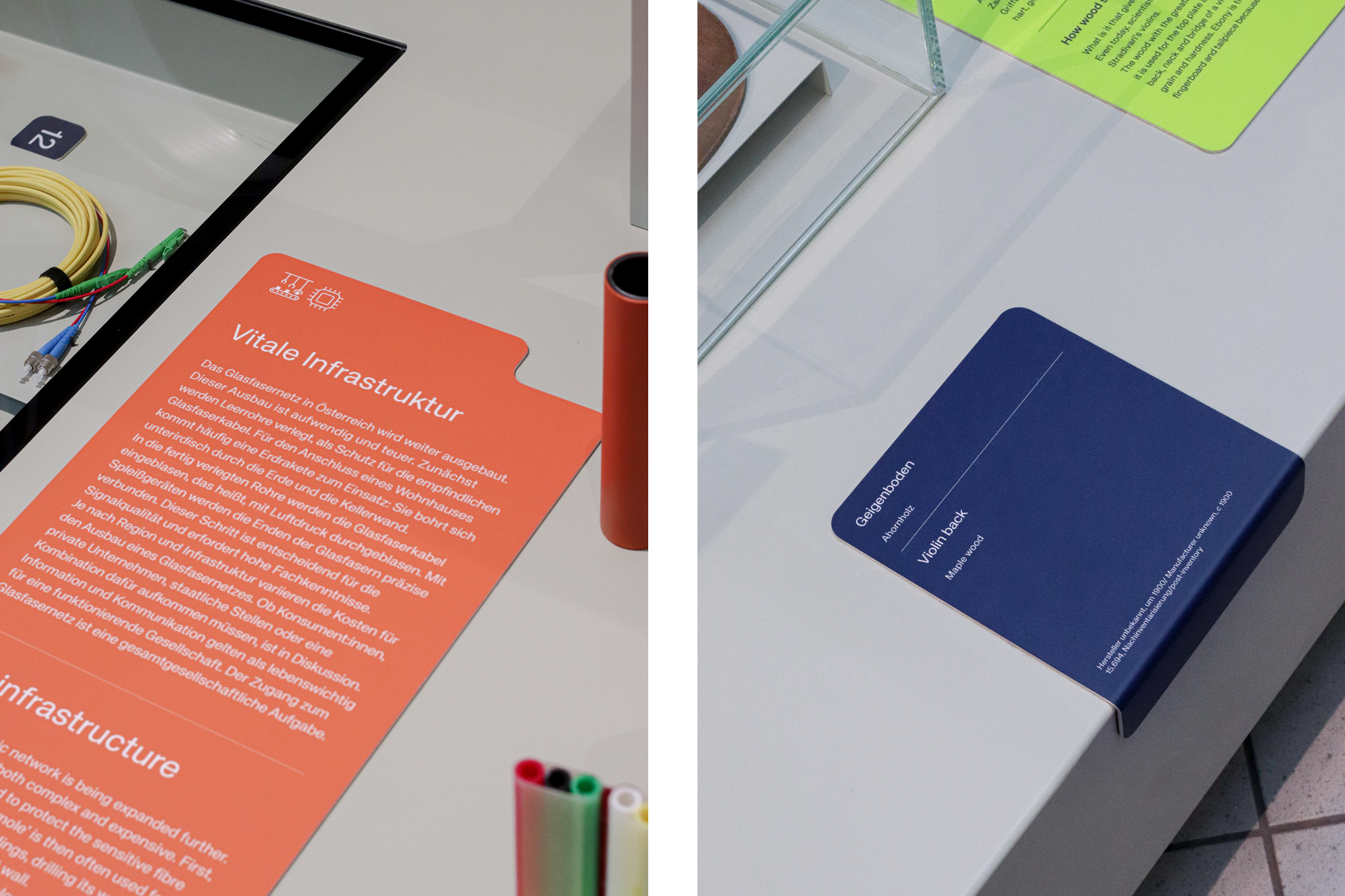
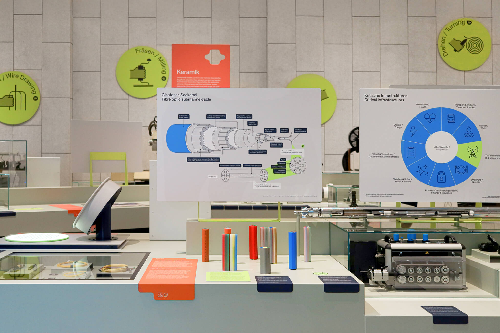
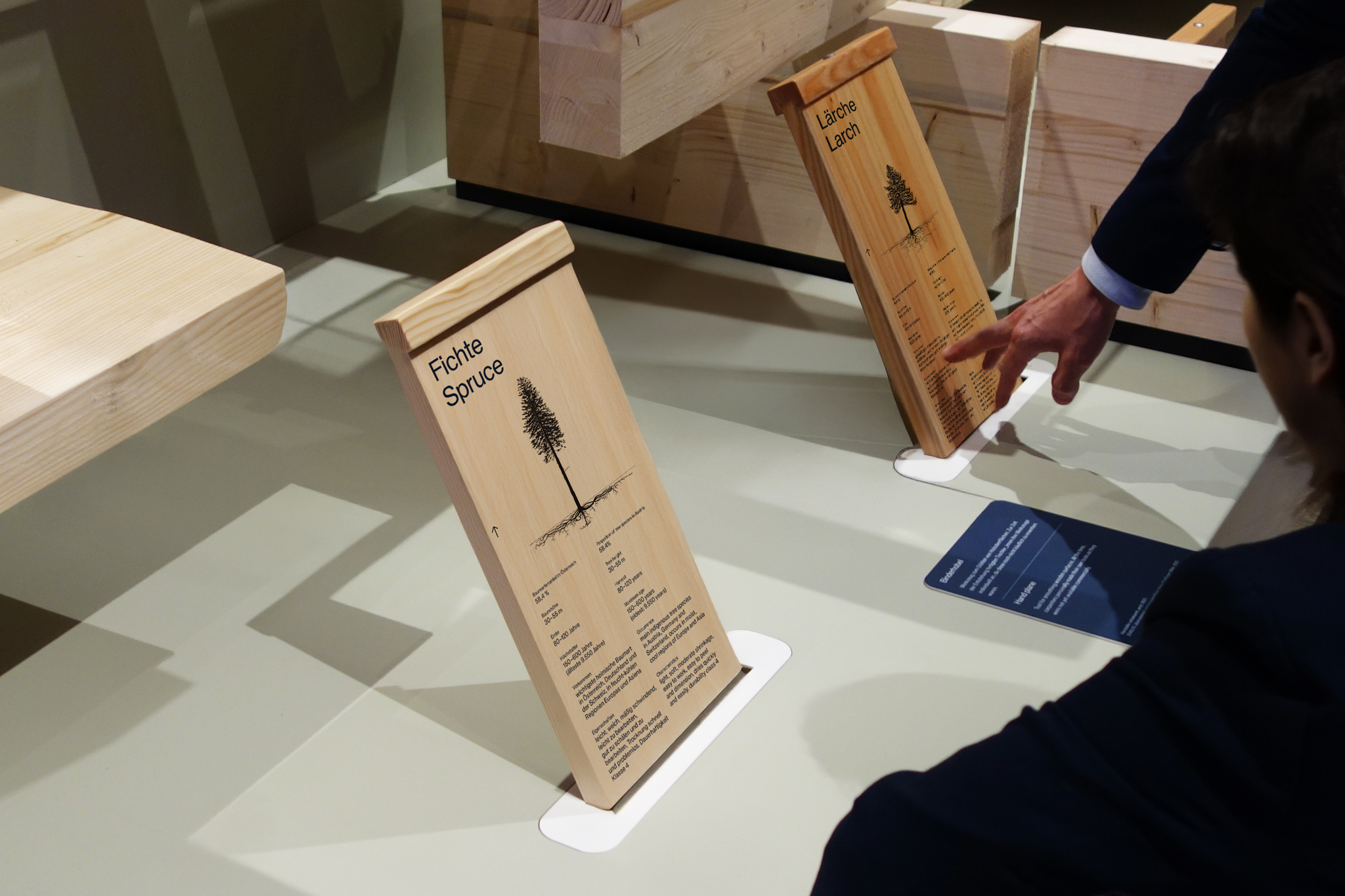
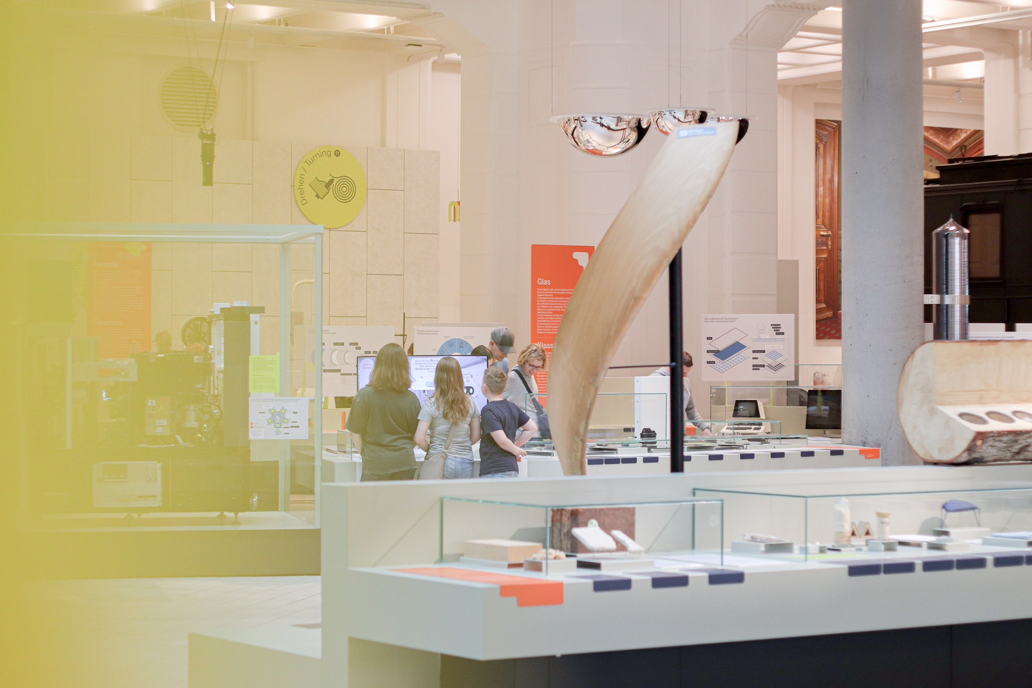
Reveal what our world is made of — for the Vienna Museum of Science & Technology. Designed at Bleed.
More info
▲ SETTING
The permanent exhibition Material Worlds explores the richness and complexity of the materials shaping our lives. Through 13 themed stations, it reveals the stories behind everyday objects — from resource extraction to innovation — and uncovers the hidden links between materials, design, production, and society.
⚑ SOLUTION
A soft, fluid visual language highlights the individuality of each material while revealing their interconnections. A luminous color spectrum, paired with playful, tactile, and dynamic elements, visualizes the ongoing transformation of materials and makes hidden processes engaging and accessible.
◐ ADDITIONAL CREDITS
Astrid Feldner (Creative direction), Maryan Ivasyk (Initial concept), Propeller Z (Exhibition architecture)
MERGE/EMERGE
Promo Identity
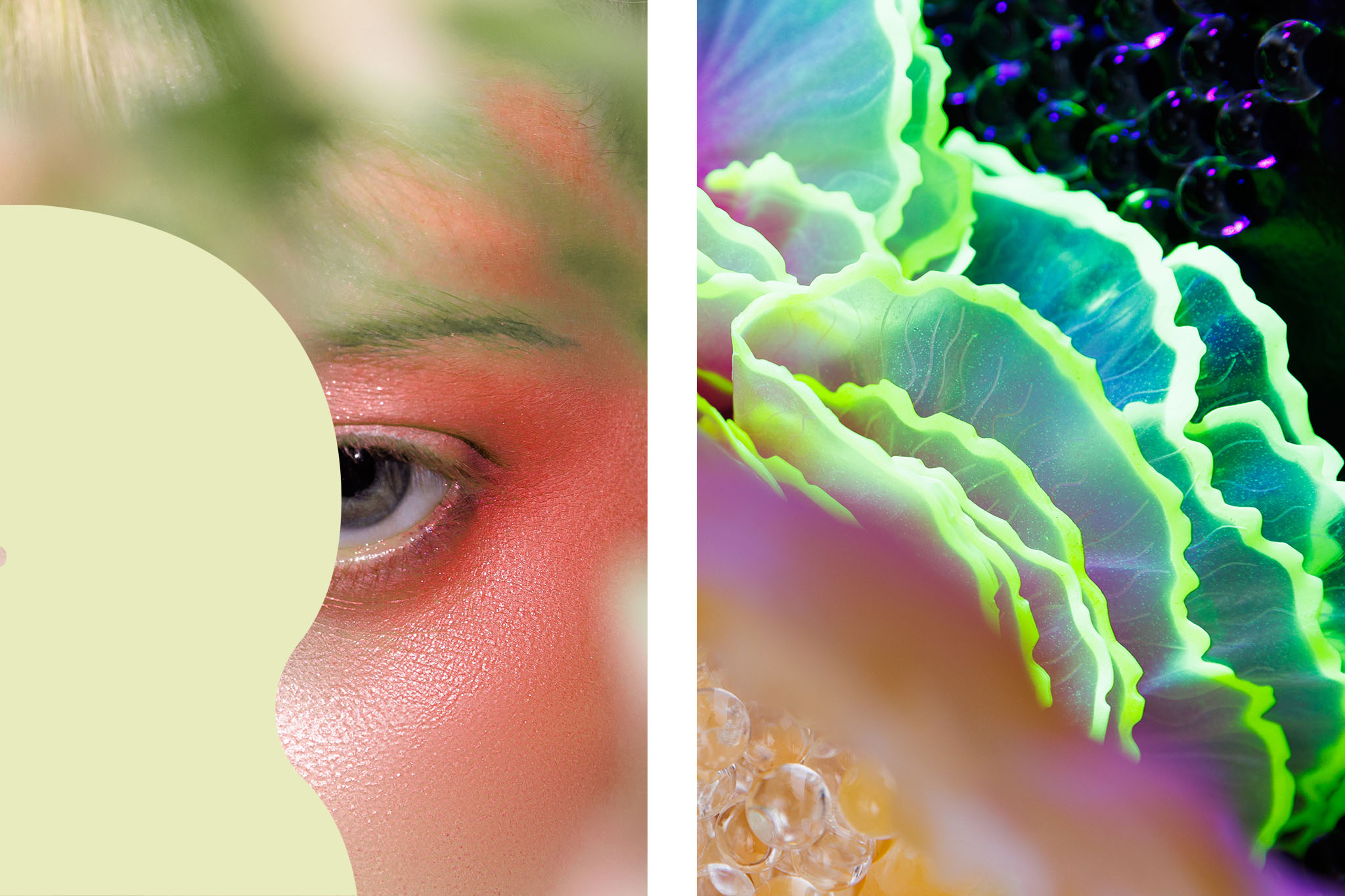
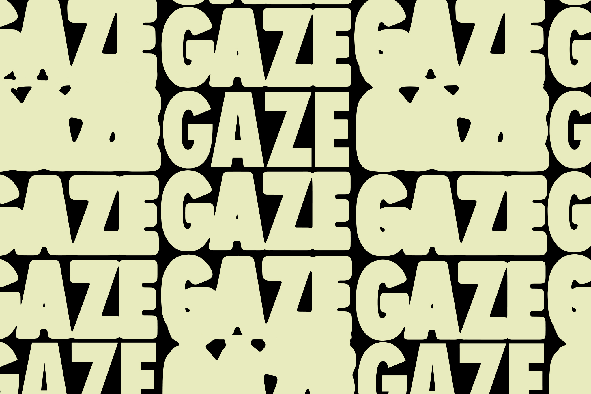
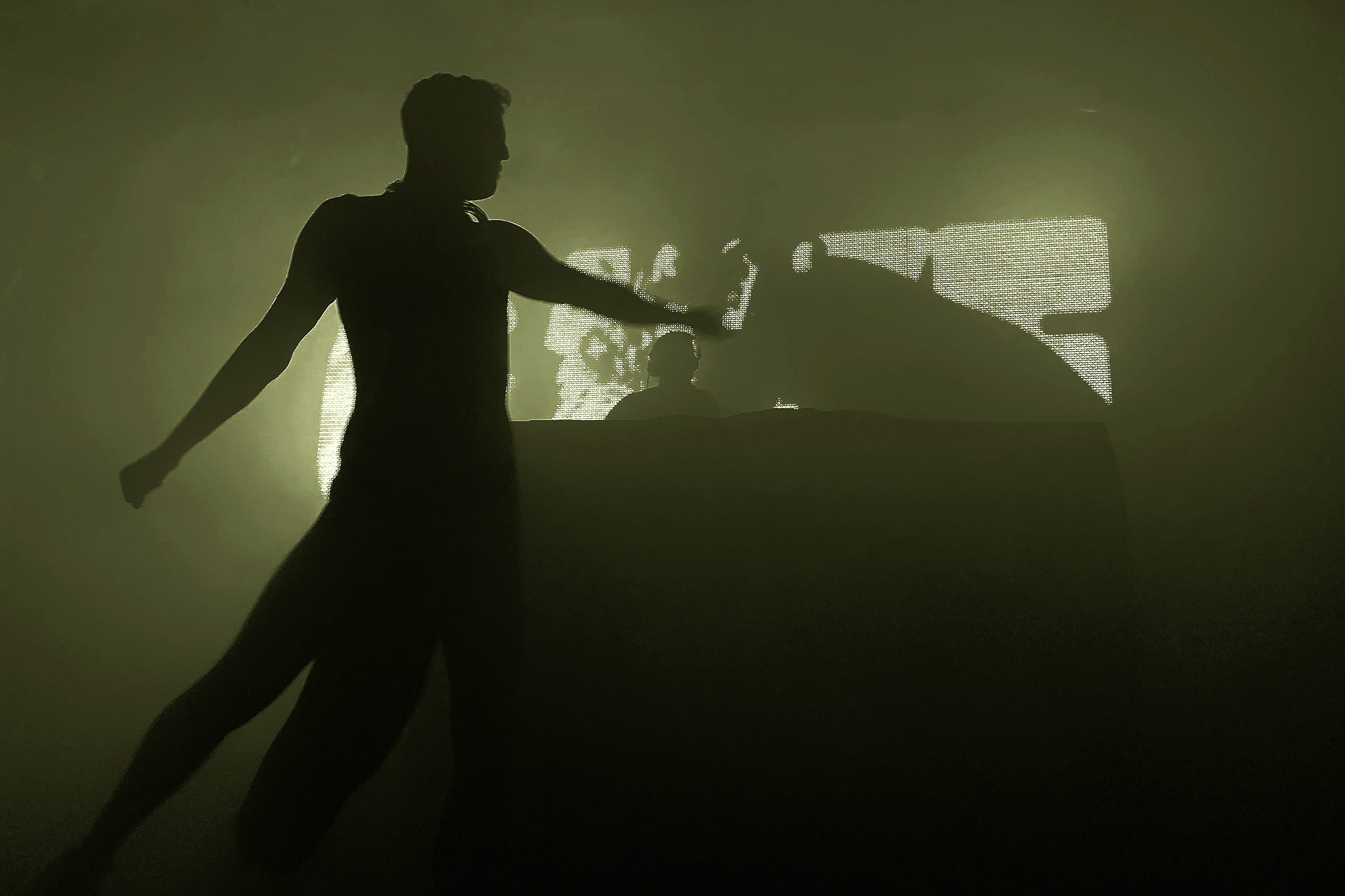
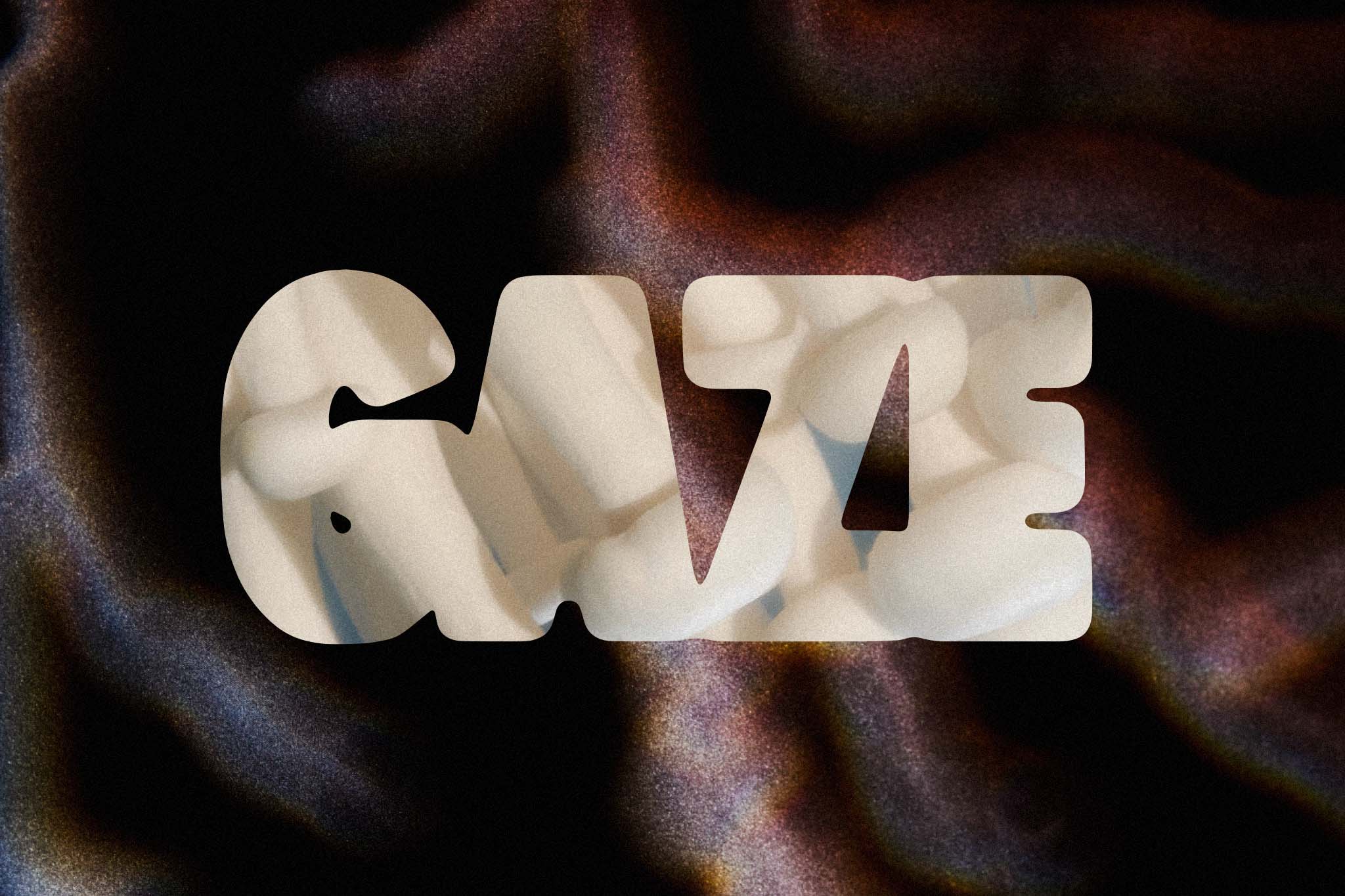
Paying tribute to the ongoing queer legacy in club culture at GAZE.
More info
▲ SETTING
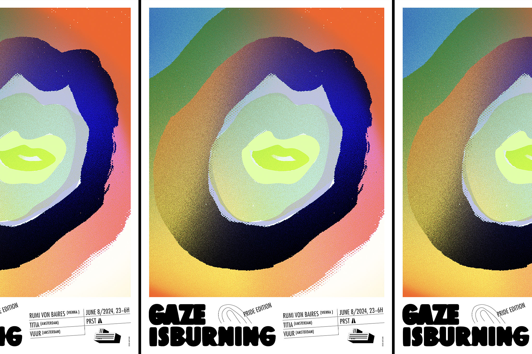
The history of electronic music and club culture is deeply rooted in the LGBTQI+ community. Vienna's Queer club night GAZE wants to pay tribute to those that paved the way into the undergound; artists, disco pioneers, the creators of house music and techno. For it's 2 years anniversary GAZE aimed for a promo design that embraces social media, print and the club visuals alike.
⚑ SOLUTION
The graphic concept Merge/Emerge embraces the immersive club experience where people can freely get lost and dissolve in the crowd in order to find new versions of themselves. Based on a distinct typographic motion principle the promo design aimed to serve screen first on social media and the club visuals alike. The lettering extends on print and merch as bold pattern sequence.
◐ ADDITIONAL CREDITS
Field record footage by GAZE
OPEN SPACE FOR THE ARTS
Visual Identity
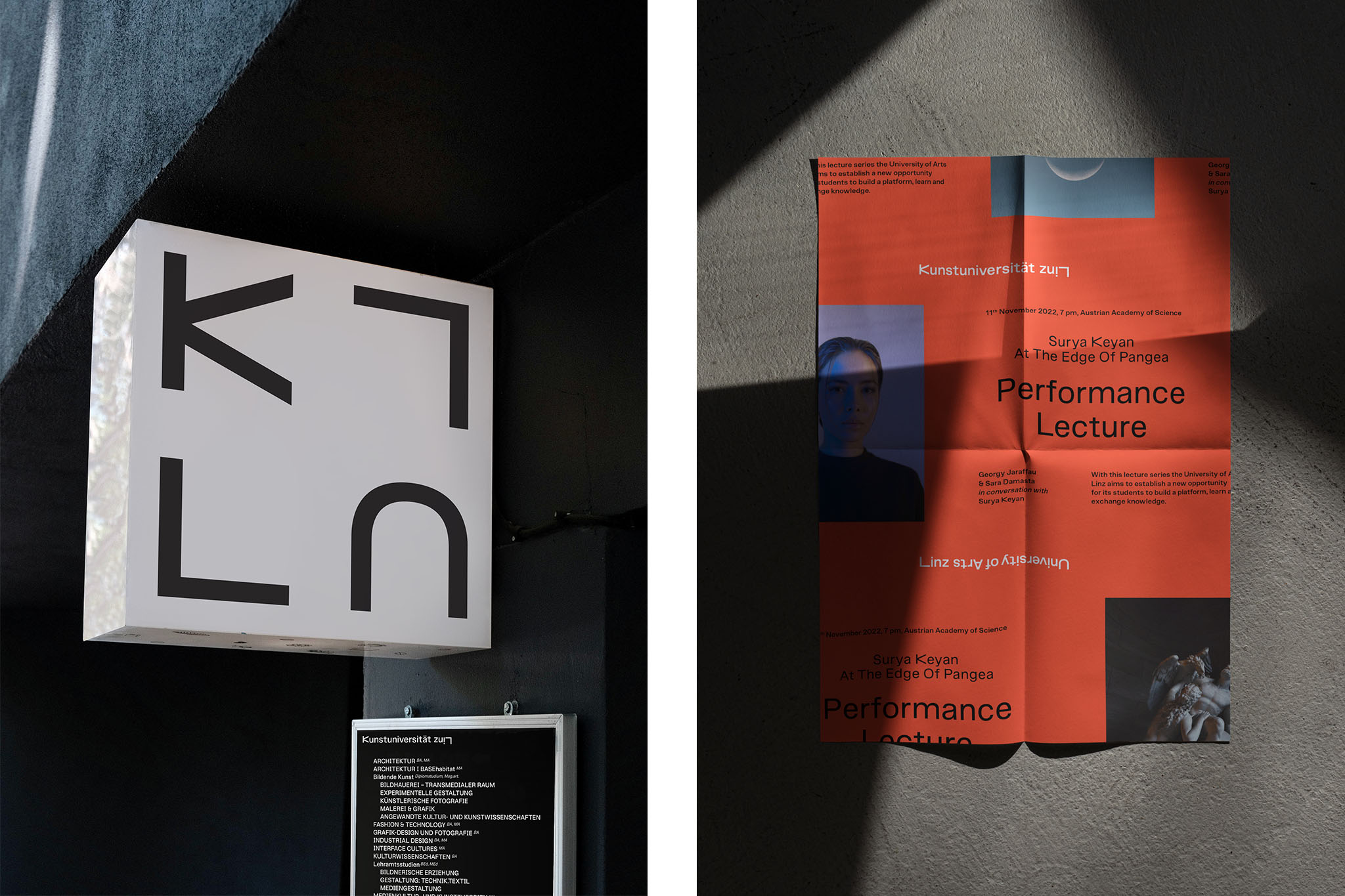
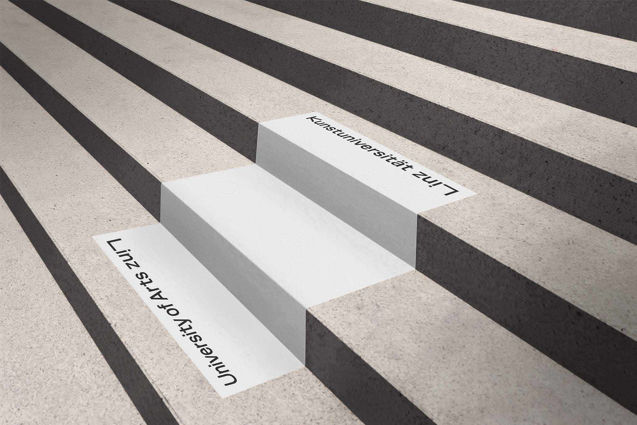
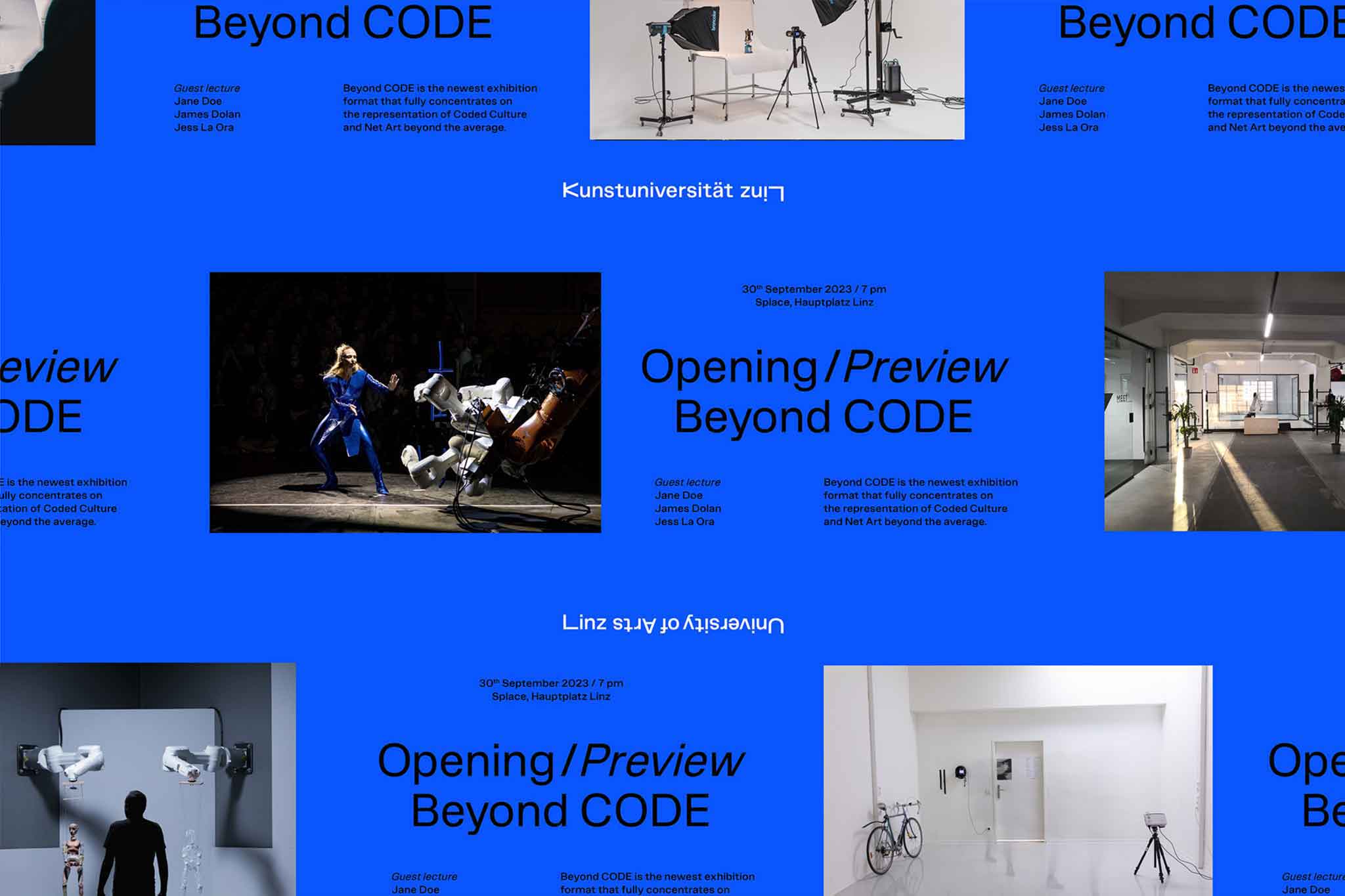
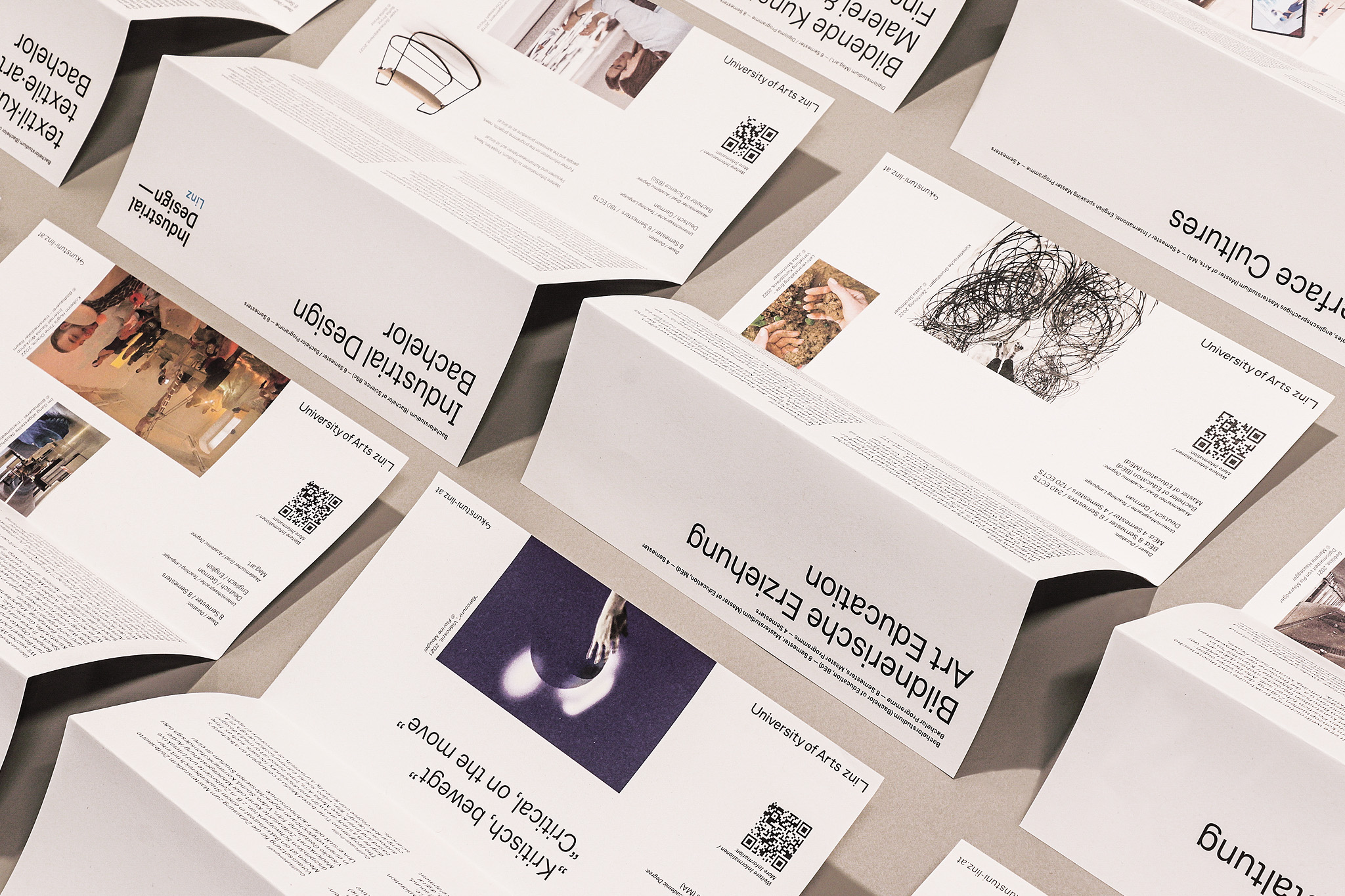
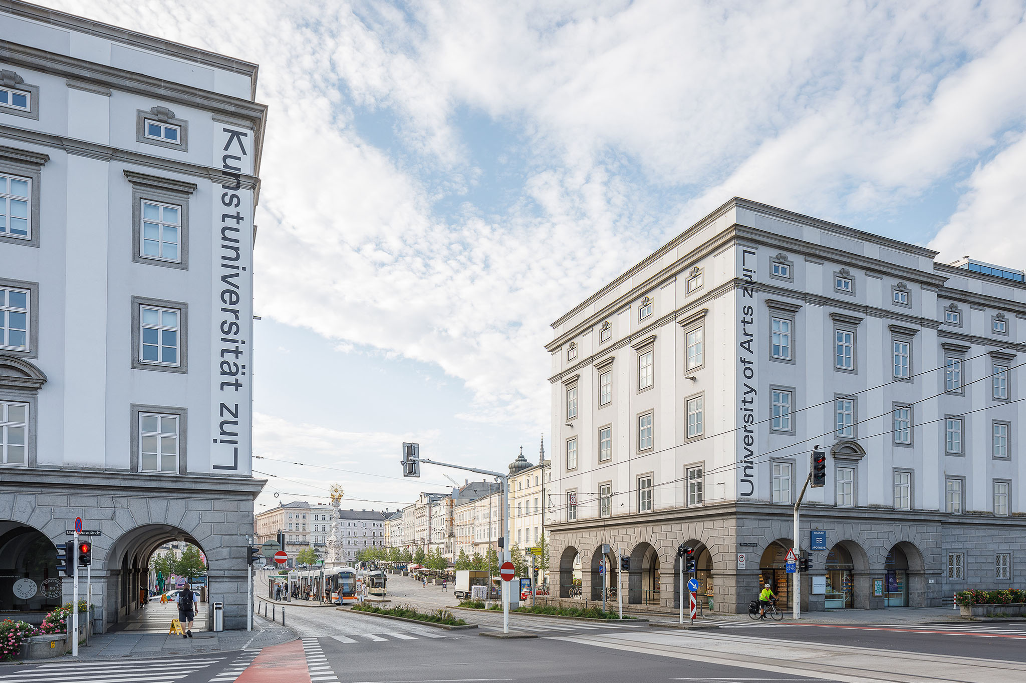
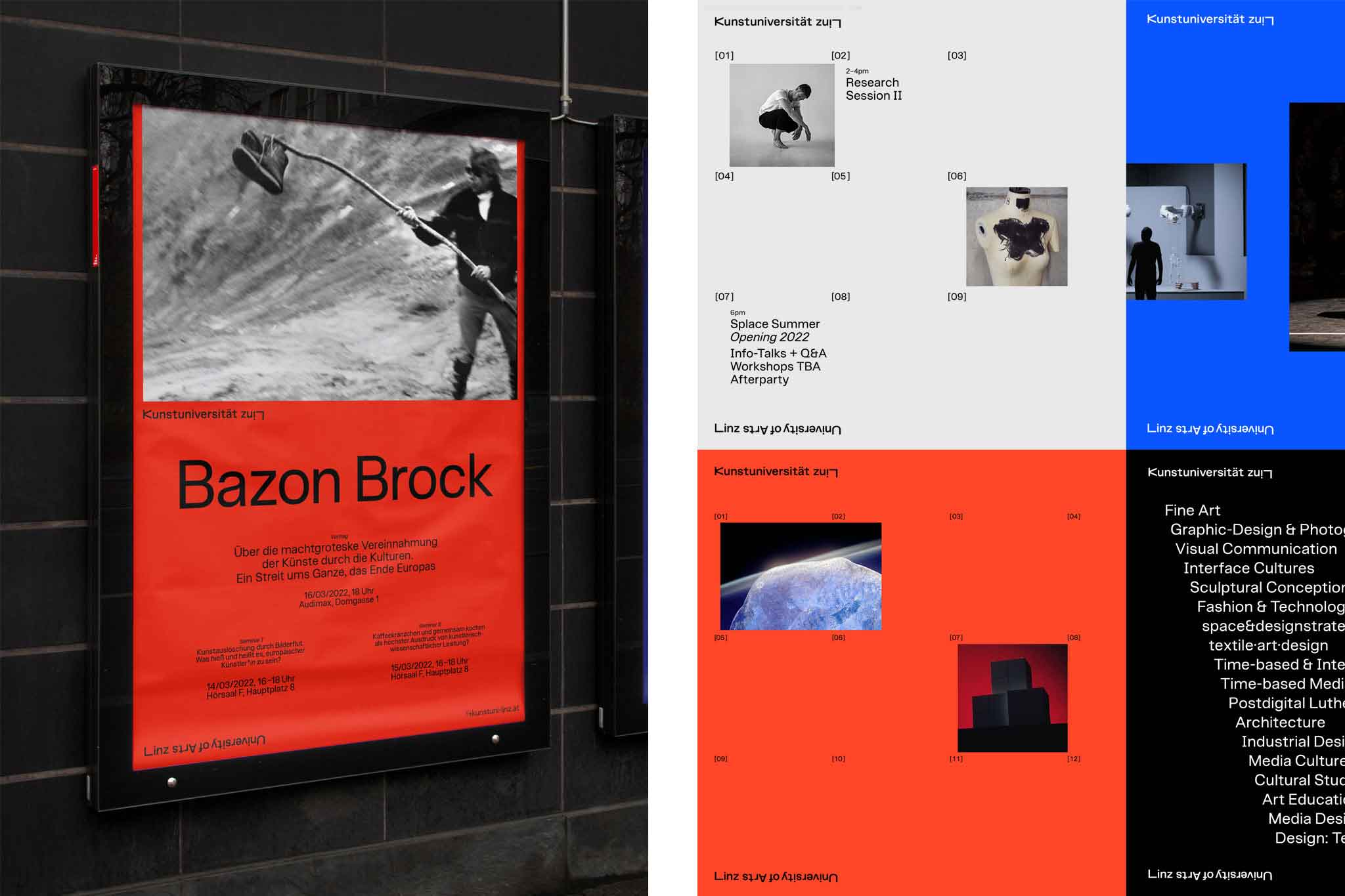
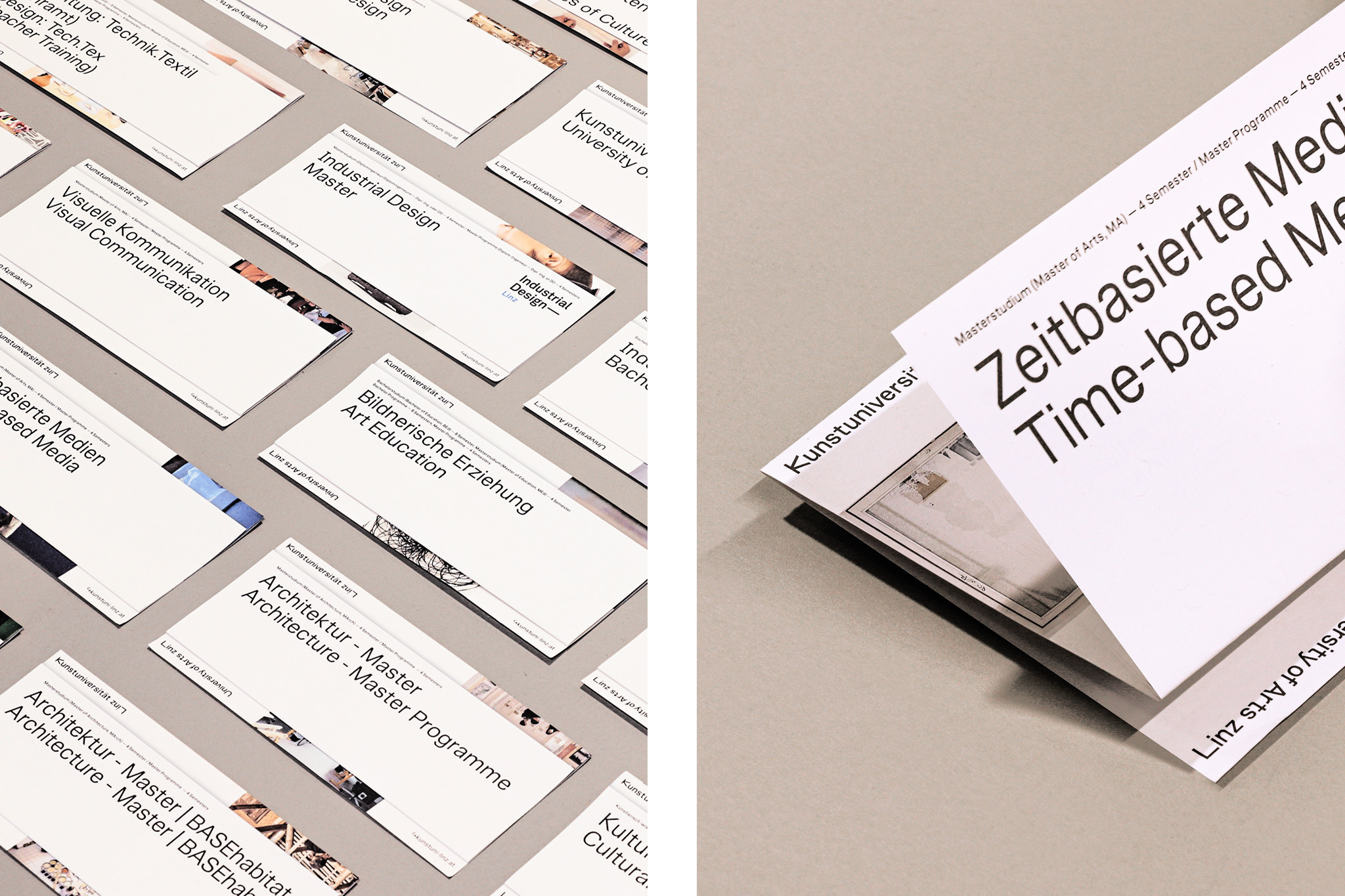
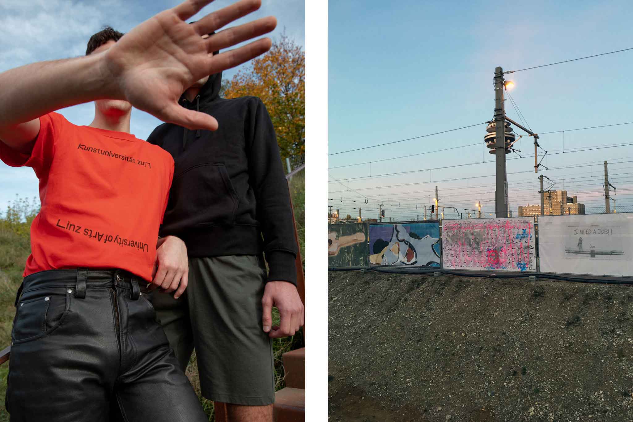
An identity as hybrid space, for University of Arts Linz. Designed at Bleed.
More info
▲ SETTING
The University of the Arts Linz is set among Austria's most important art universities and is a hot spot for cultural encounter in the region. Founded in 1947 and established in the spirit and tradition of 1920’s/30’s German Bauhaus, its didactic and scientific approach is based on three main pillars—intermediality, spatial strategy, and artistic research. The University fosters diversity, cross-discipline work, experimentation, and an open mind for exploring the arts.
⚑ SOLUTION
The new identity is based on a fluid system and visual vessel which provides maximum space for individual expression and communication. Interactivity, digitalisation, and motion define the core principles of the visual language. The opening bilingual logotype refers to the universities' international orientation and inclusive mindset. The layout on spatialisation, print, motion or digital design carries the institutions' vast and multifaceted content under one strong framework.
◐ ADDITIONAL CREDITS
Astrid Feldner (Creative direction), Jana Papiernikova (Graphic design), Sara El Abed (Motion Design), William Stormdal and Halvor Nordrum (Type programming)
⊙ AWARDS
European Design Awards 2023
REMIX THE INFINITE
Channel Identity & Art Direction
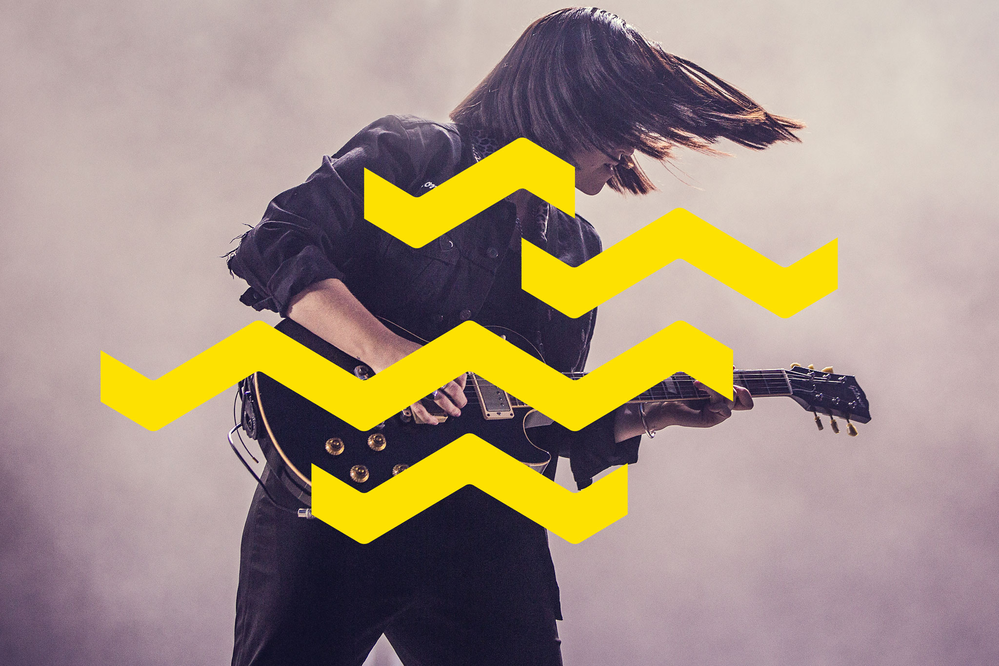
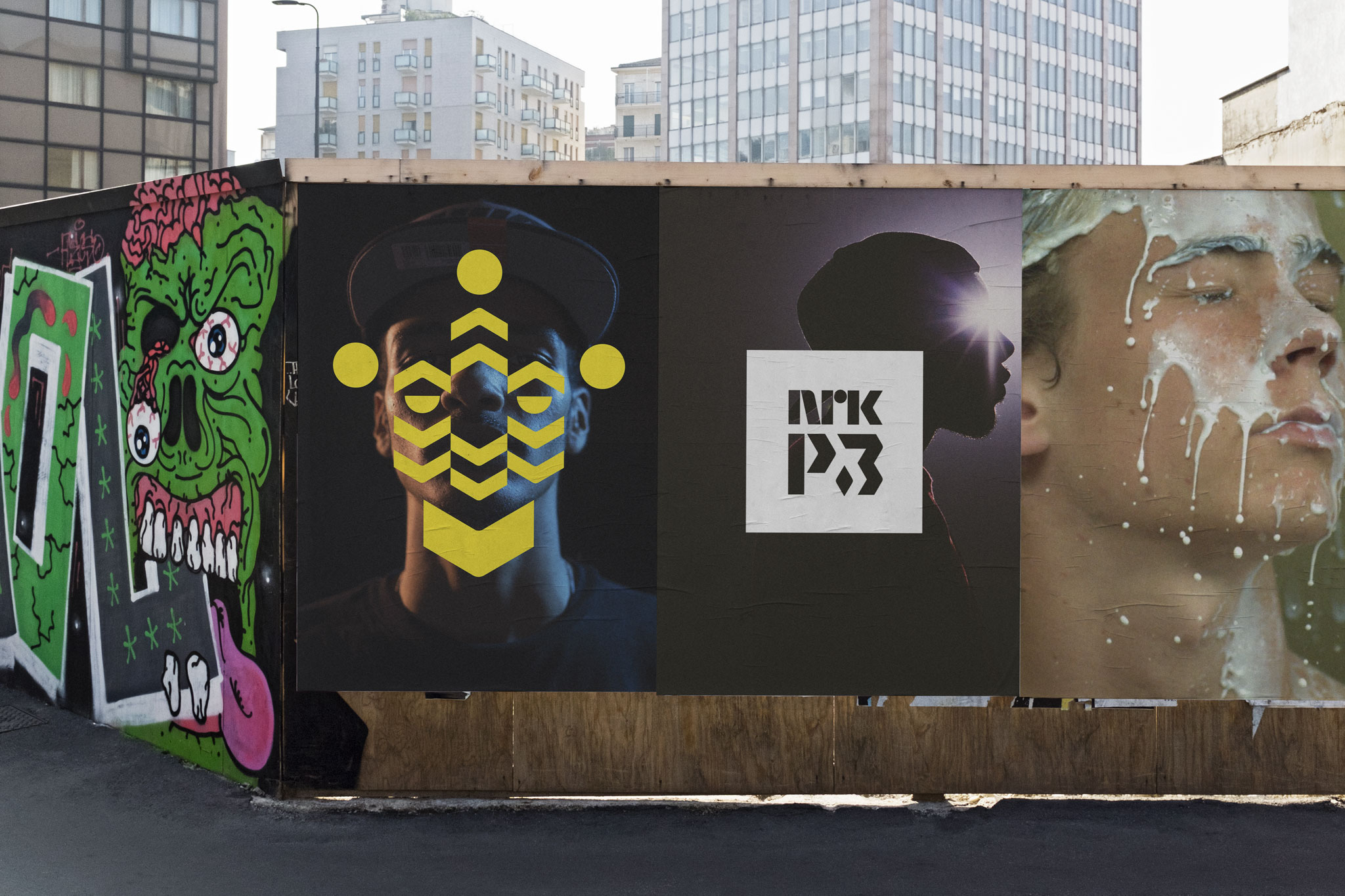
Rejuvenating Norwegian youth channel NRK P3. Designed at Bleed.
More info
▲ SETTING
Since its establishment in 1993 Norwegian broadcasting channel NRK P3 defines Norway’s youth culture with an eclectic mix of pop, alternative, infotainment and news. Increasing social media presence and an ever-younger audience together with the aim of creating a stronger link to the motherbrand NRK required a fresh take on the visual identity with a clear emphasis on motion-based screen implementation.
⚑ SOLUTION
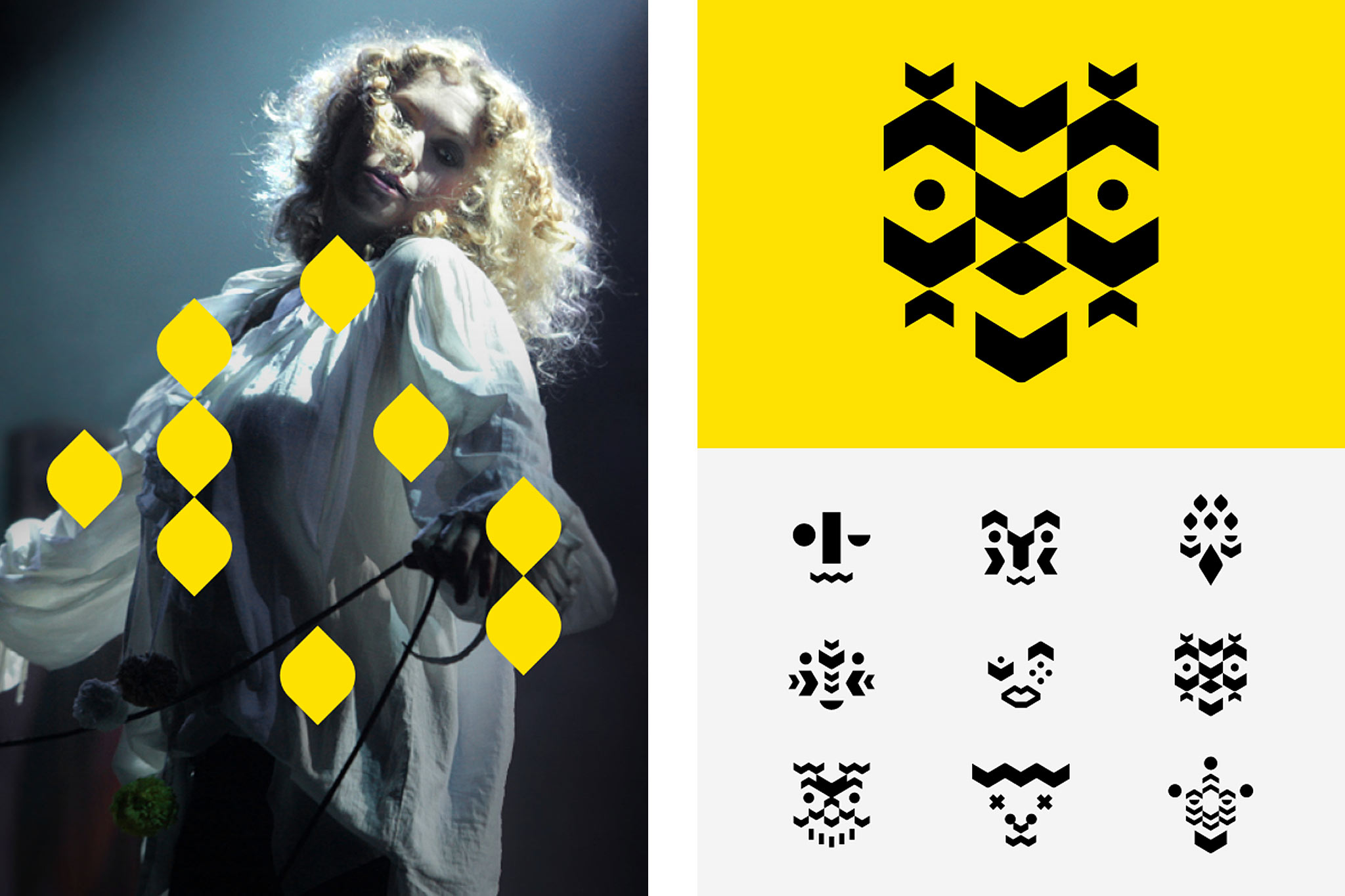
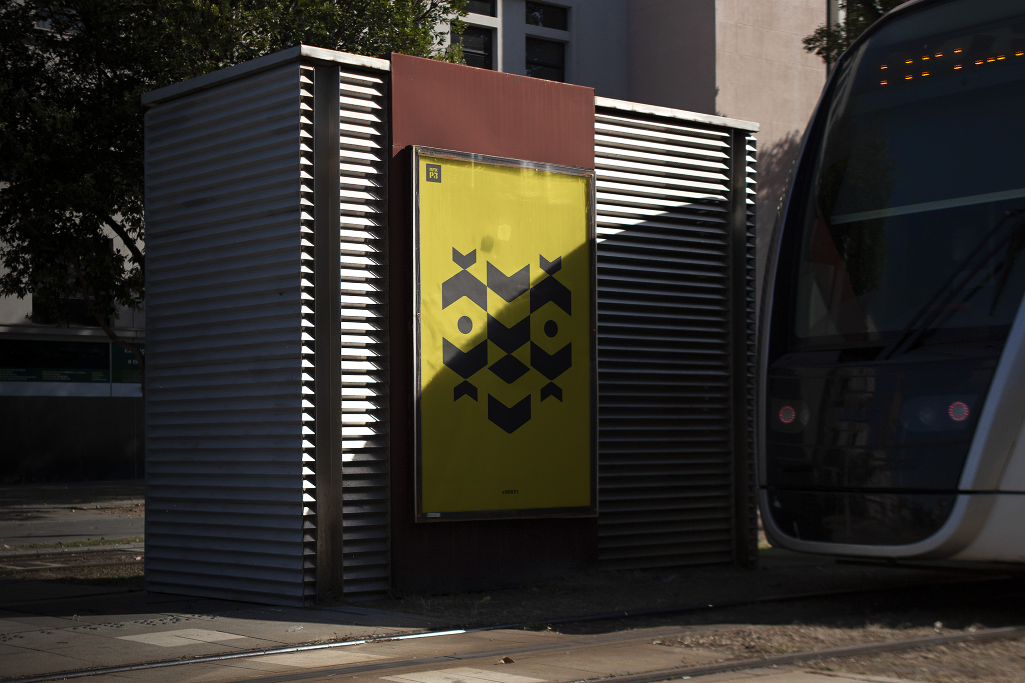
P3’s relation to its motherbrand NRK was targeted with the vivid identity concept »Remix«. Through deconstructing and »remixing« the offical NRK-logos specific geometric shapes an elaborate graphic language for P3 was established, the base for a strong new logo mark, unlimited and playful iconography and a custommade display typeface. The channel team—consisting of show hosts, DJ’s, bloggers, comedians, coaches and news journalists—noticeably add a lot of credibility and character to the brand appeal. The visual system equipped this »P3 tribe« with its very own graphic »totems«—making the channel even more tangible.
◐ ADDITIONAL CREDITS
Dag Solhaug Laska (Creative direction), Bjørnar Pedersen (Design), Benedikte Bølling (Project management), Hilde Jørgenvåg & NRK-Inhouse design team (Motion Design)
AWARDS
Gold, Visuelt 2018
OUT OF THE BOX
Signage system
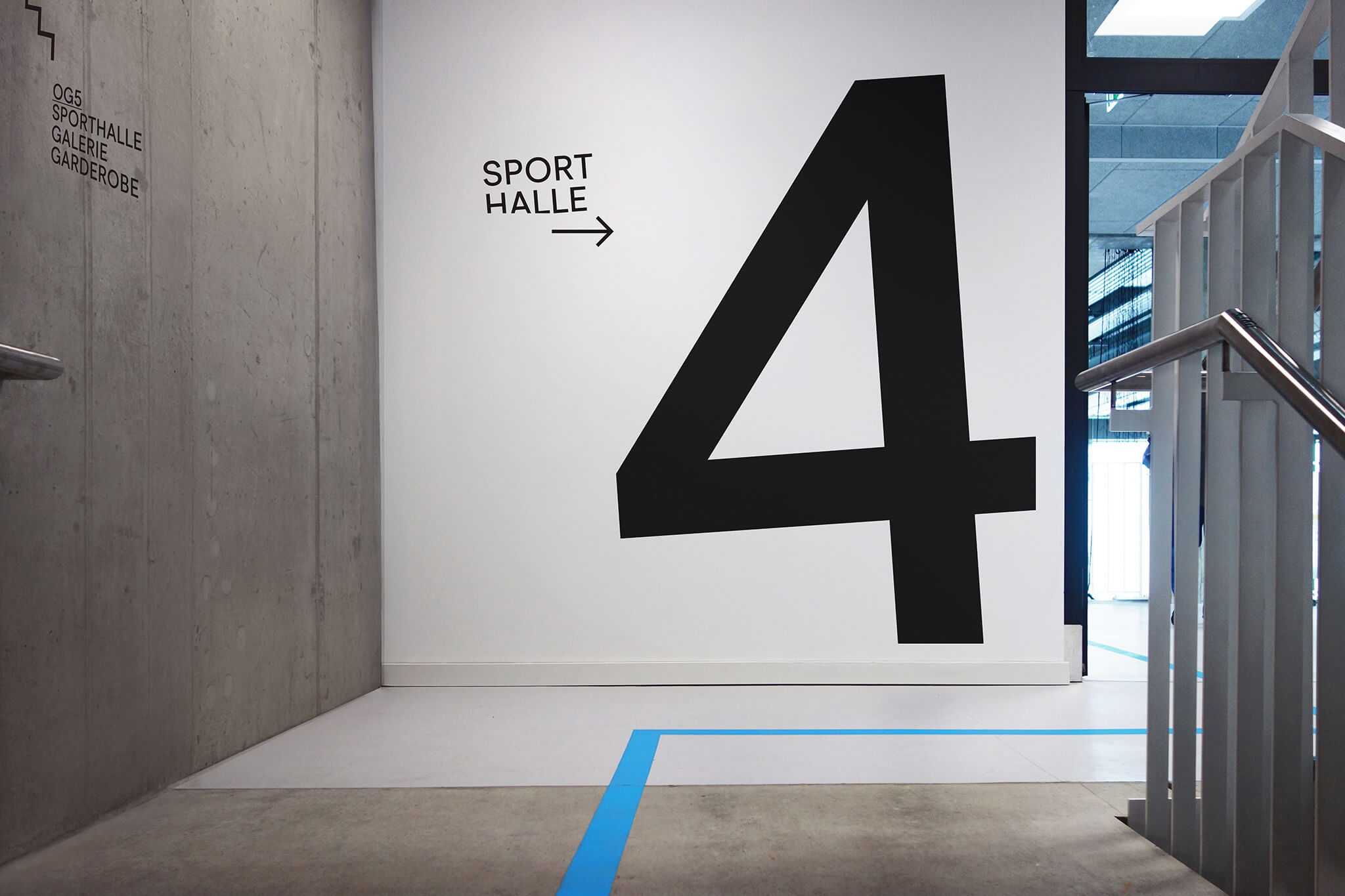
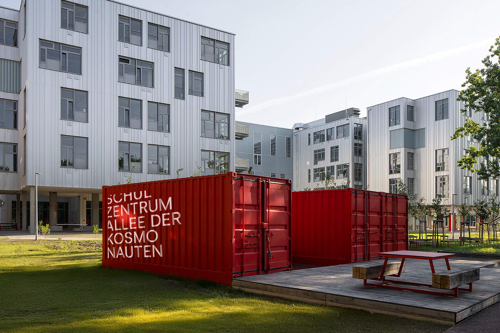
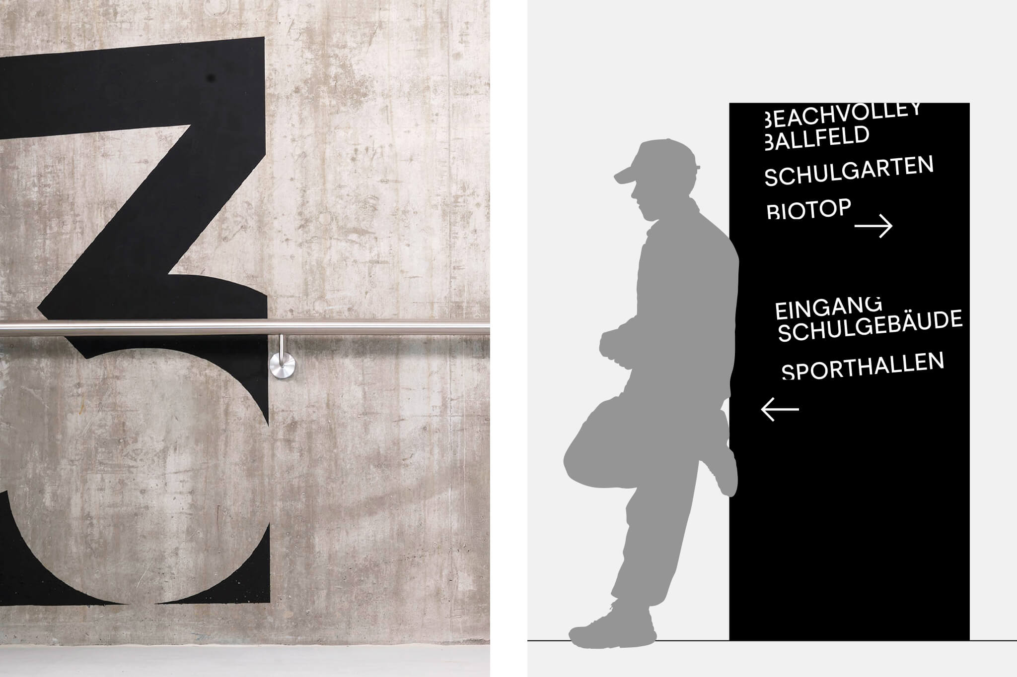
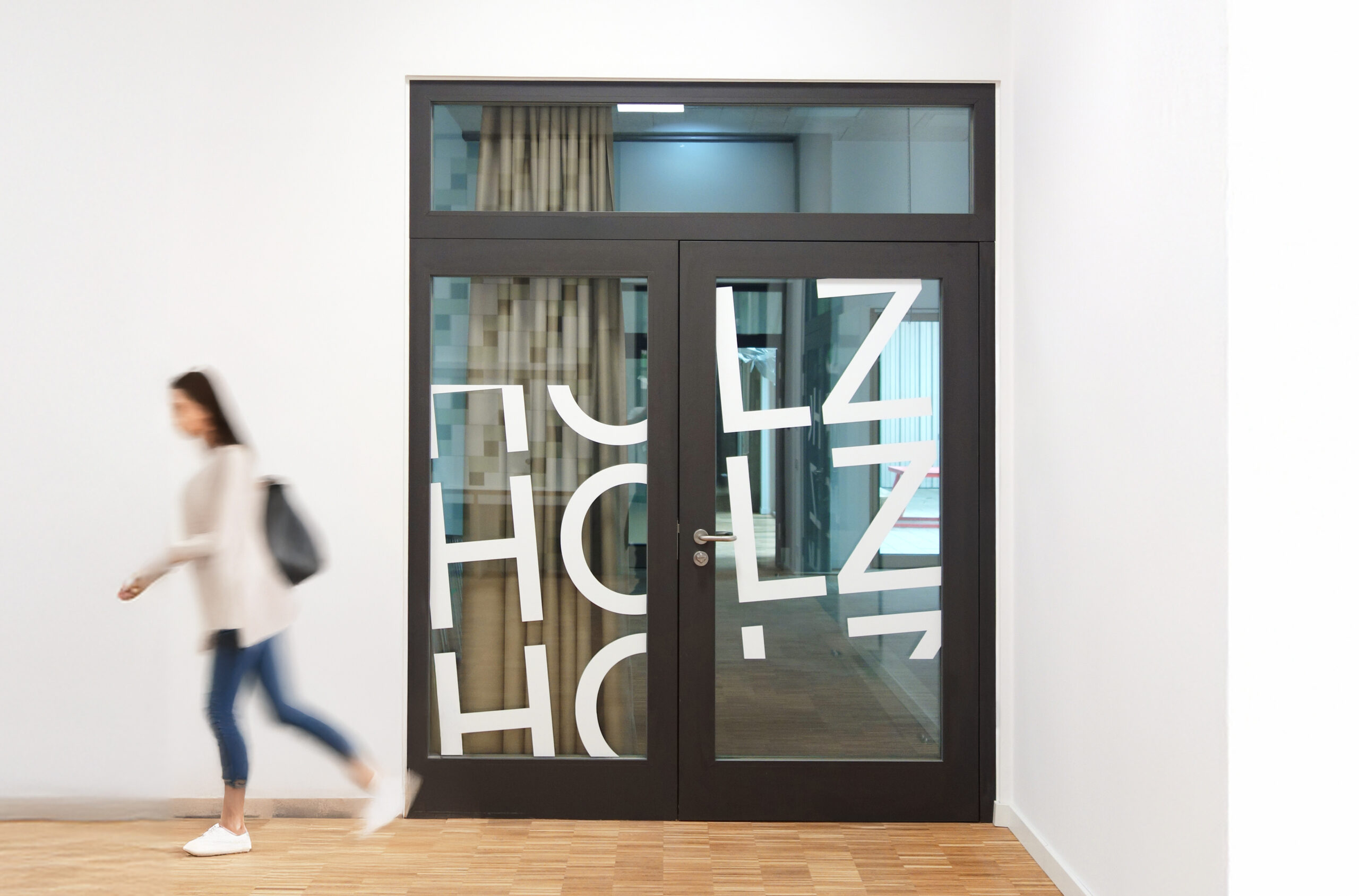
New ways of education for Schulzentrum Allee der Kosmonauten in Berlin. Designed at Bleed
More info
▲ SETTING
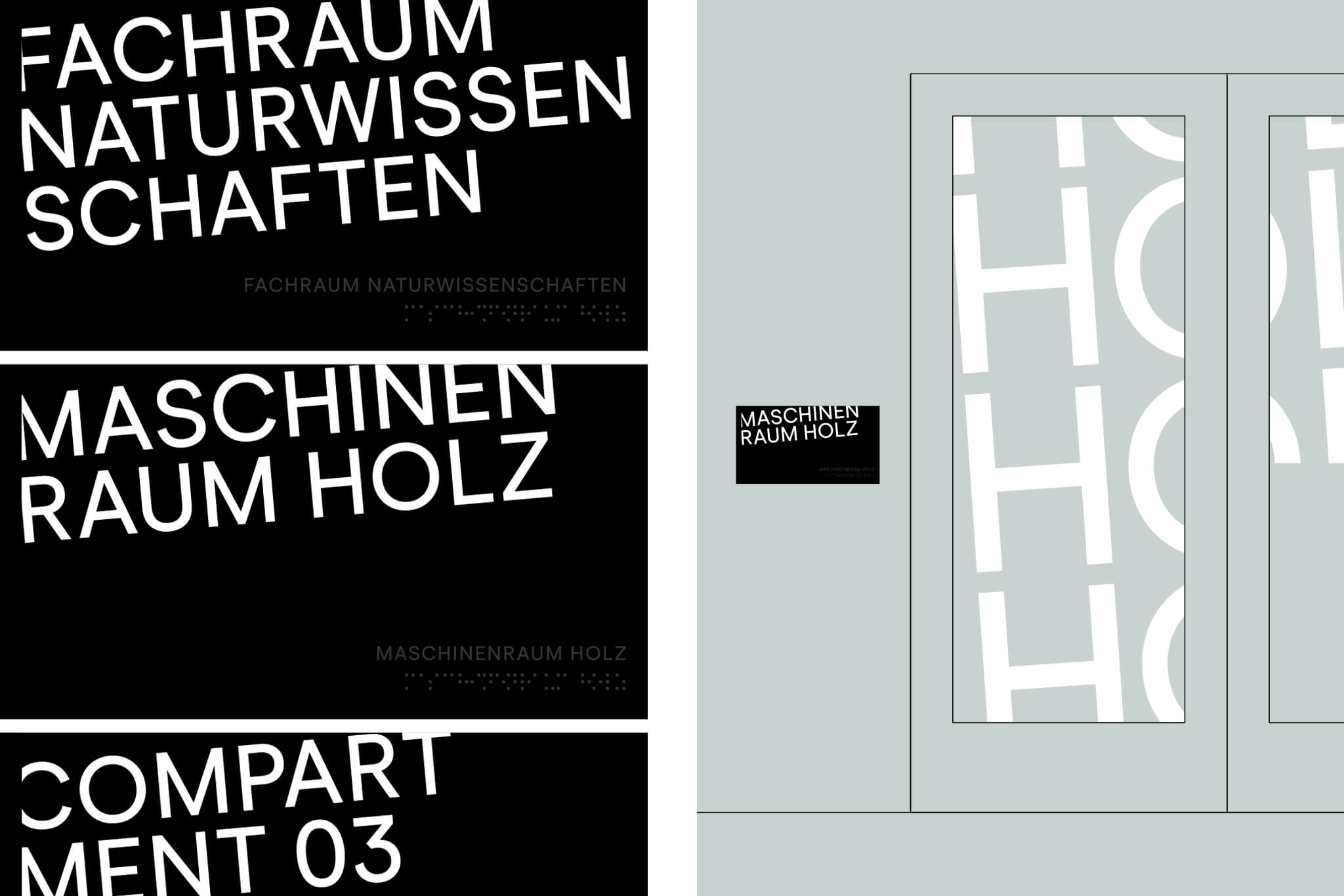
With the "Allee der Kosmonauten," the Berlin School Construction Initiative created an innovative school type with flexible building structures that adapt to changing needs in student numbers and space requirements. As a compartment school, organized into core groups rather than fixed classes, it promotes open structures, progressive thinking, and learning.
⚑ SOLUTION
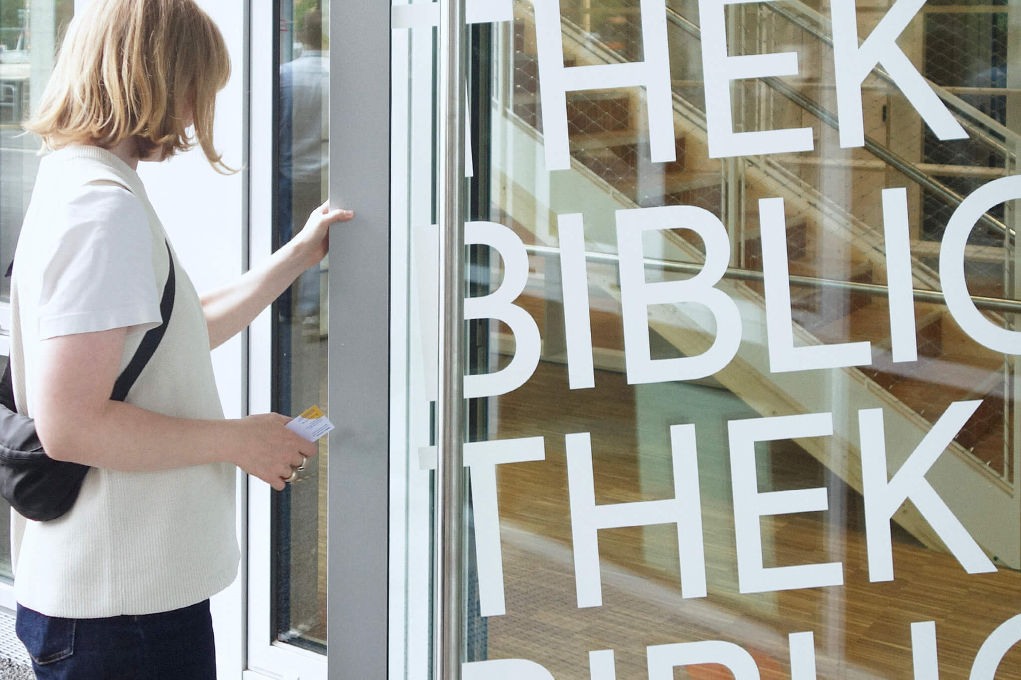
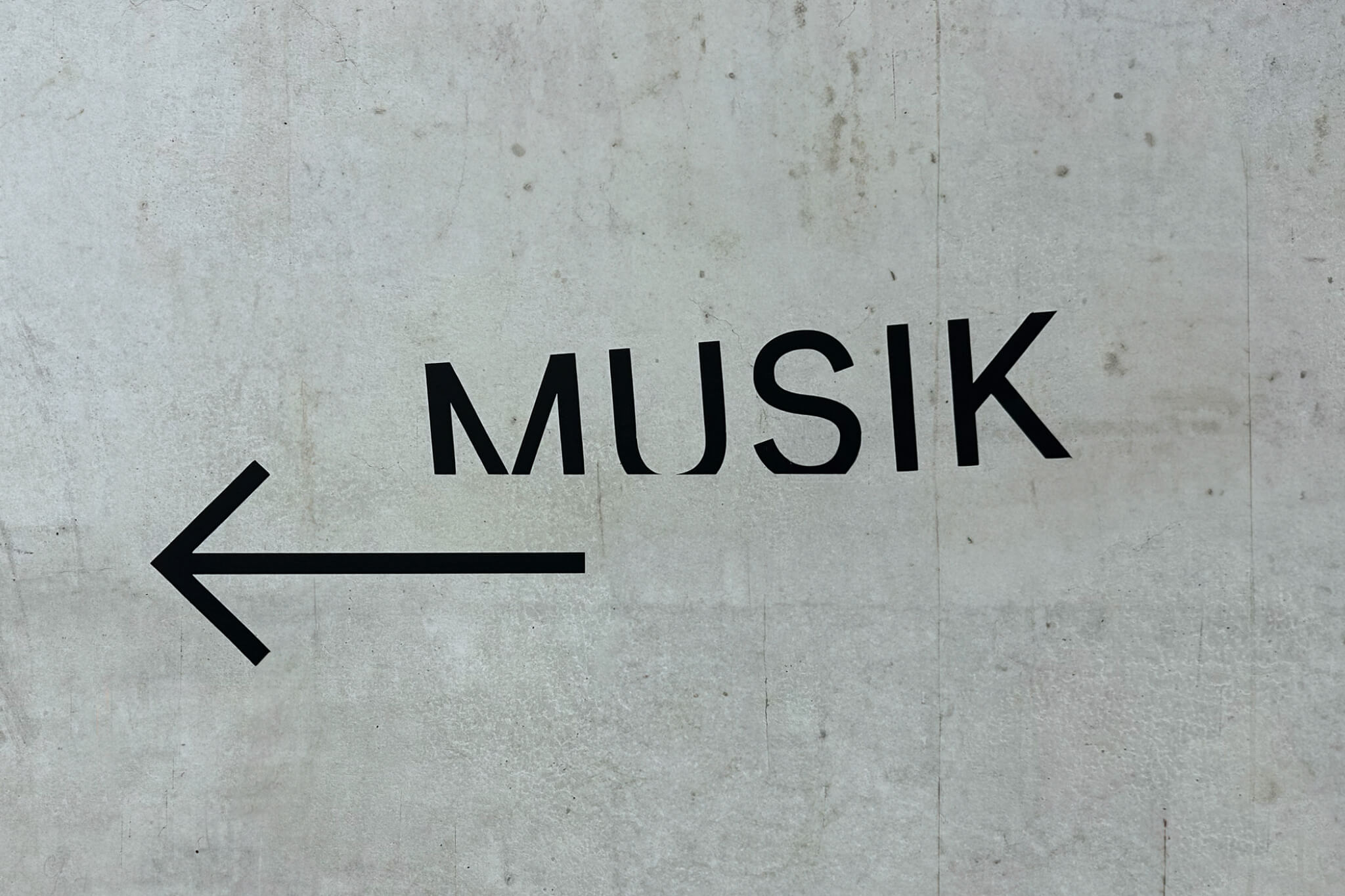
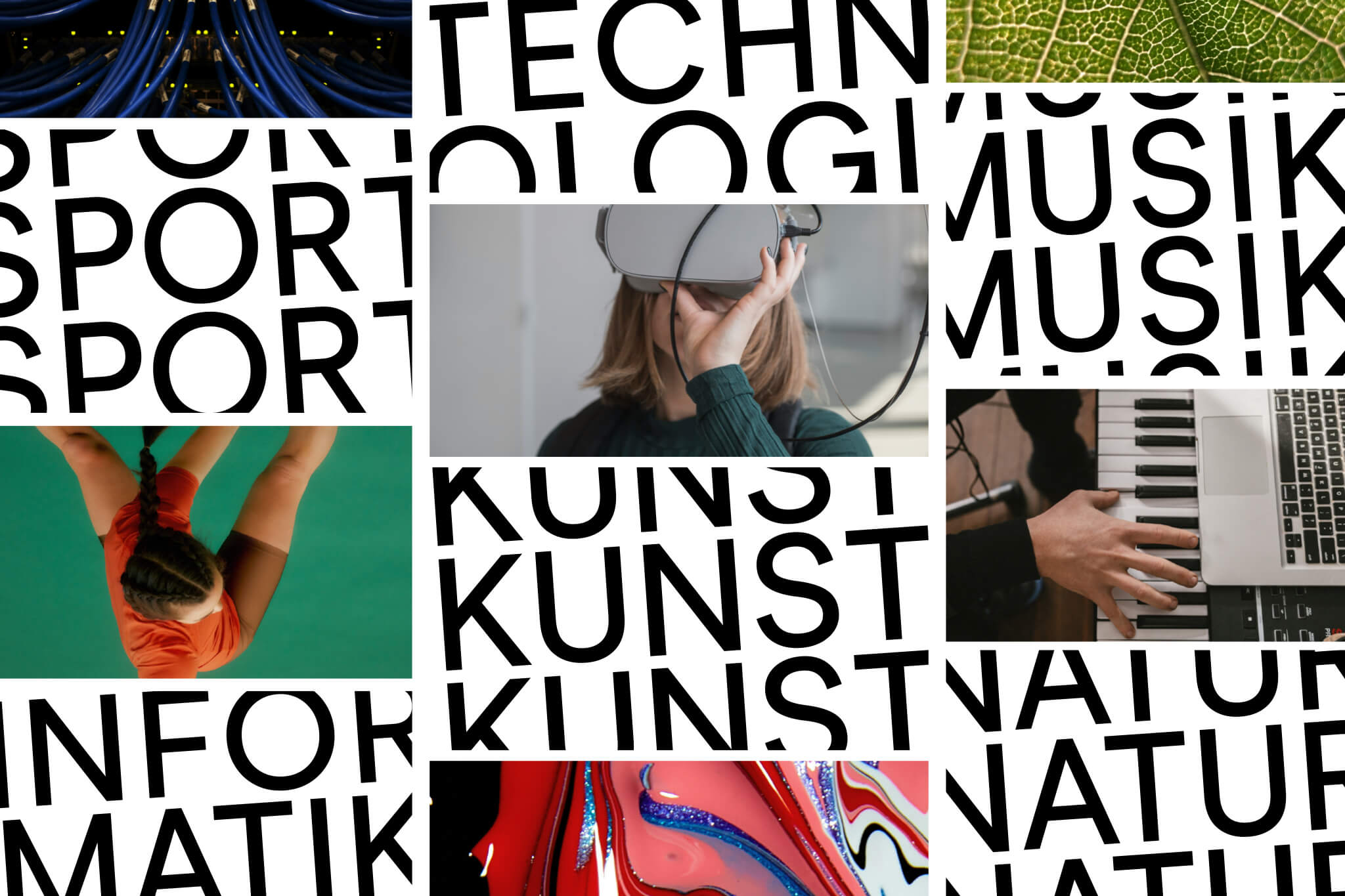
The graphic concept "Out of the Box" is based directly on the open, progressive learning environment. Here, typography consciously breaks out of its baselines, establishing a strong, independent visual identity for the entire school building. Large-scale typography organizes compartments and subject rooms, while bespoke signage and flexible displays enable (re-)personalization of spaces. Floating informational elements and inspiring texts on the walls allow thoughts to flow freely.
◐ ADDITIONAL CREDITS
Astrid Feldner (Creative direction), PPAG (Architecture)
THE SUM OF ITS PARTICLES
Visual Identity
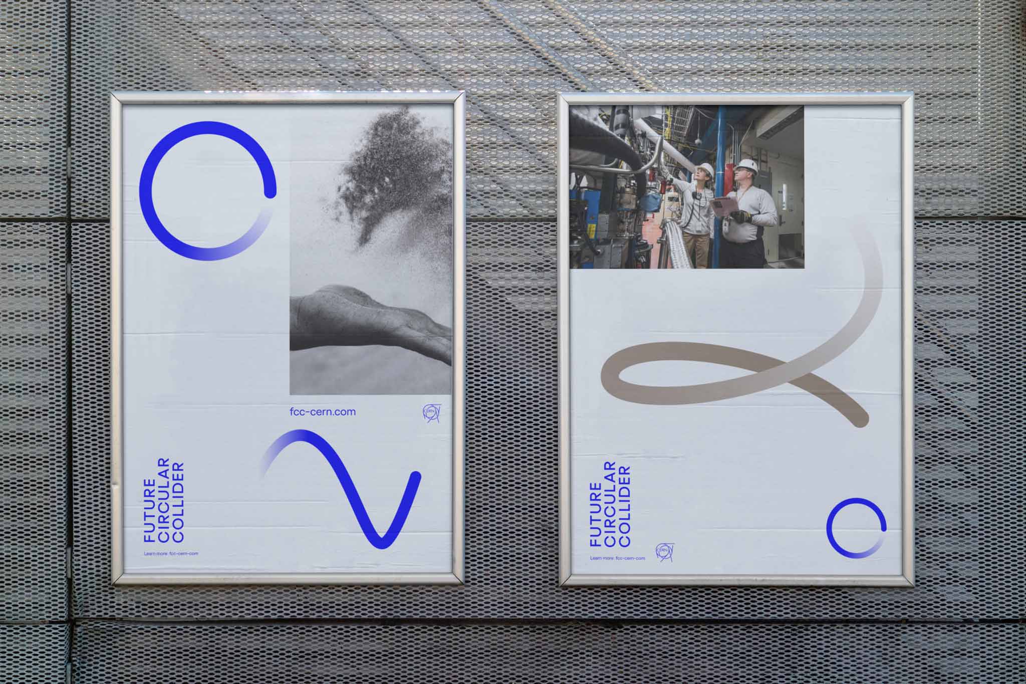
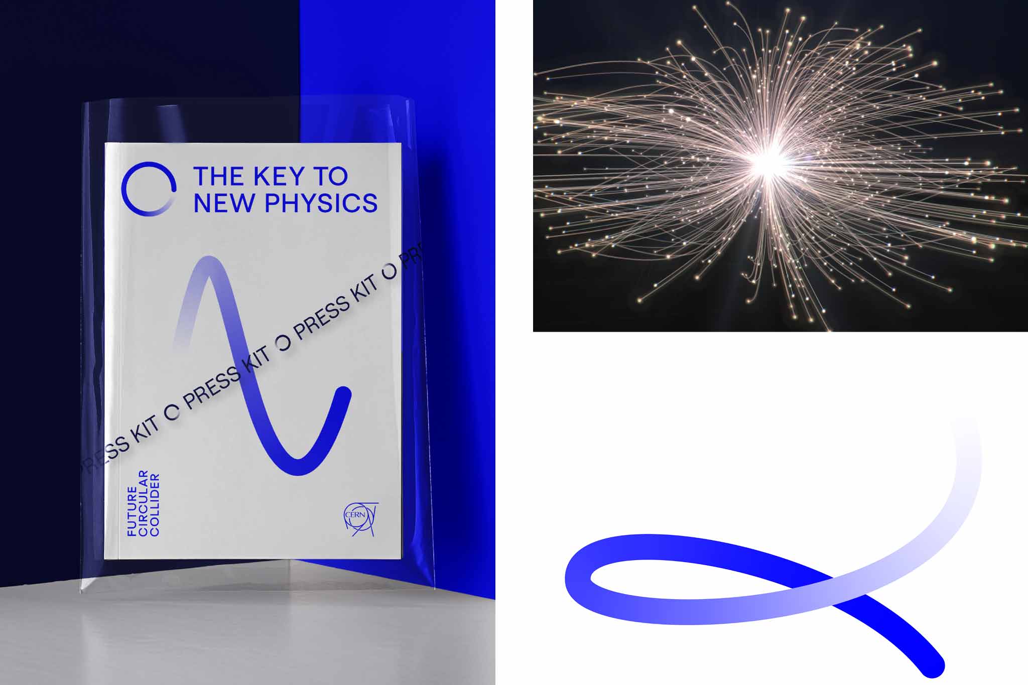
A spotlight on dark matter of particle physics supermassive new research project, the Future Circular Collider at CERN. Designed at Bleed.
More info
▲ SETTING
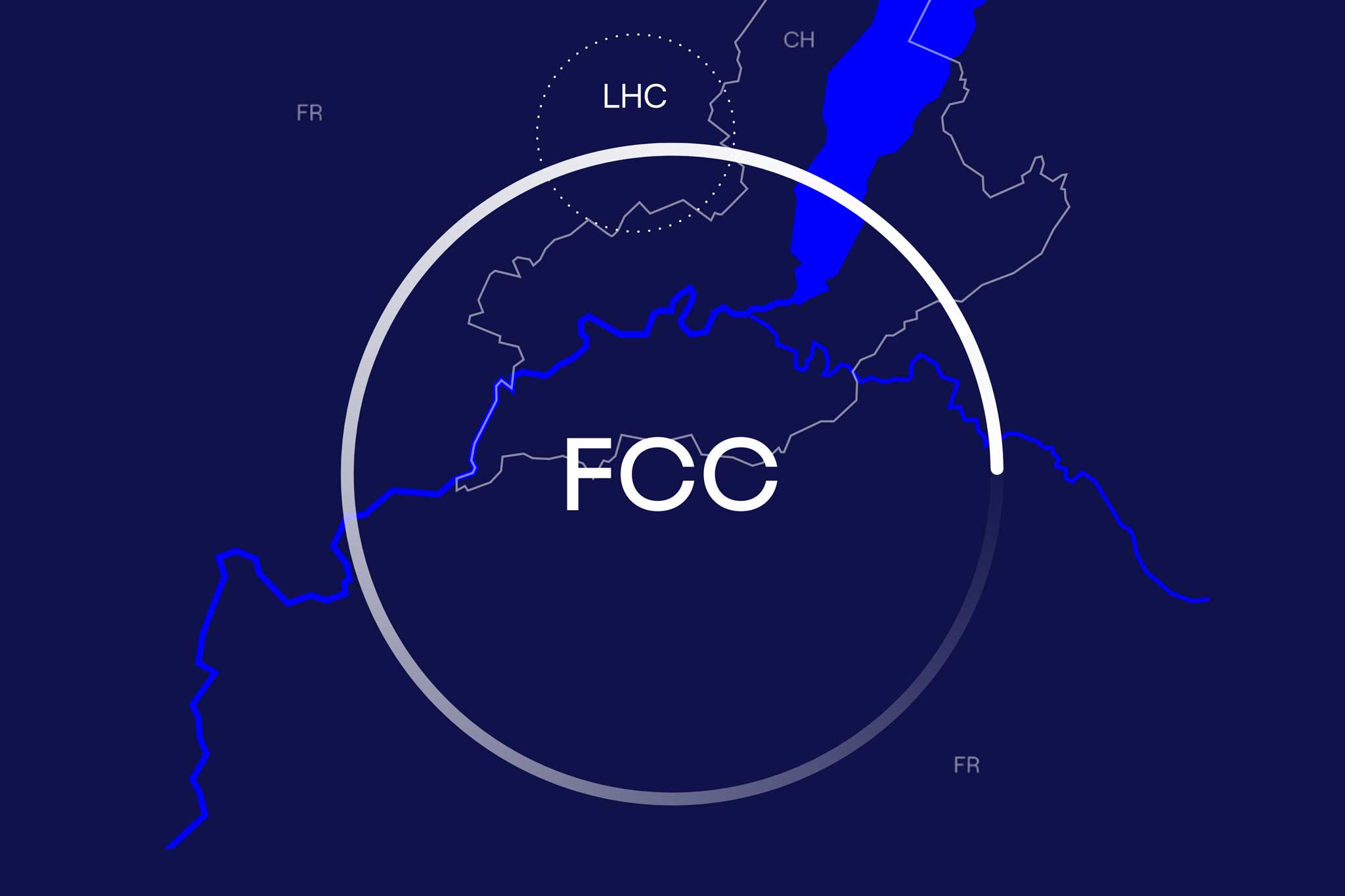
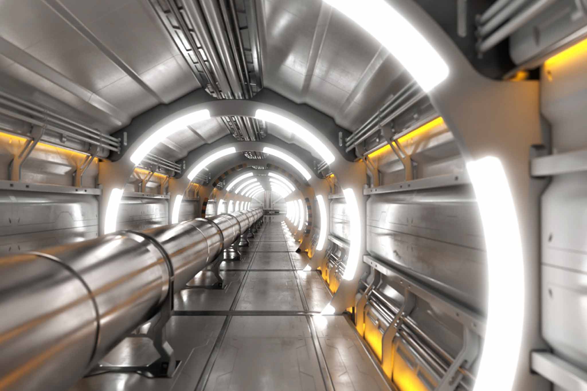
The European Organization for Nuclear Research (CERN)— the world's first instance in the sector of particle physics—establishing its largest research project, the Future Circular Collider. Like the already existing Large Hadron Collider, it accelerates particles in its gigantic circular structure, in order to gather information on particles behaviour during collision with each other. With a circumference of 100 kilometres the construction of the FCC is as massive as its mission: Changing the foundations of physics, unravelling deep knowledge on dark matter, and expanding the boundaries of human existence in the universe.
⚑ SOLUTION
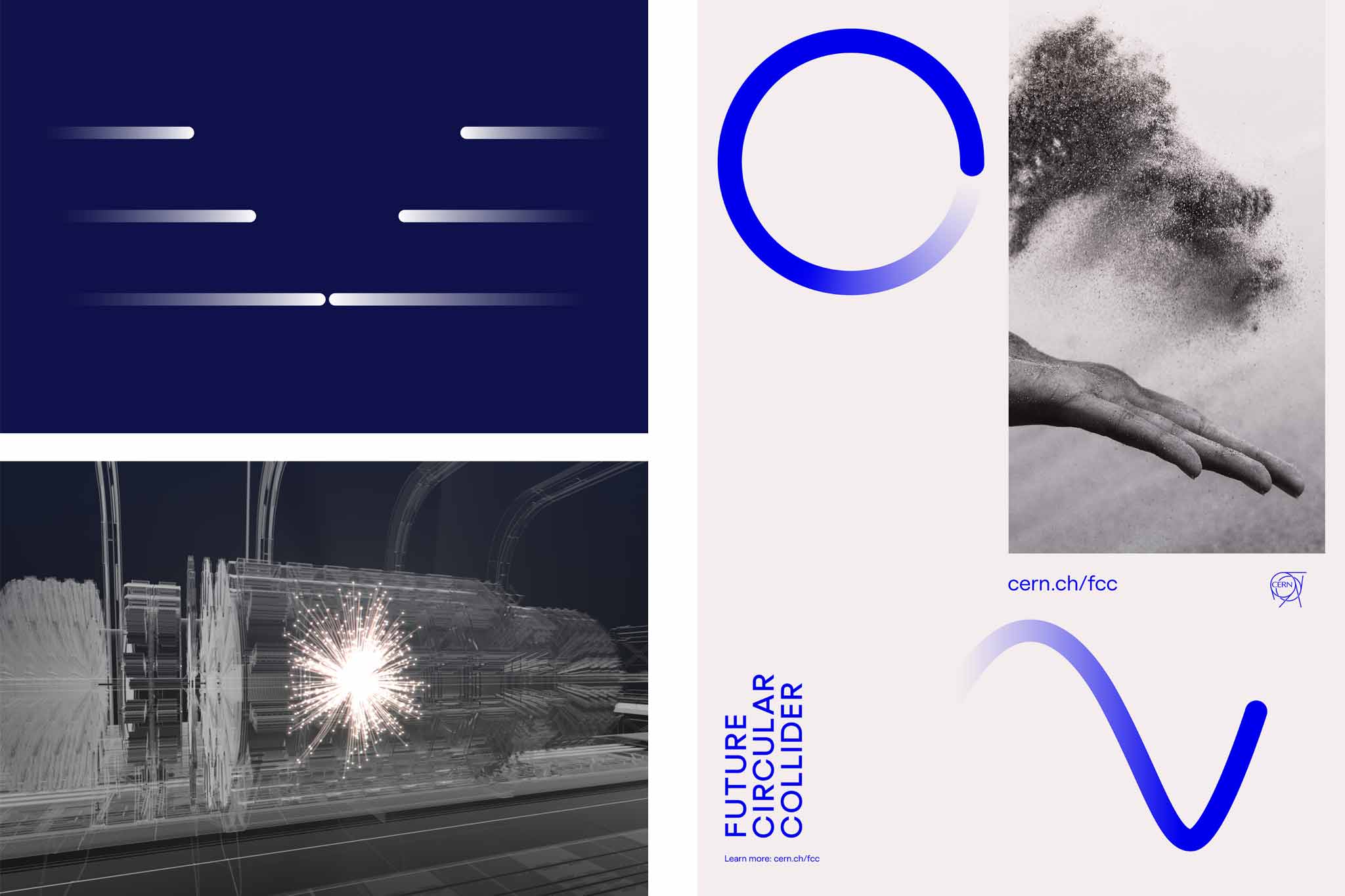
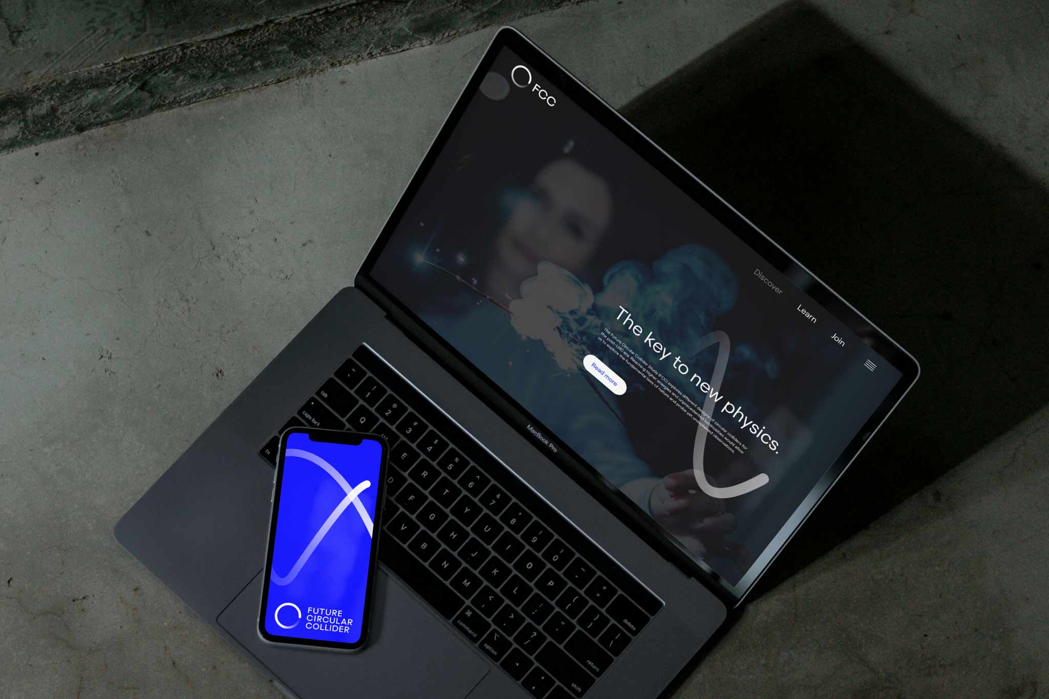
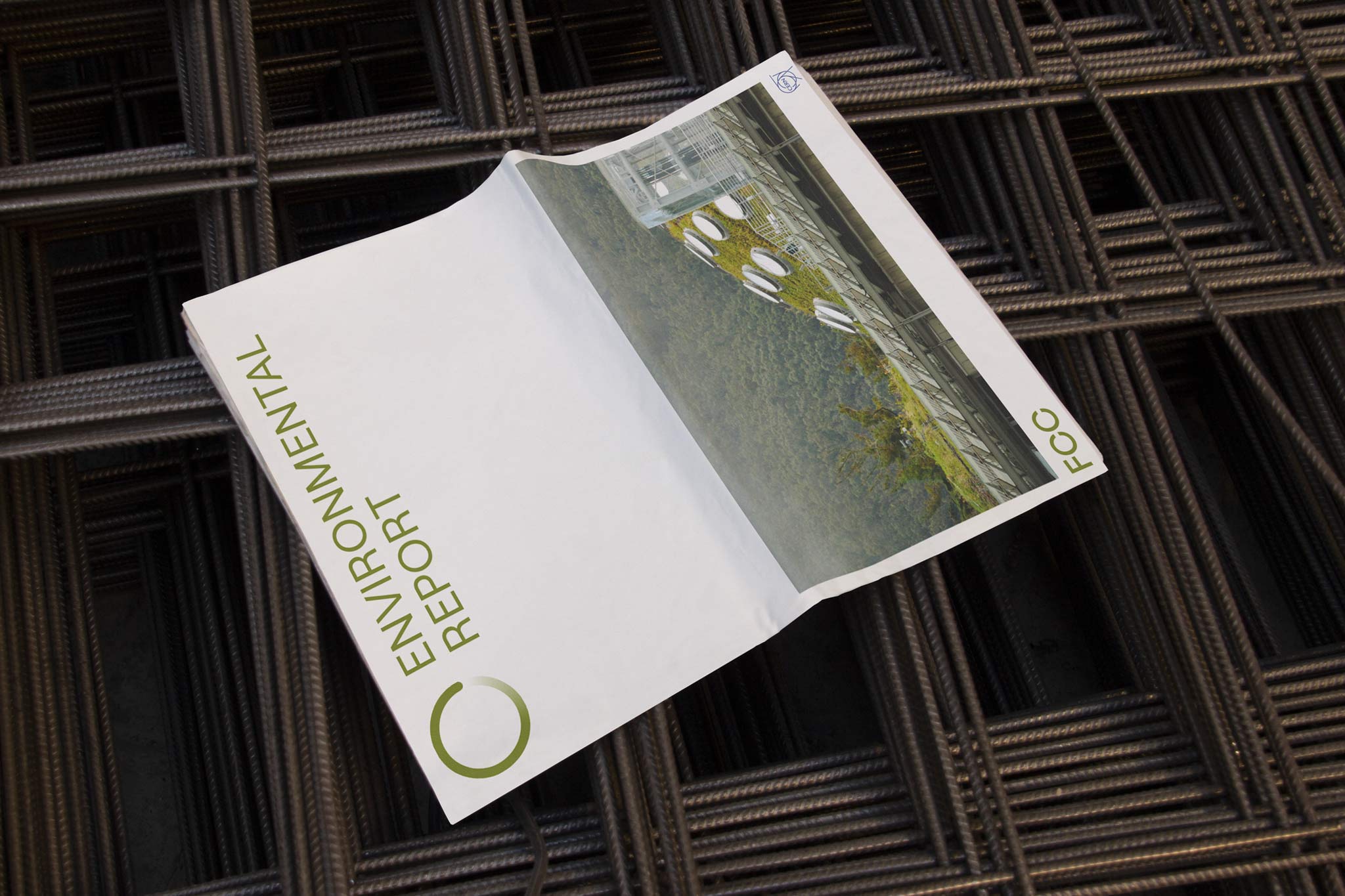
The design concept is based on a simple question: If the FCC might change the way mankind looks at the world - what if the visual identity can change how to look at a simple circle? The solution distils the complexity of the FCC to its very core. Its circular formal structure inspired the logo approach—a simple circle, but with a twist. Treating the movement with a change on perspective and angle creates new dimensions, shapes and insights. Within all applications the »open circle« unfolds lightness, atmosphere and optimism, providing the canvas for ground-breaking scientific explorations in the future.
◐ ADDITIONAL CREDITS
Astrid Feldner (Creative direction), Matyas Czel (Motion logo concept), Sara El Abed (Motion Design), Markus Mooslechner/Terra Matter Studios (Project Coordination), Site videos©CERN
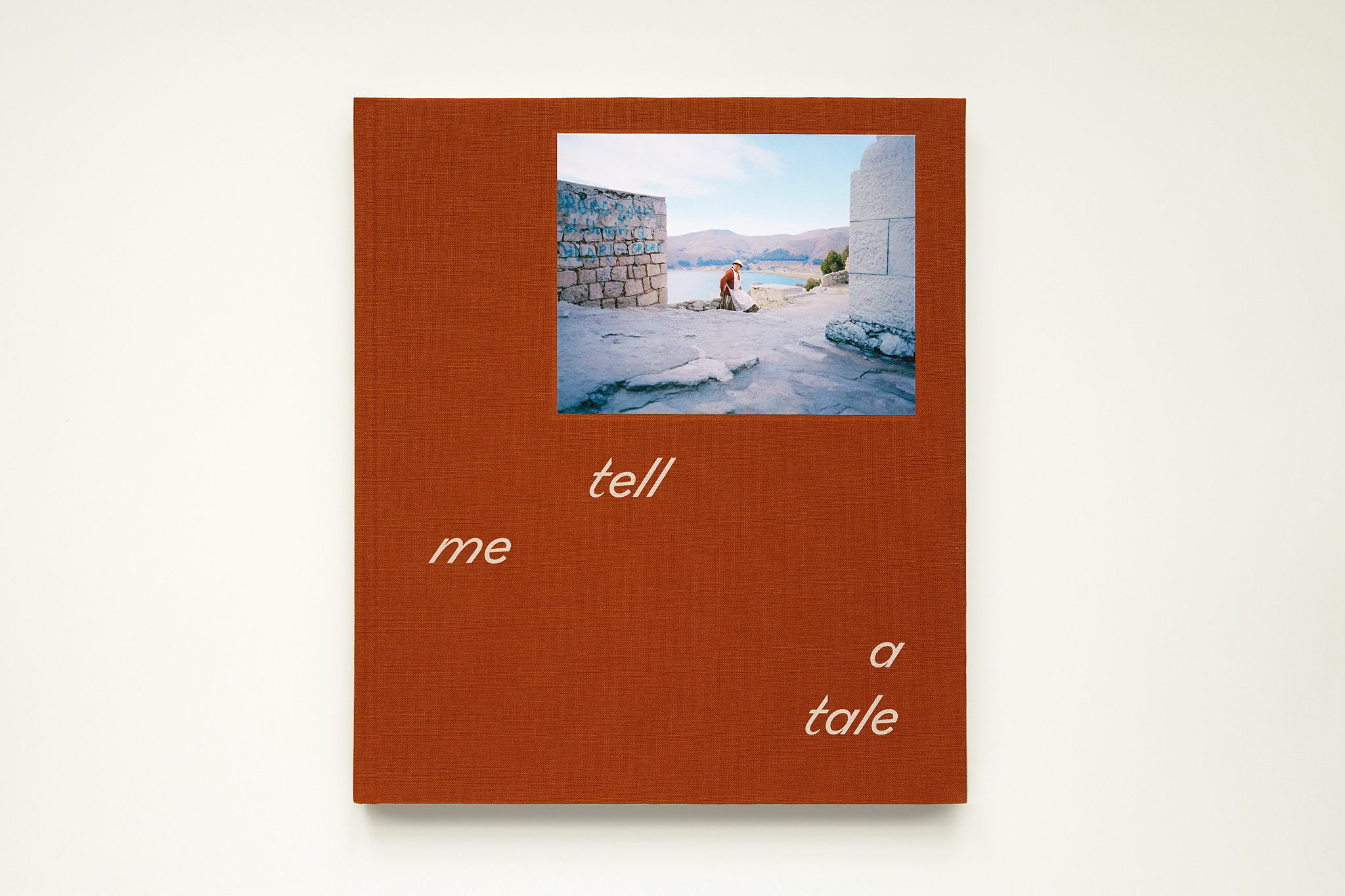
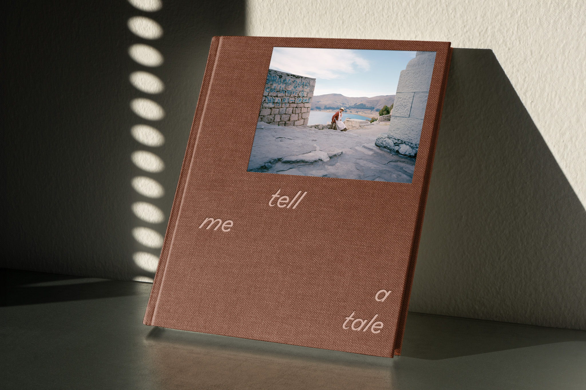
TELL ME A TALE
Book design
Unfolding stories unseen, by photographer Gregor Kuntscher. Designed at Bleed.
More info
▲ SETTING
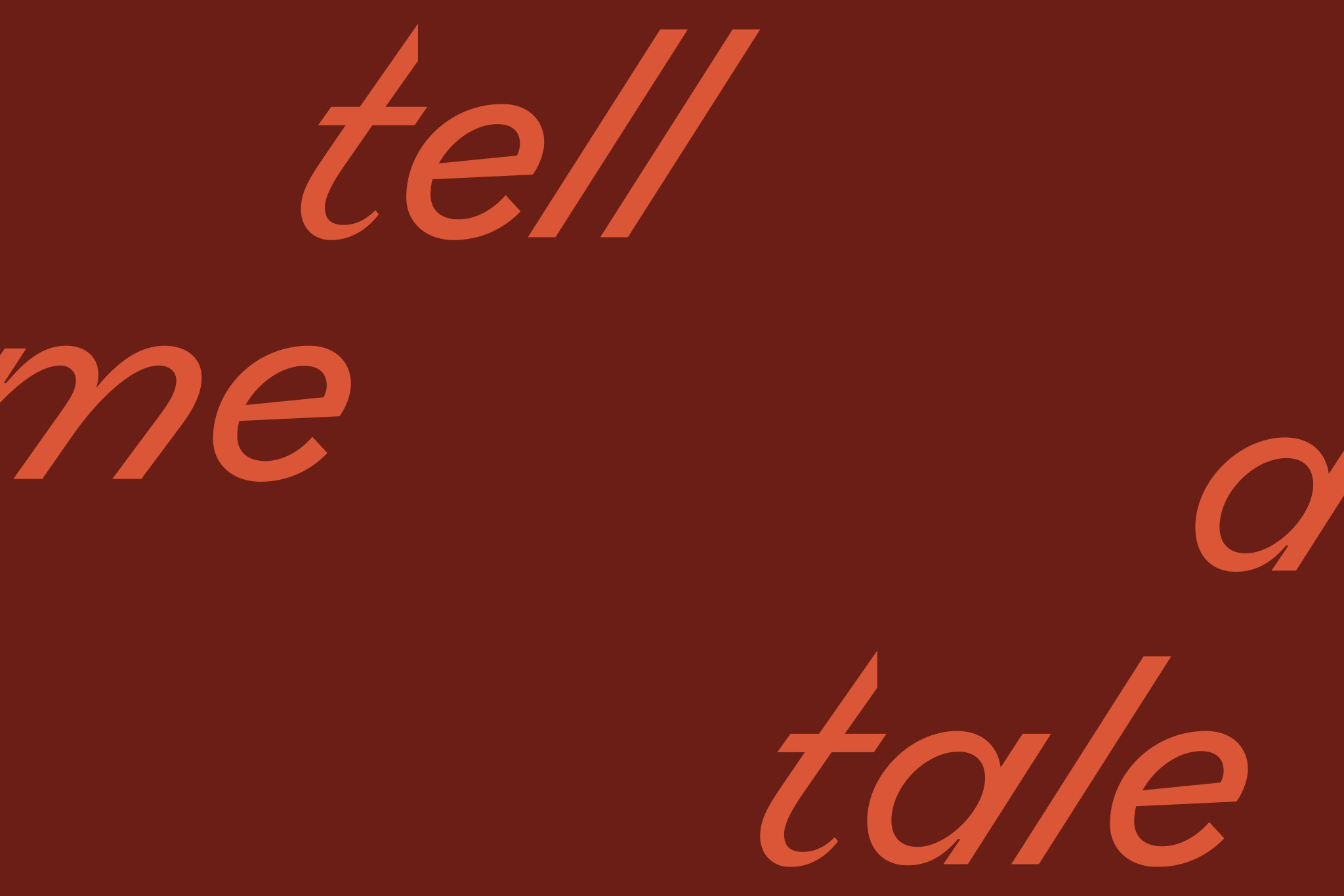
Photographer Gregor Kuntscher’s documentary work captures subtle moments of everyday life during his travels across Africa and Asia. His upcoming book and exhibition, Tell Me A Tale, presents a visual journey through diverse cultures, landscapes, and personal stories. With his lens, Kuntscher highlights untold narratives, offering viewers a glimpse into the world’s many layers.
⚑ SOLUTION
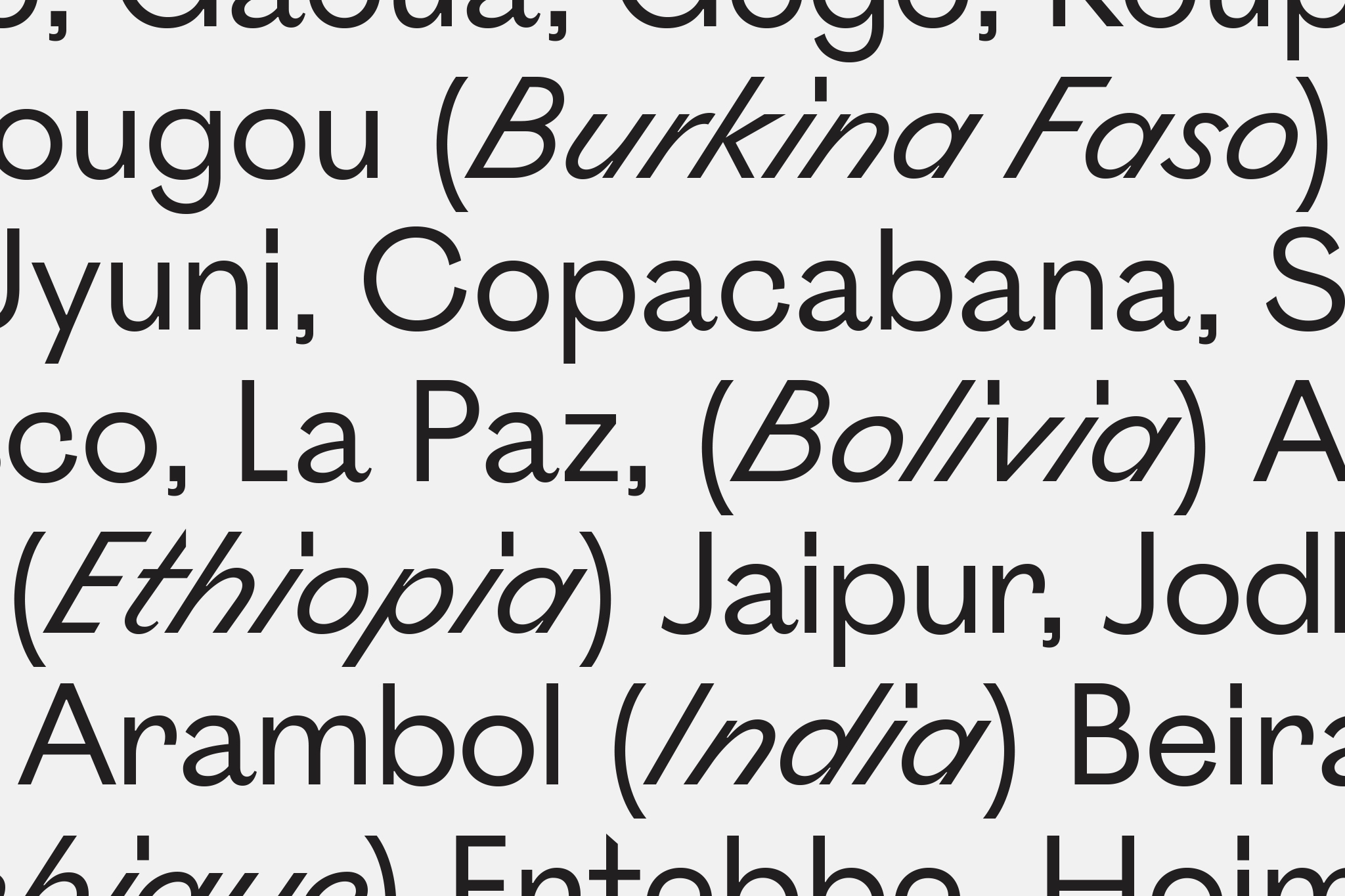
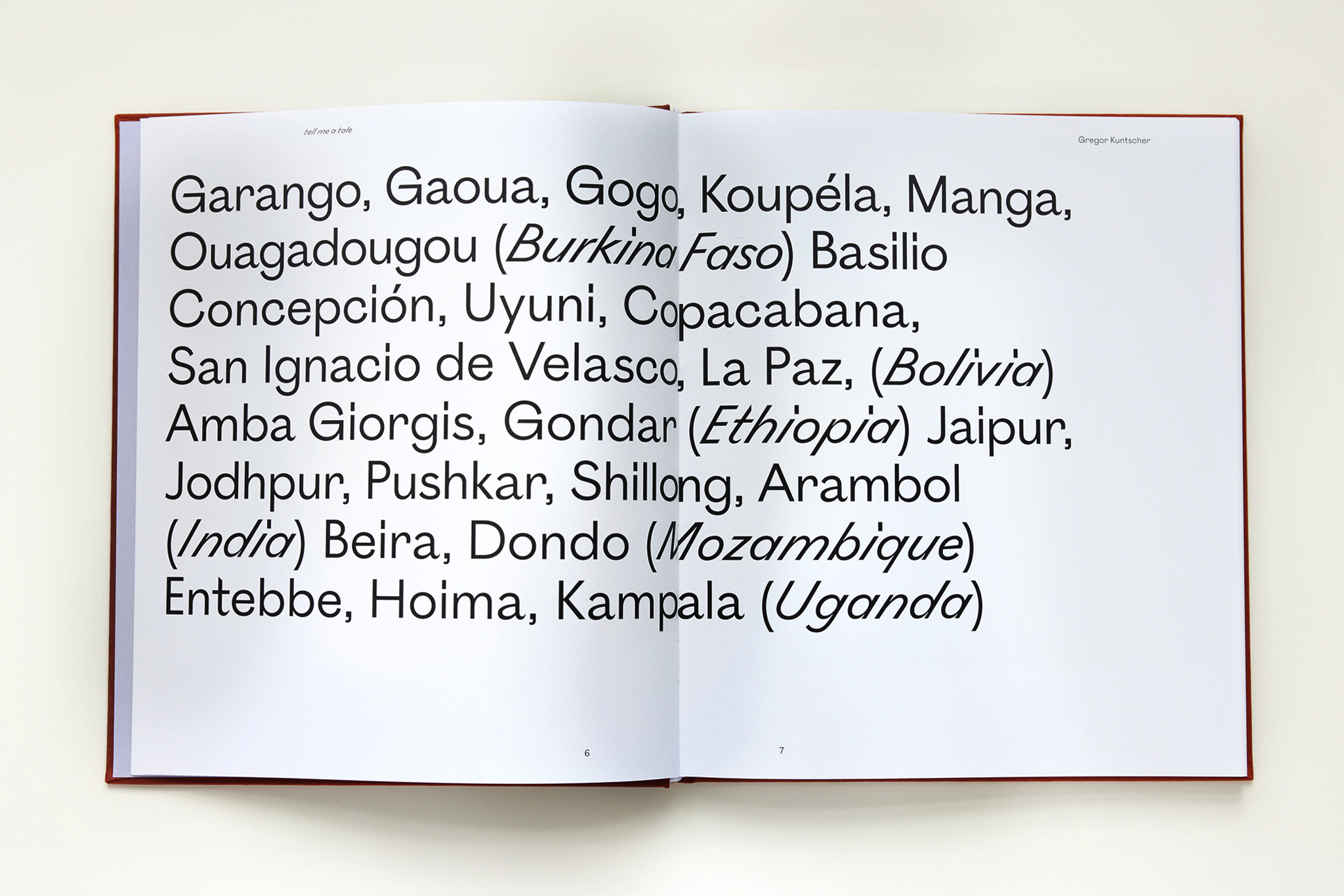
Tell Me A Tale opens with an invitation to explore and discover. The floating title on the cover creates a subtle sense of depth, while the linen wrap adds a soft, tactile element that complements the book's connection to its content. Inside, careful typographic detailing complements the spacious layout, allowing the images to breathe and resonate, giving each photograph room to tell its story.
◐ ADDITIONAL CREDITS
Astrid Feldner (Creative direction & layout), TEA Design - Bulgaria (Print production), Gregor Kuntscher (book shots)
THE AURA OF THE MOMENT
Visual Identity
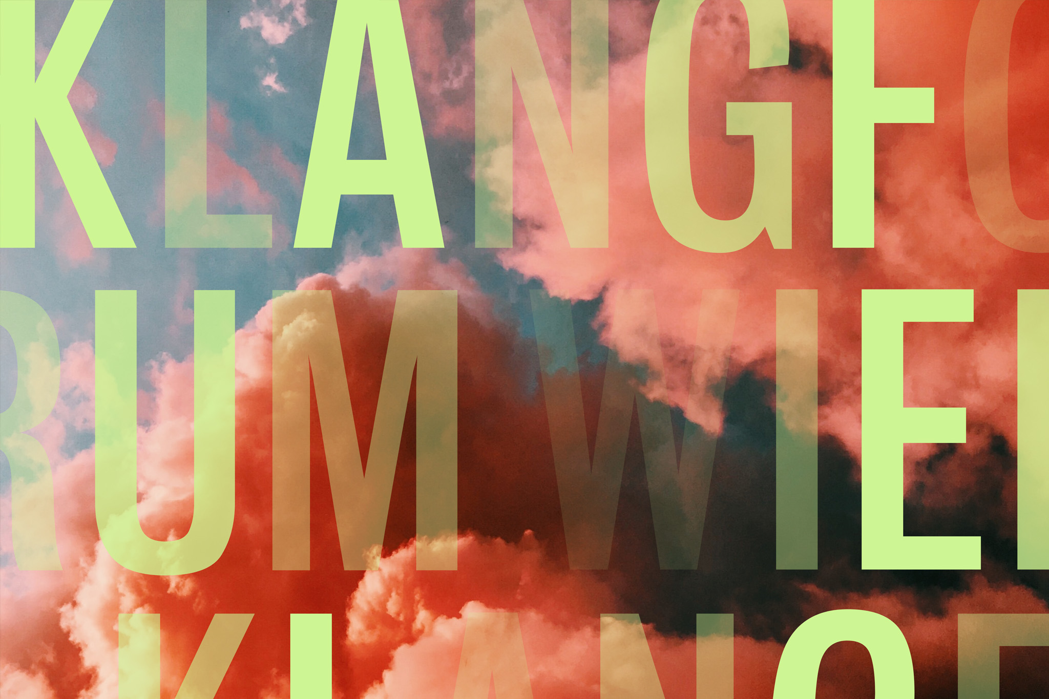
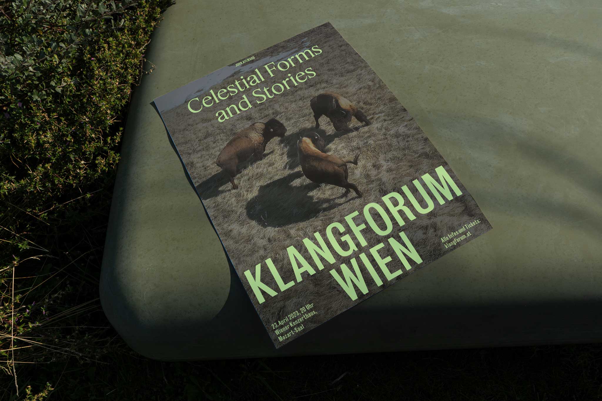
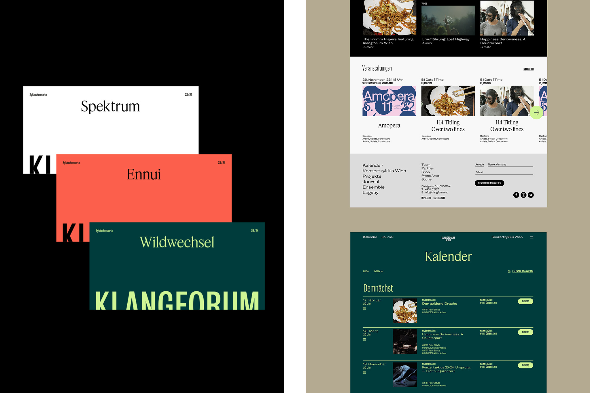
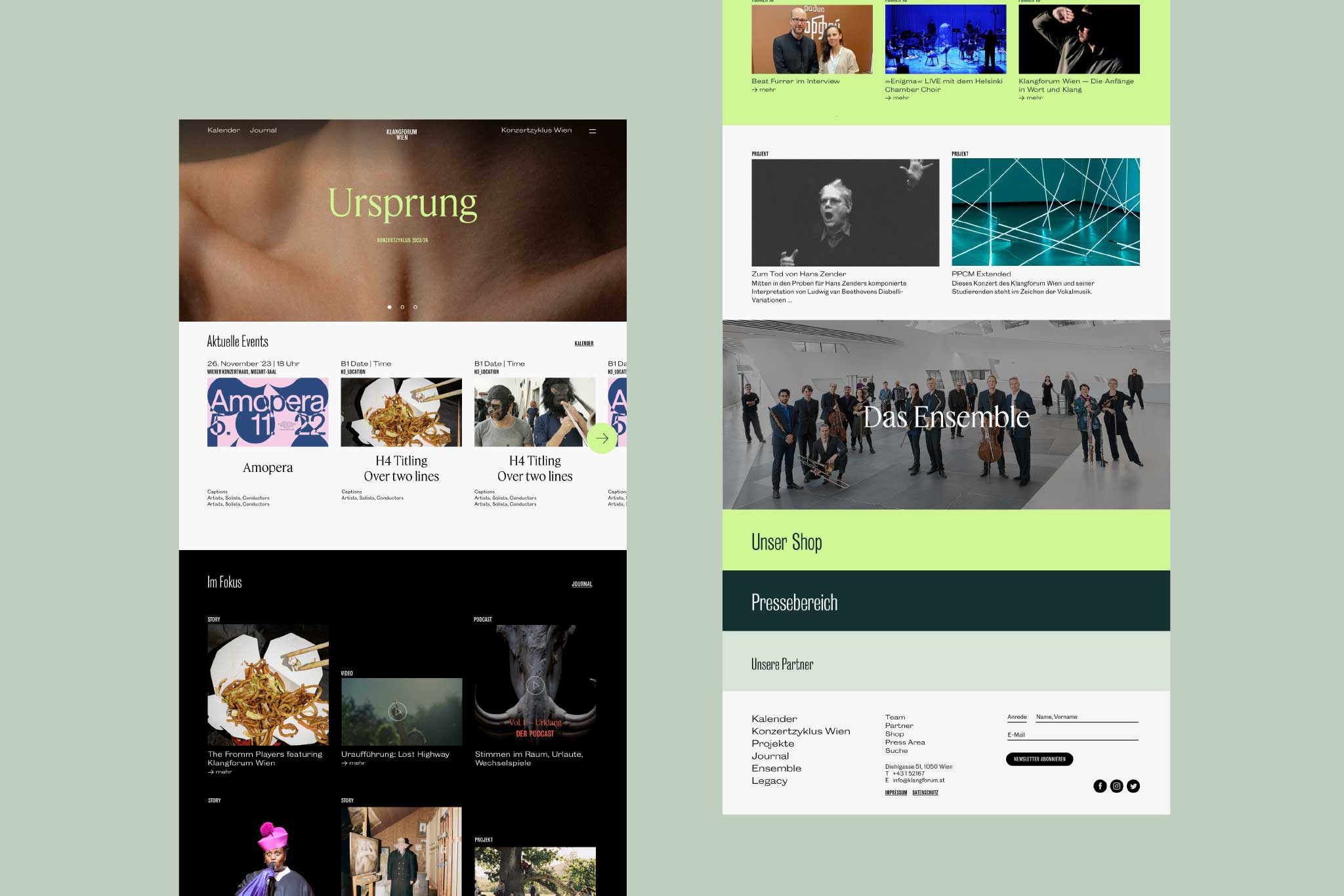
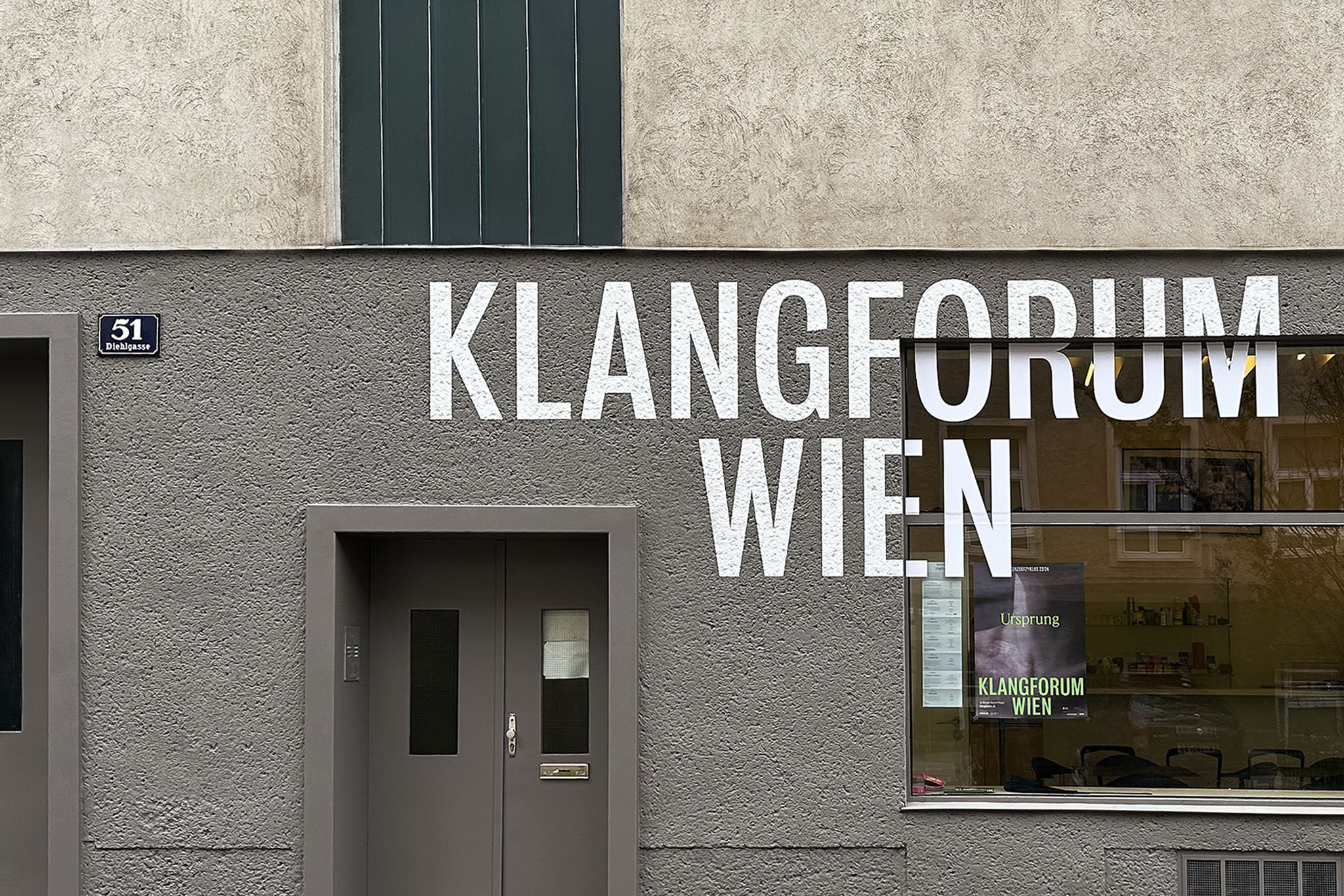
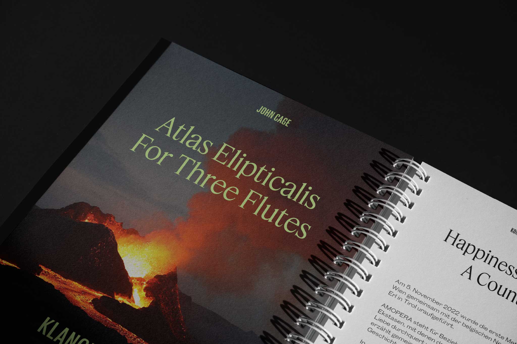
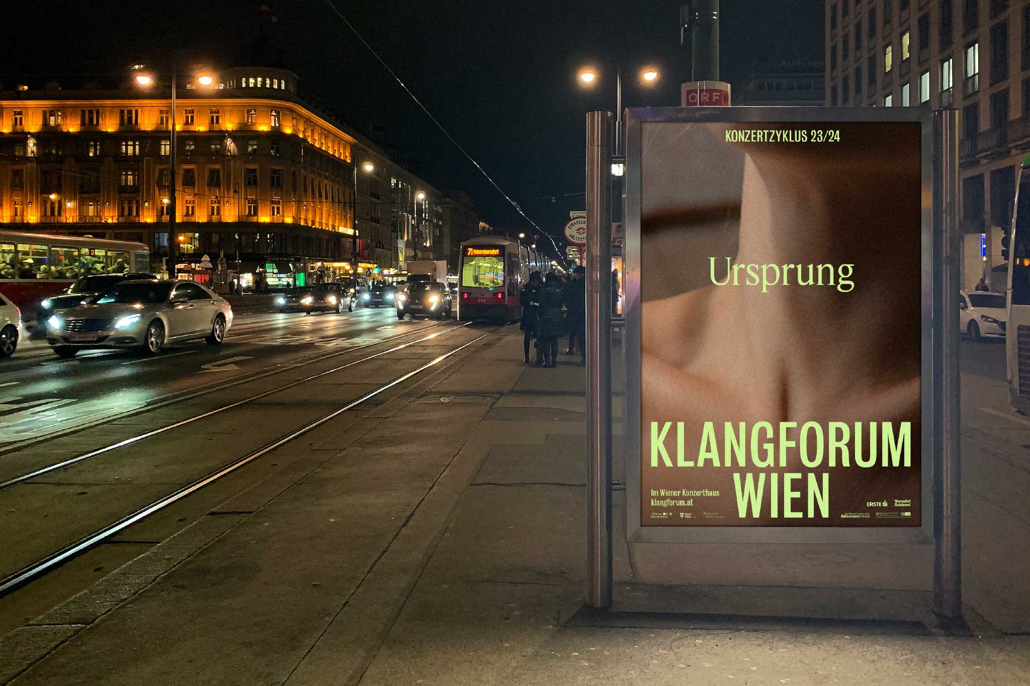
A new visual score for contemporary music ensemble Klangforum Wien. Designed at Bleed.
More info
▲ SETTING
Founded in 1982 Klangforum Wien counts itself as one of the world's most prolific ensembles for contemporary music. It’s 24 members from all over the world shape immersive and immediate experiences, ephemeral yet with lasting impact—not just in the very moment of their interpretation, but on the perception of innovative soundscapes in general.
⚑ SOLUTION
»The aura of the moment«—this poetic phrase from an interview by one of the ensembles longest-serving musicians became the essential inspiration for the visual identity. It describes the ability of the collective to reach sublimity in very special situations wether in extensive rehearsal work, or within the performances itself. The confident logo lettering embraces both the solid and stage-like on static use and the fluctuating-ephemeral in motion. Elaborate typography, an active colour scope, and image concept accelerates the auratic momentum of being.
◐ ADDITIONAL CREDITS
Astrid Feldner, Svein Haakon Lia (Creative Direction), Lewis Scott (Project management), Giuseppe Defilippis (Motion design), Max Tomren (Web coding)
ARISEN THE SENSES
Pavilion Identity, Art Direction
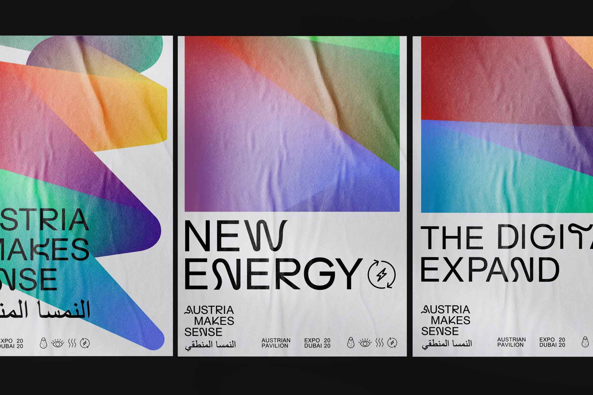
A sensory design system for the Austrian Pavilion at EXPO 2020 DUBAI. Designed at Bleed.
More info
▲ SETTING
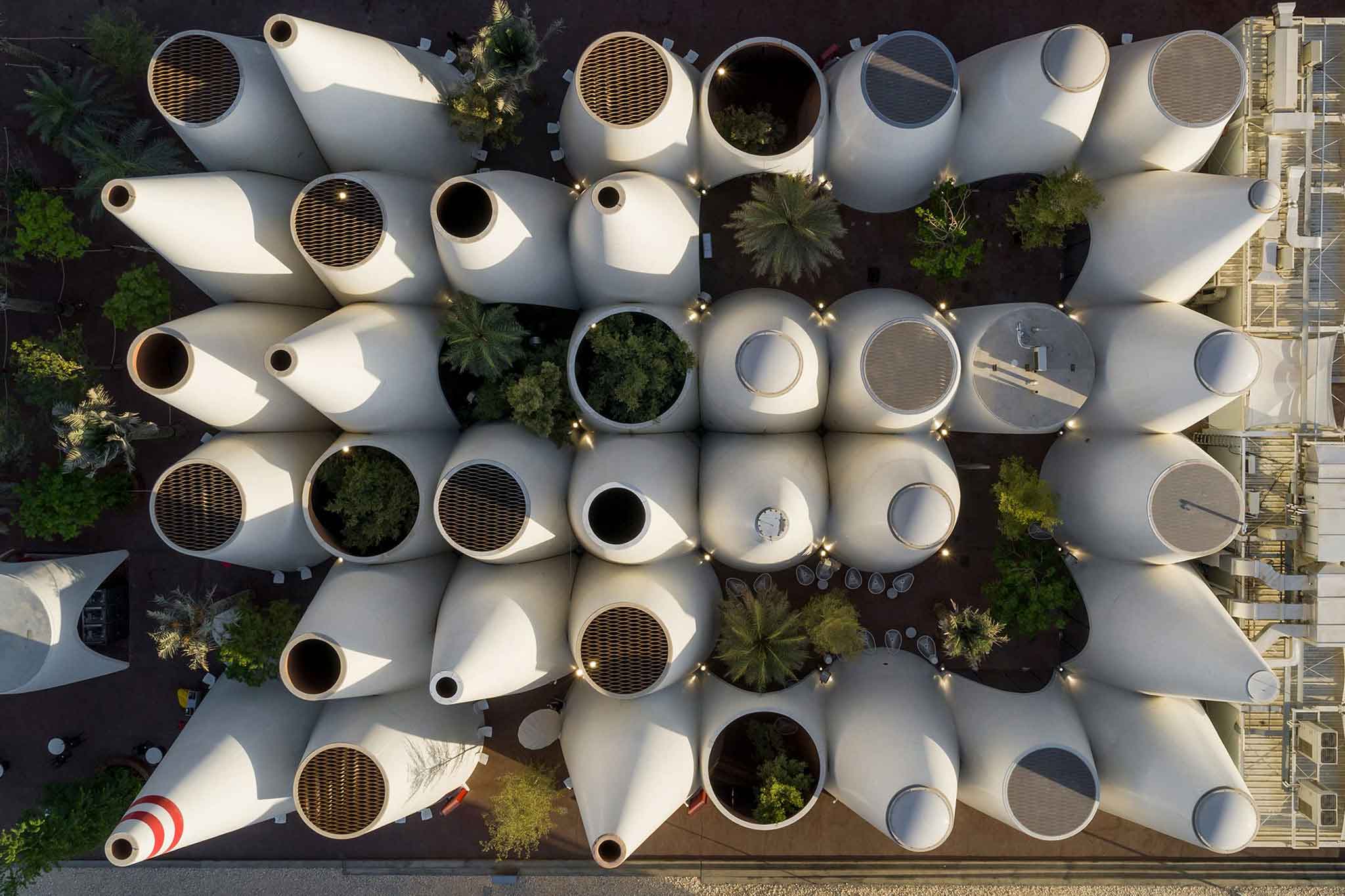
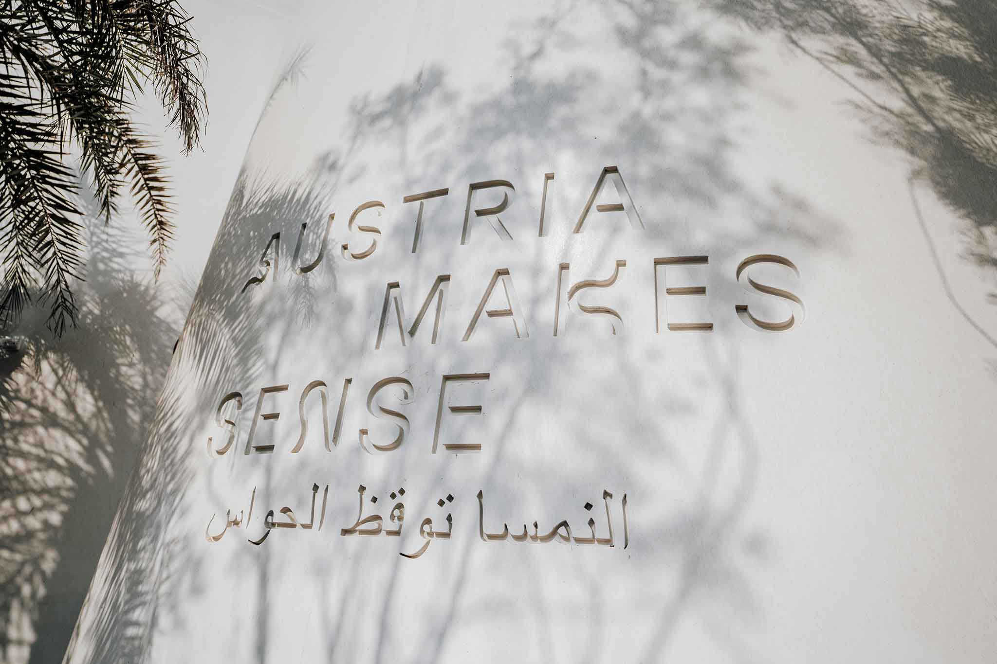
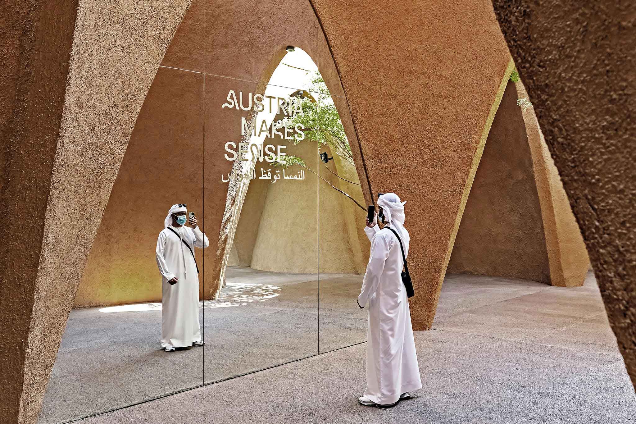
At EXPO 2020 DUBAI Austria presents itself to the expected 25 million visitors with a striking pavilion under the sparkling anthem »Austria makes sense«. Based on the title the exhibition identity and design is based on its overall topic: the mindful and respectful use of our earthly resources as well as sensual experiences of Austrian innovation. The pavilion itself, inspired by Arabian wind tower architecture, is plastered with clay on its interior and features an intelligent climate concept that allows the building to cool by itself with a constant airflow circulation.
⚑ SOLUTION
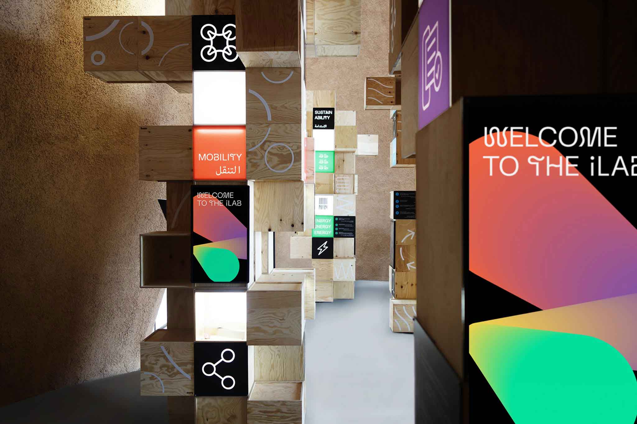
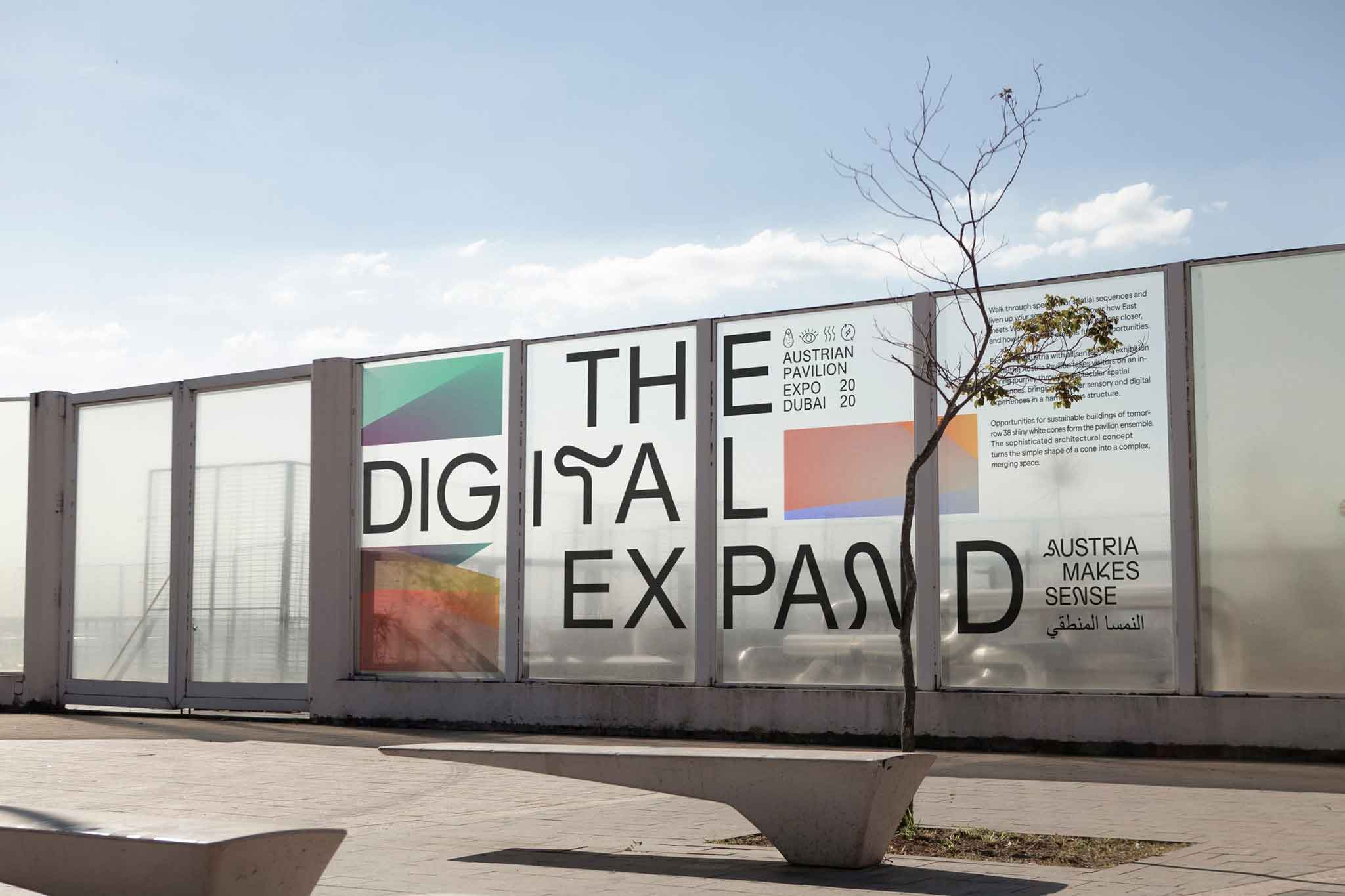
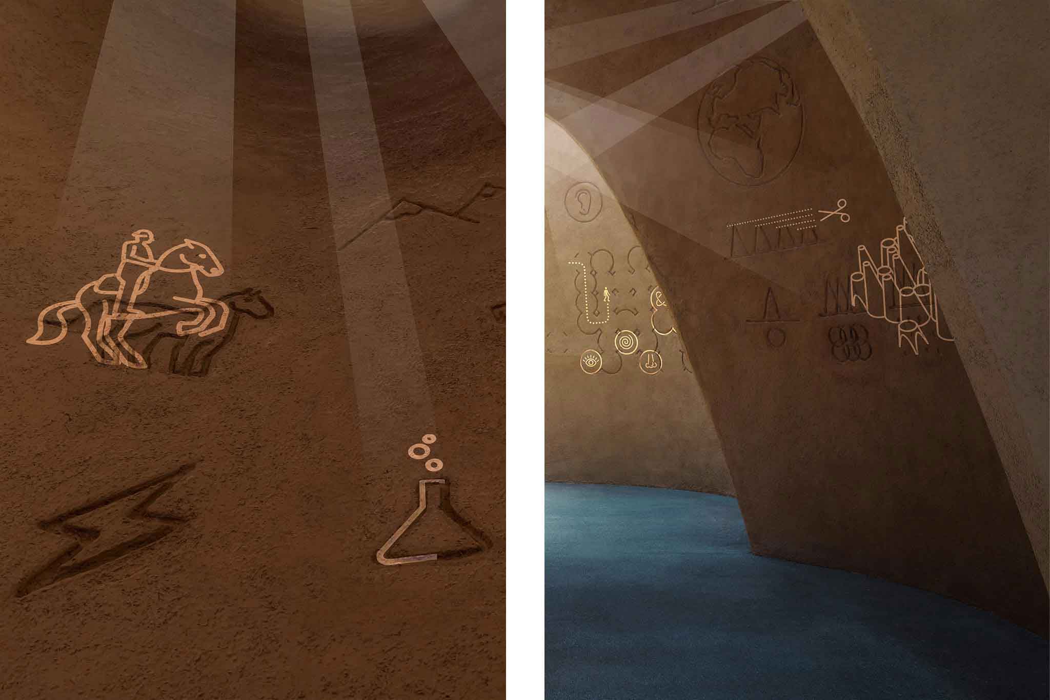
The Austrian pavilion offers space for its visitors to enter into a non verbal dialogue. The use of an intercultural language consisting of universally understandable gestures, visuals, sounds and scents breaks down barriers such as language, education, age and cultural background. A vivid color gradient that reflect the cone-shaped architecture and a custom made bespoke typeface based on the airflow climate principle became the identity basics. The entrance area features elaborate iconography carved in the clay walls and being brought to life by moving head 3D projections. In its combination the identity, exhibition and overall experience become as fluent as a flow of air.
◐ ADDITIONAL CREDITS
Astrid Feldner (Creative direction), Matyas Czel, Sara El Abed (Motion Design), William Stormdal (Type programming), Emil Höher (Project management), querkraft architects (Pavilion architecture), Ars Electronica Solutions (Digital scenography), Buero Wien (Curation)
⊙ AWARDS
Red Dot Design Award 2022
Creative Club Austria Award 2022
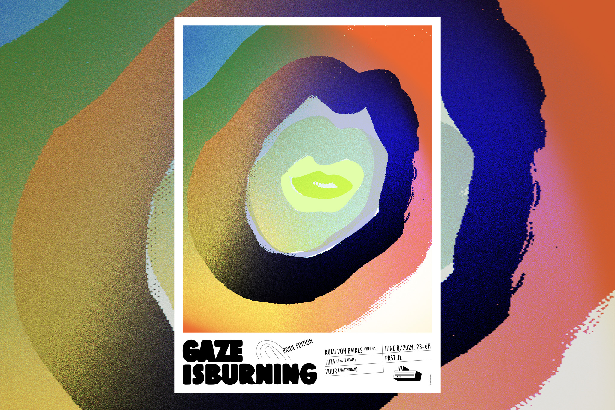
WERK THAT SHIT!
Promo artwork
Vibrancy and togetherness for GAZE IsBurning/Pride Edition.
More info
▲ SETTING
TBD
⚑ SOLUTION
TBD
◐ ADDITIONAL CREDITS
TBD
AWARDS
TBD
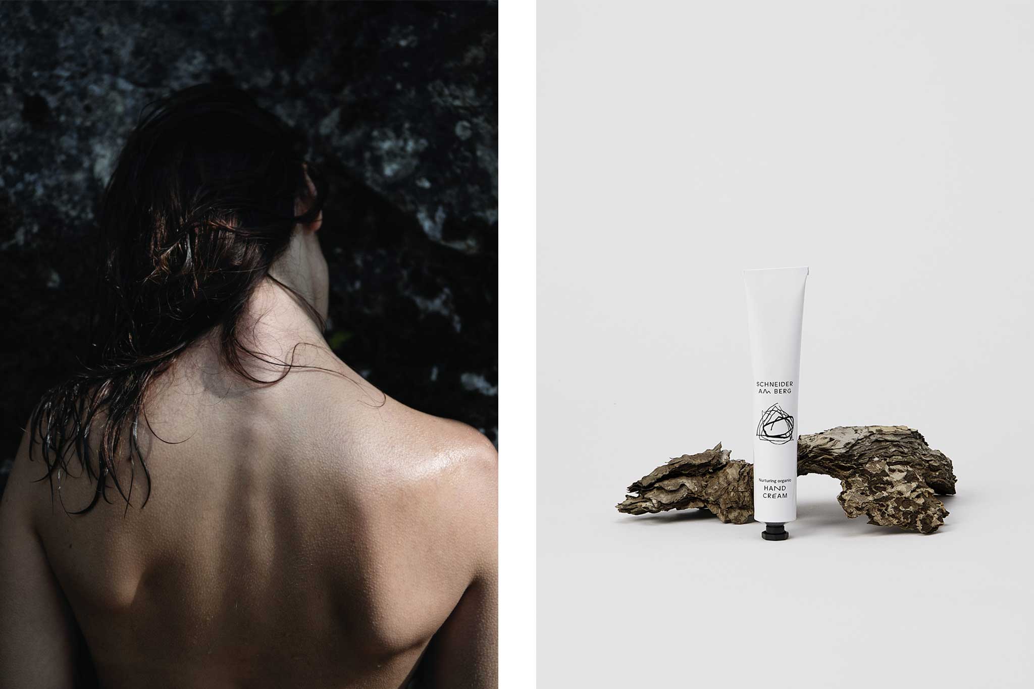
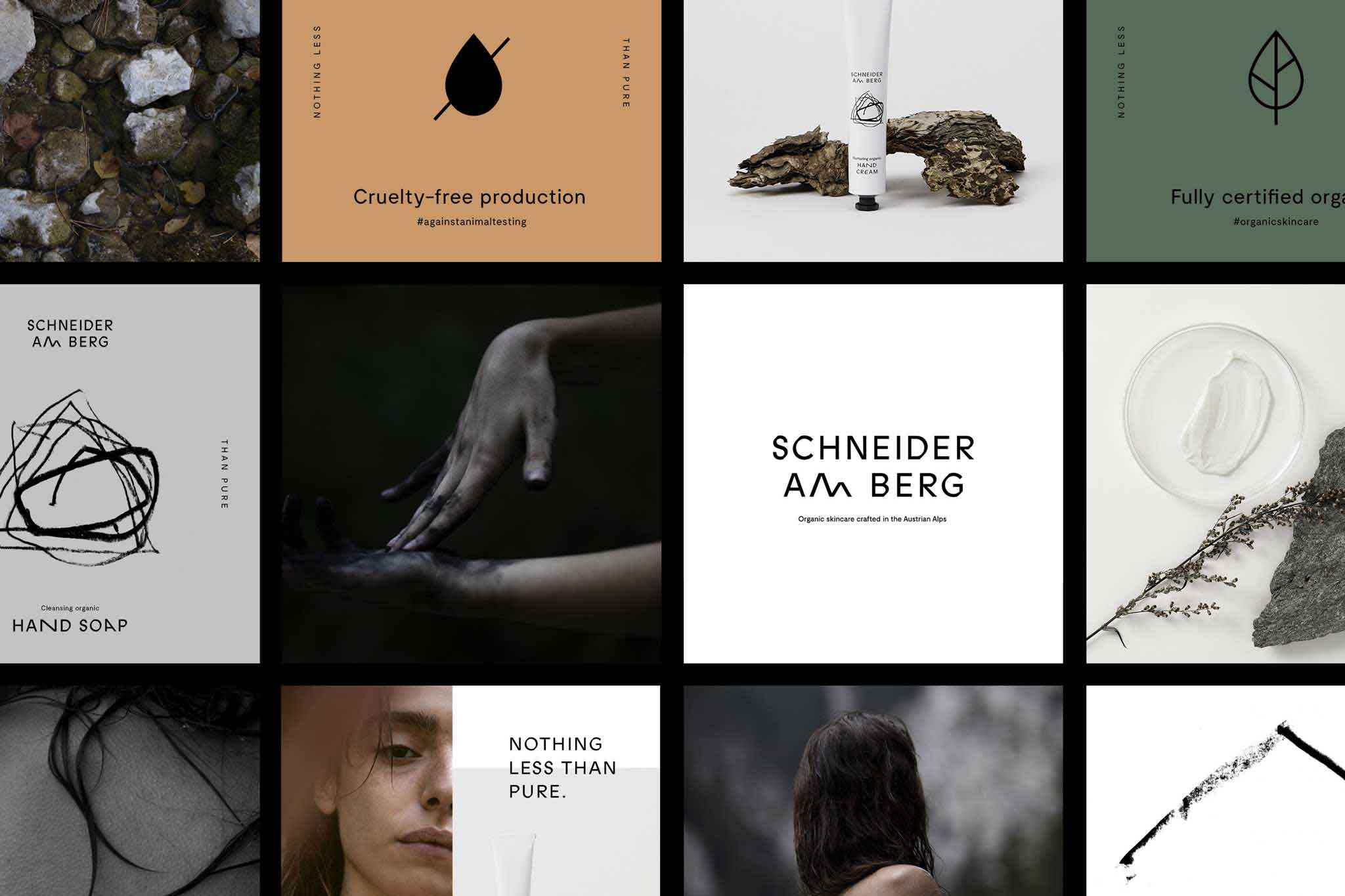
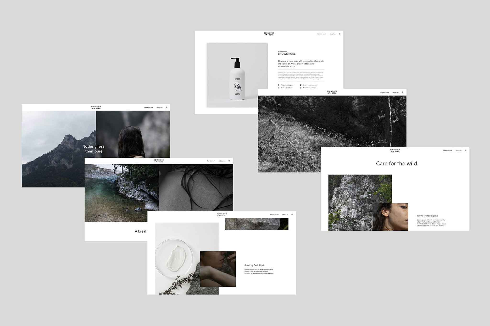
NOTHING LESS THAN PURE
Identity, packaging & art direction
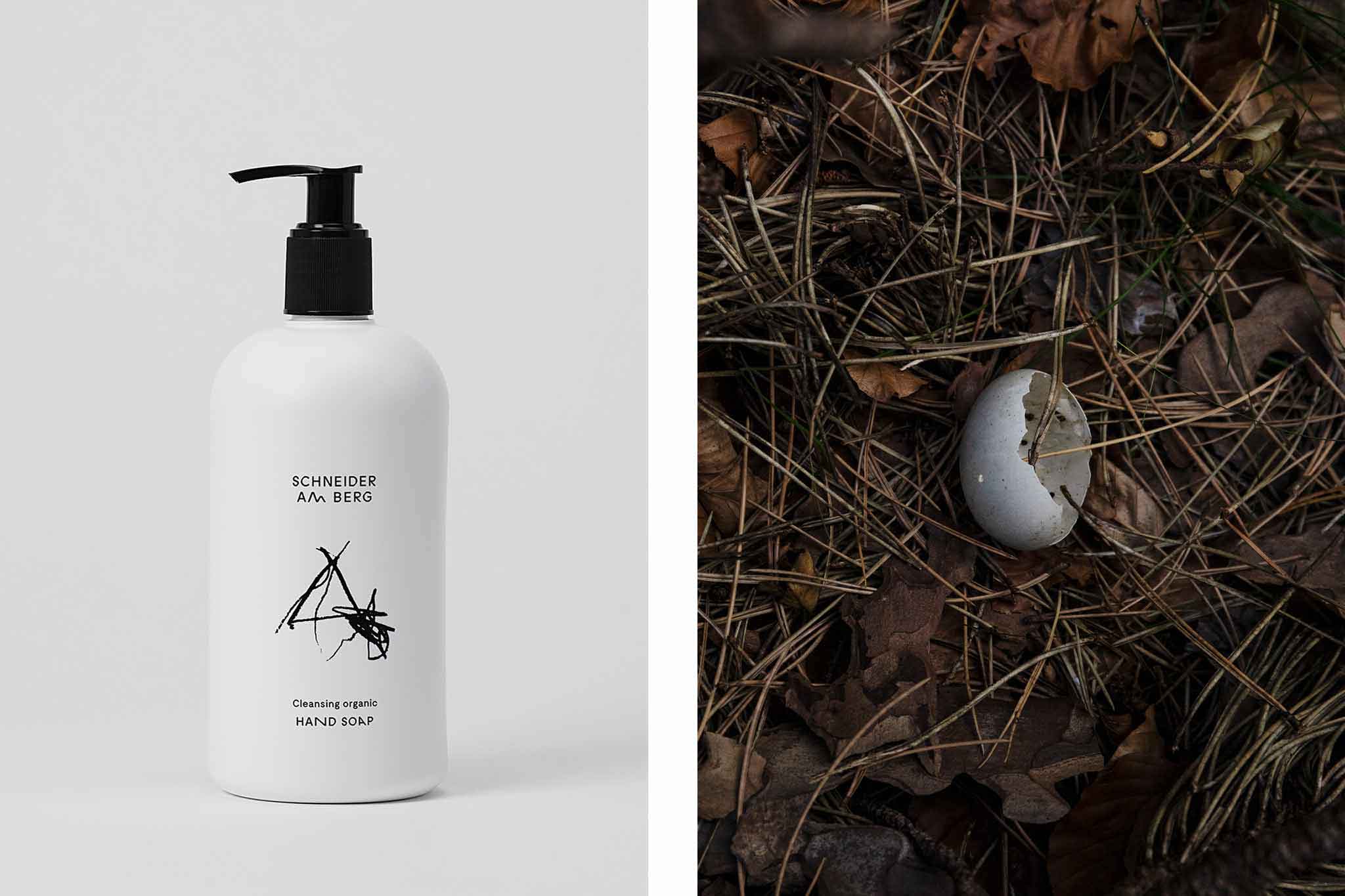
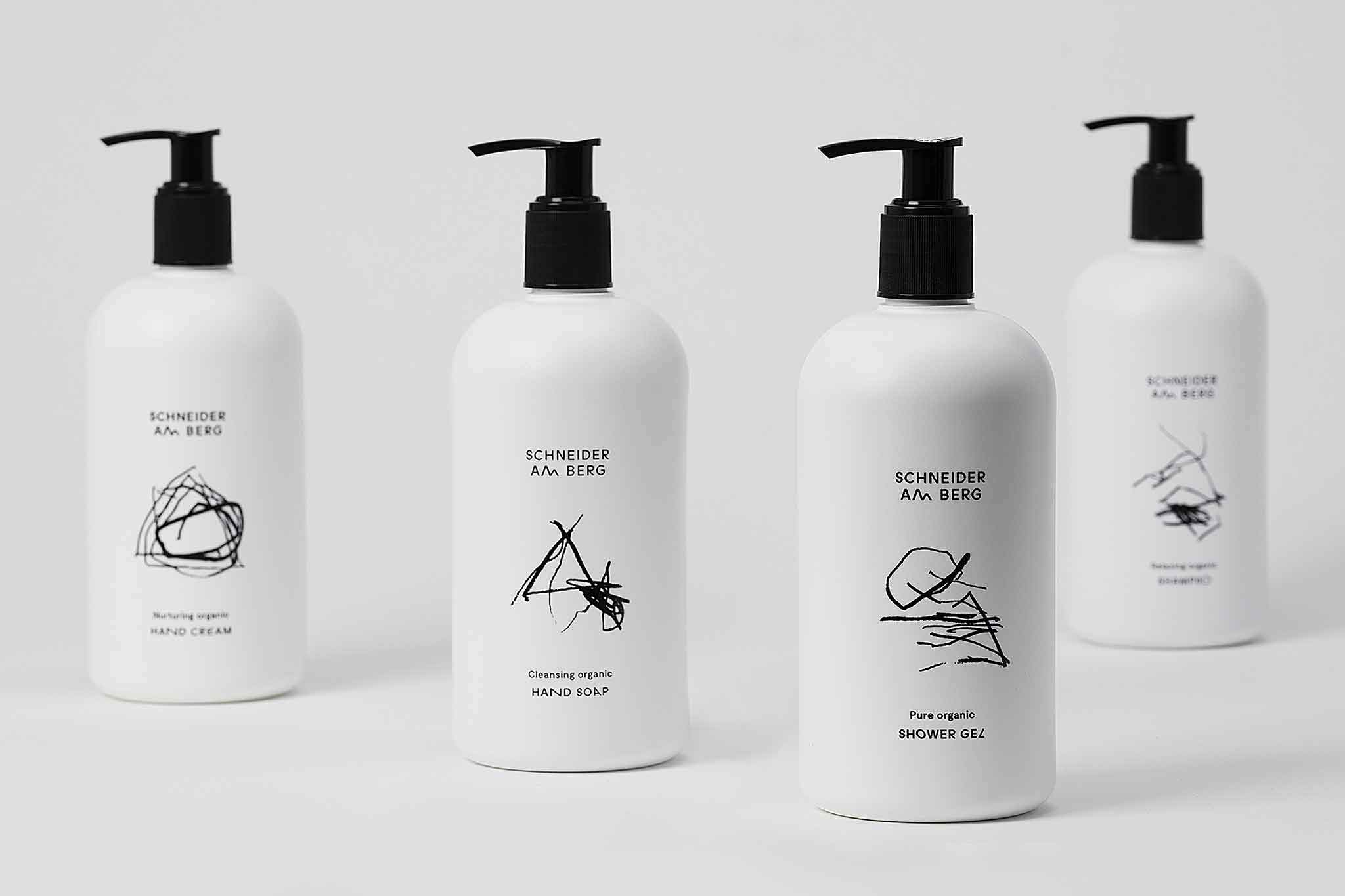
Nourish human nature, for a range of organic skincare by Schneider Cosmetics.
Designed at Bleed. Photography by Pernille Sandberg.
More info
▲ SETTING
Crafting skincare that captures the roughness of (human) nature is the mission of Austrian Schneider Cosmetics. Its brief: Setting a statement with a look that offsets from a generic and pseudo-apothecary luxury segment, while being uncompromising on material and sustainability.
⚑ SOLUTION
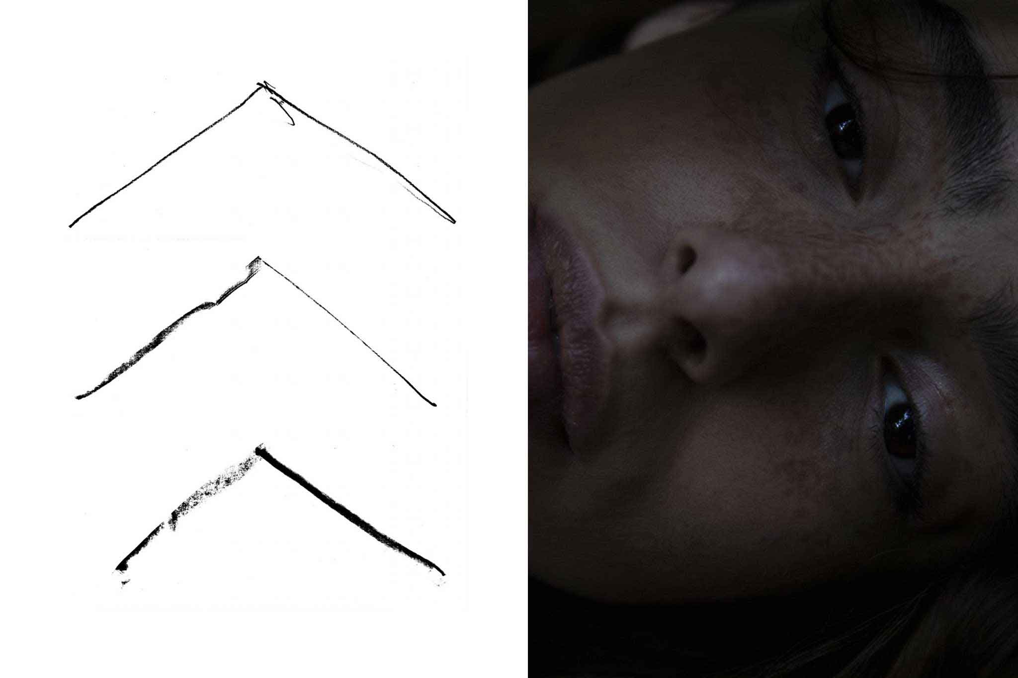
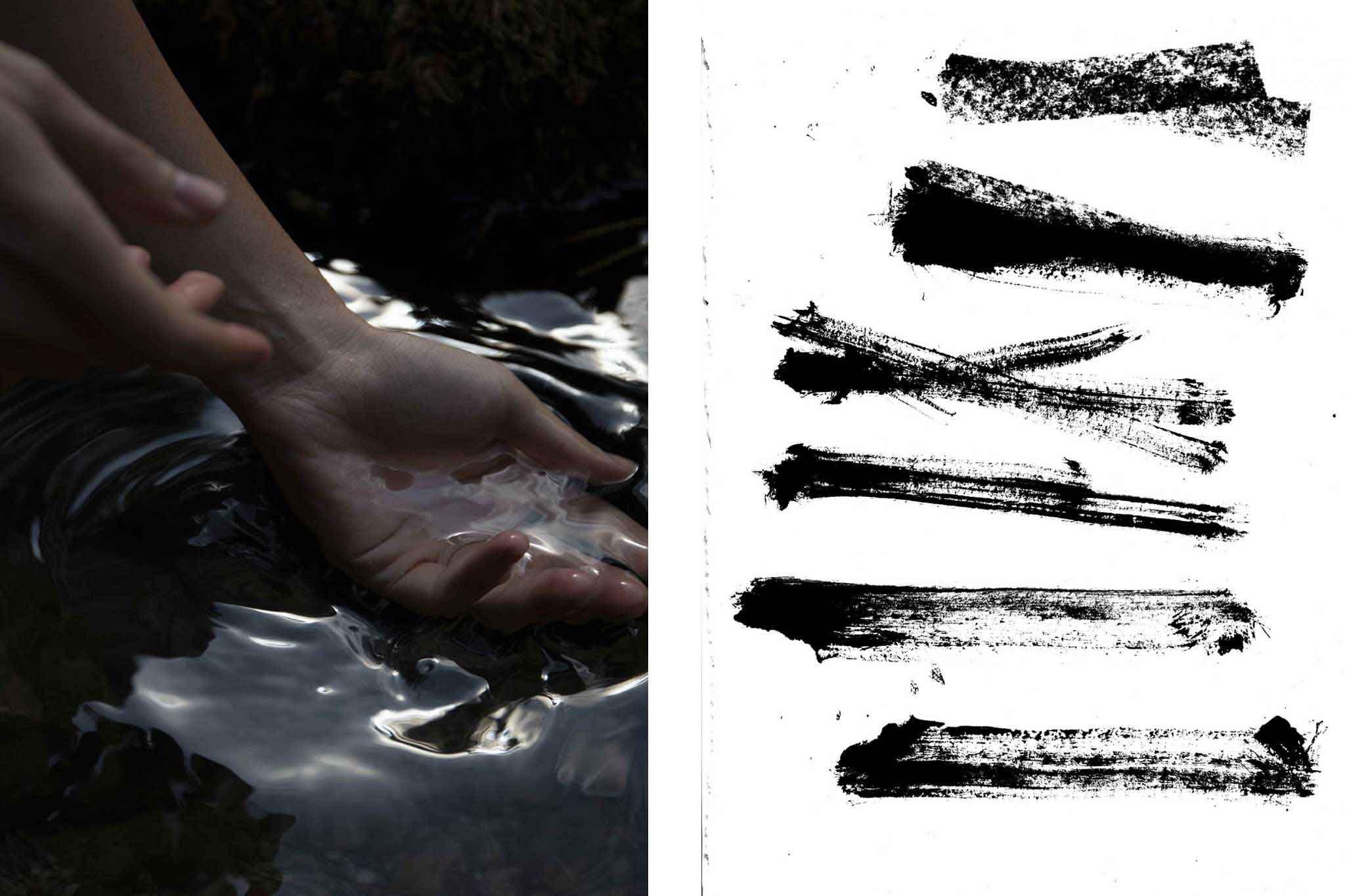
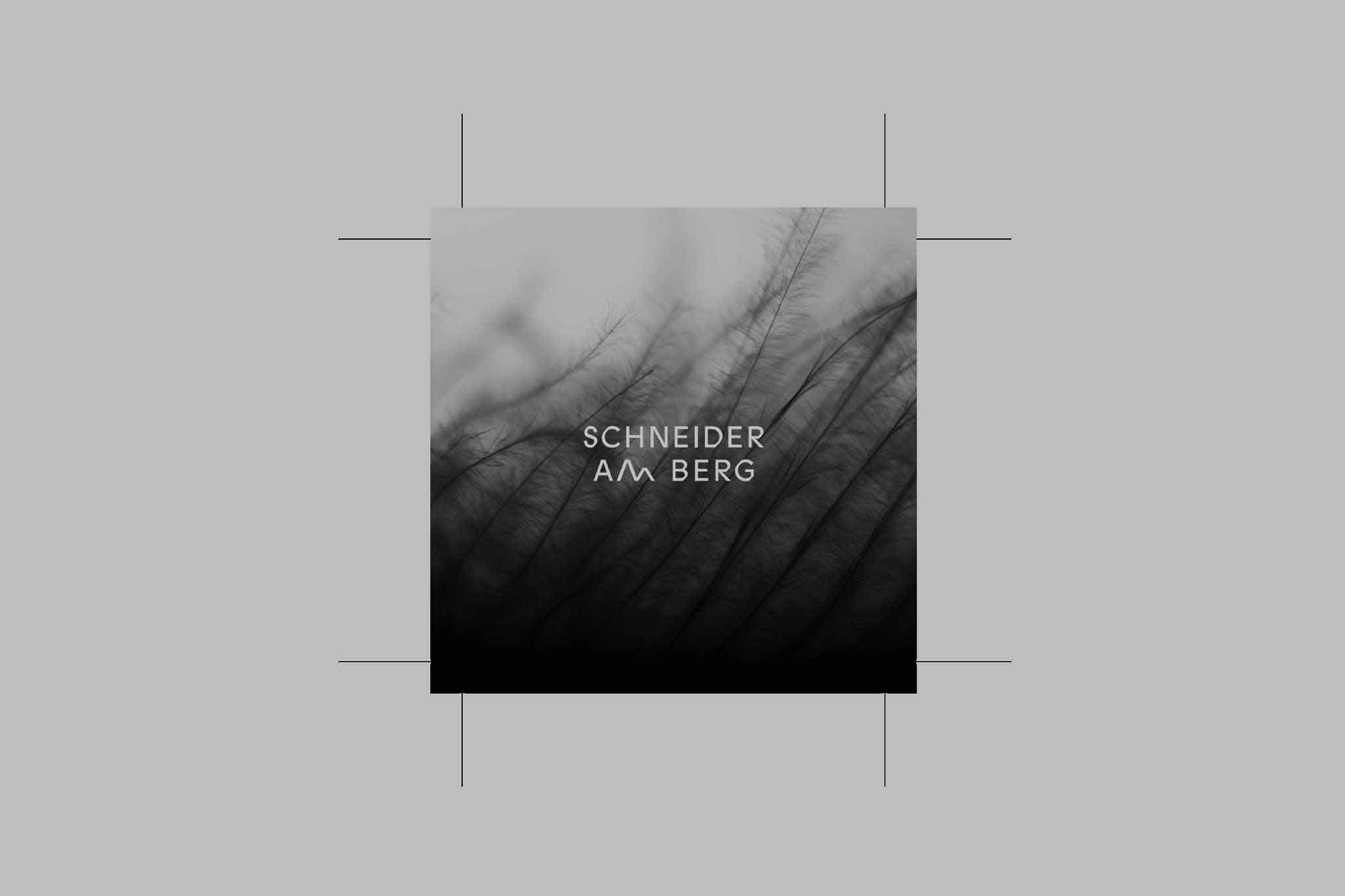
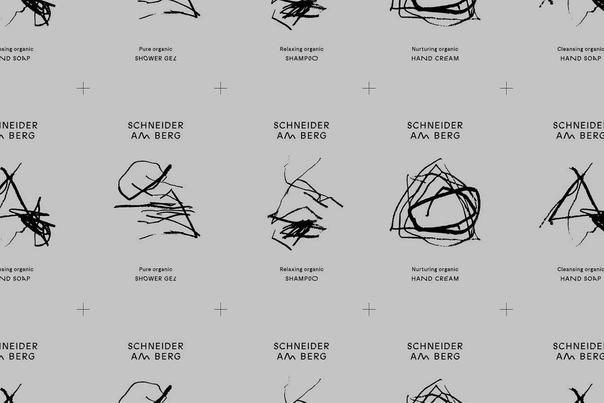
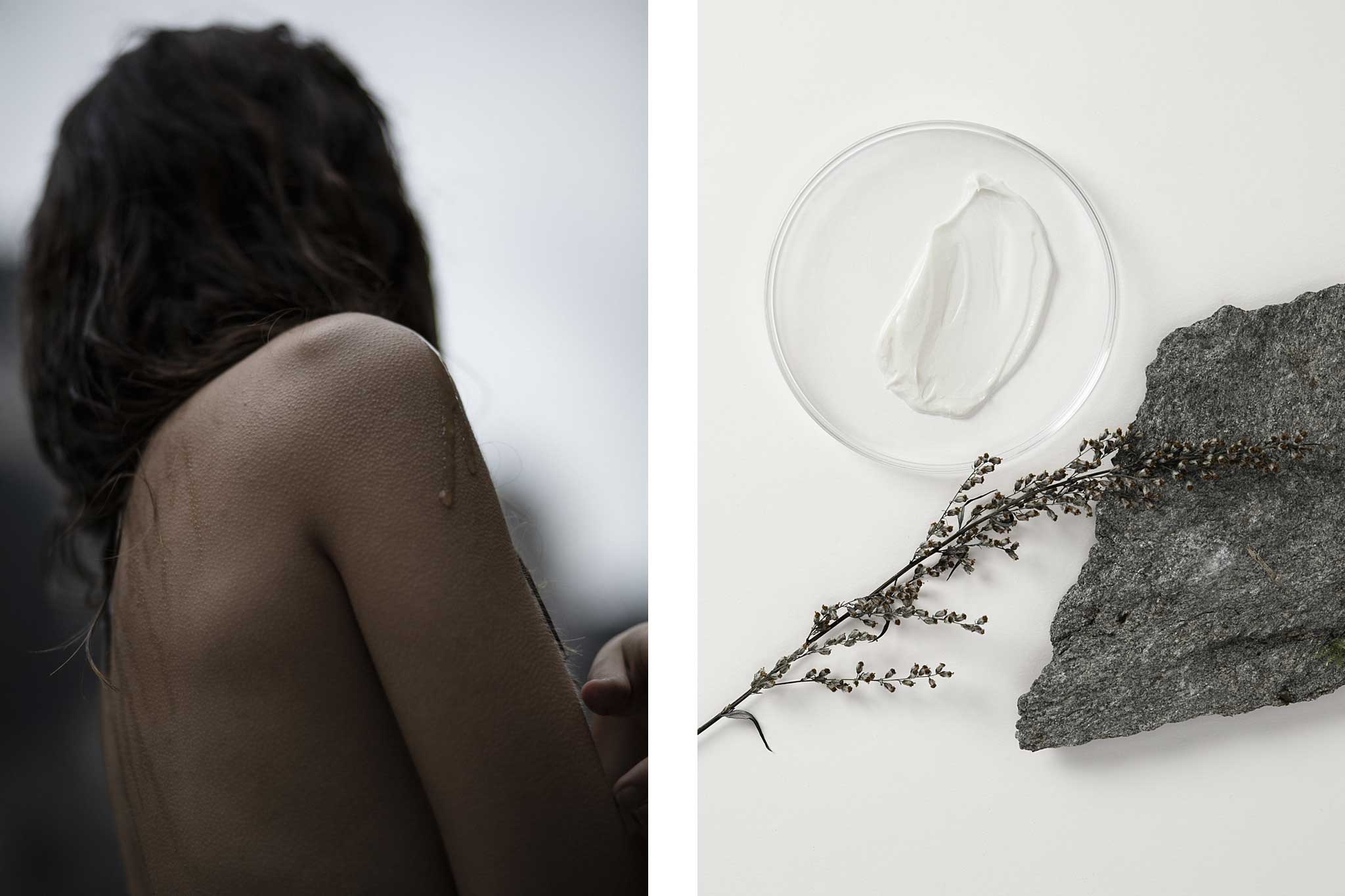
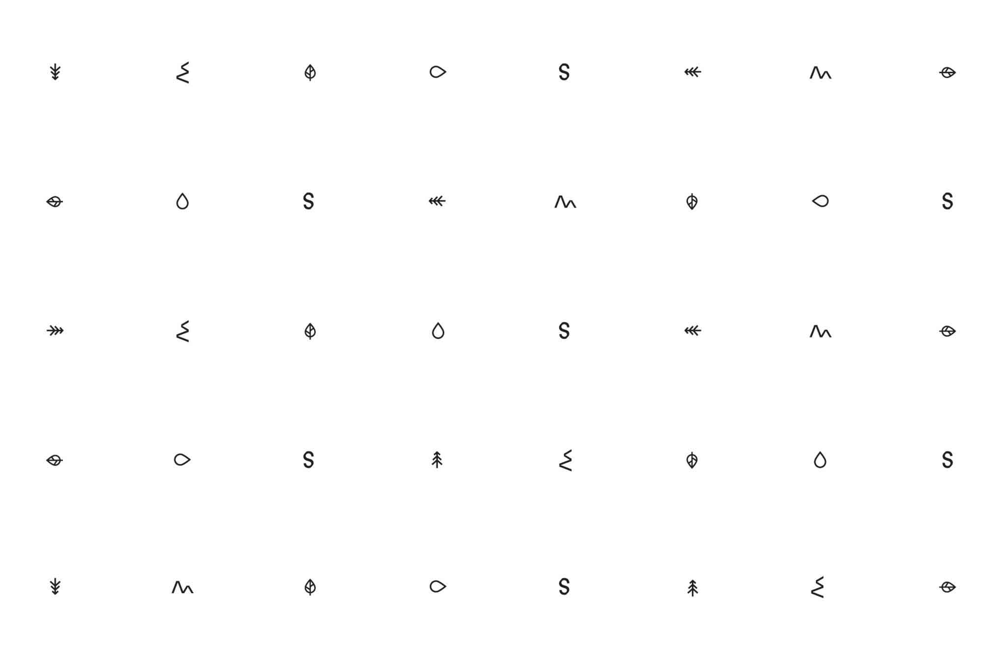
The brand identity and packaging design blends both the clean pure with the rough wild—balance and discontinuity—through customised type, fragile iconography and haptic charcoal illustration. Ephemeral authenticity, the beauty of imperfect outlines the calm yet unsettling brand photography tinted in flesh tones, moss and earth.
◐ ADDITIONAL CREDITS
Astrid Feldner (Creative Direction), Pernille Sandberg (Photography), Matyas Czel (Interaction design), PRESENT PERFECT (Photo production)
⊙ AWARDS
European Design Award 2019
Visuelt 2019
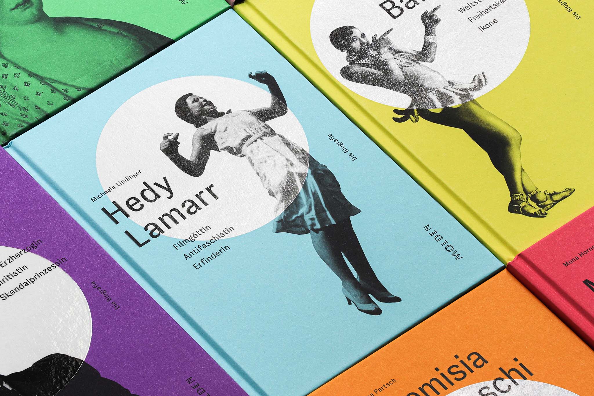
IN THE SPOTLIGHT
Book series
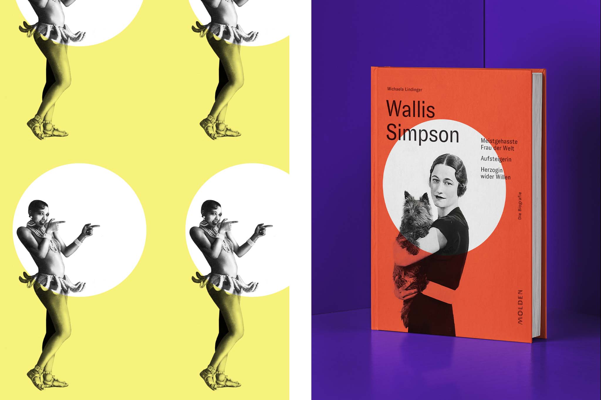
The life of pioneering female leaders, thinkers and changemakers in the spotlight, for Vienna-based publishers Molden.
More info
▲ SETTING
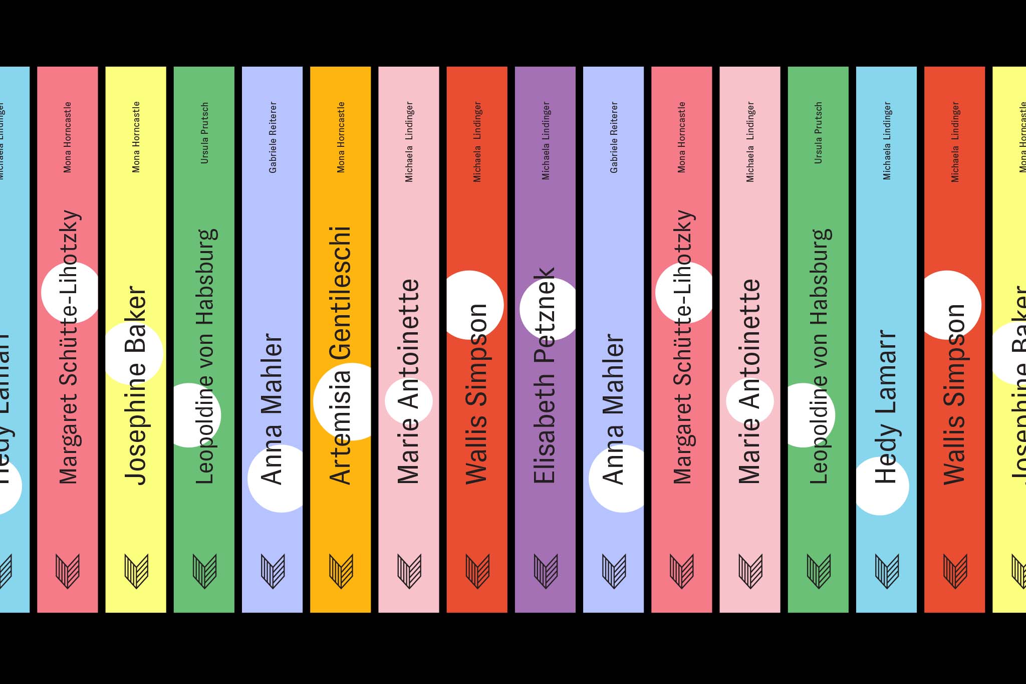
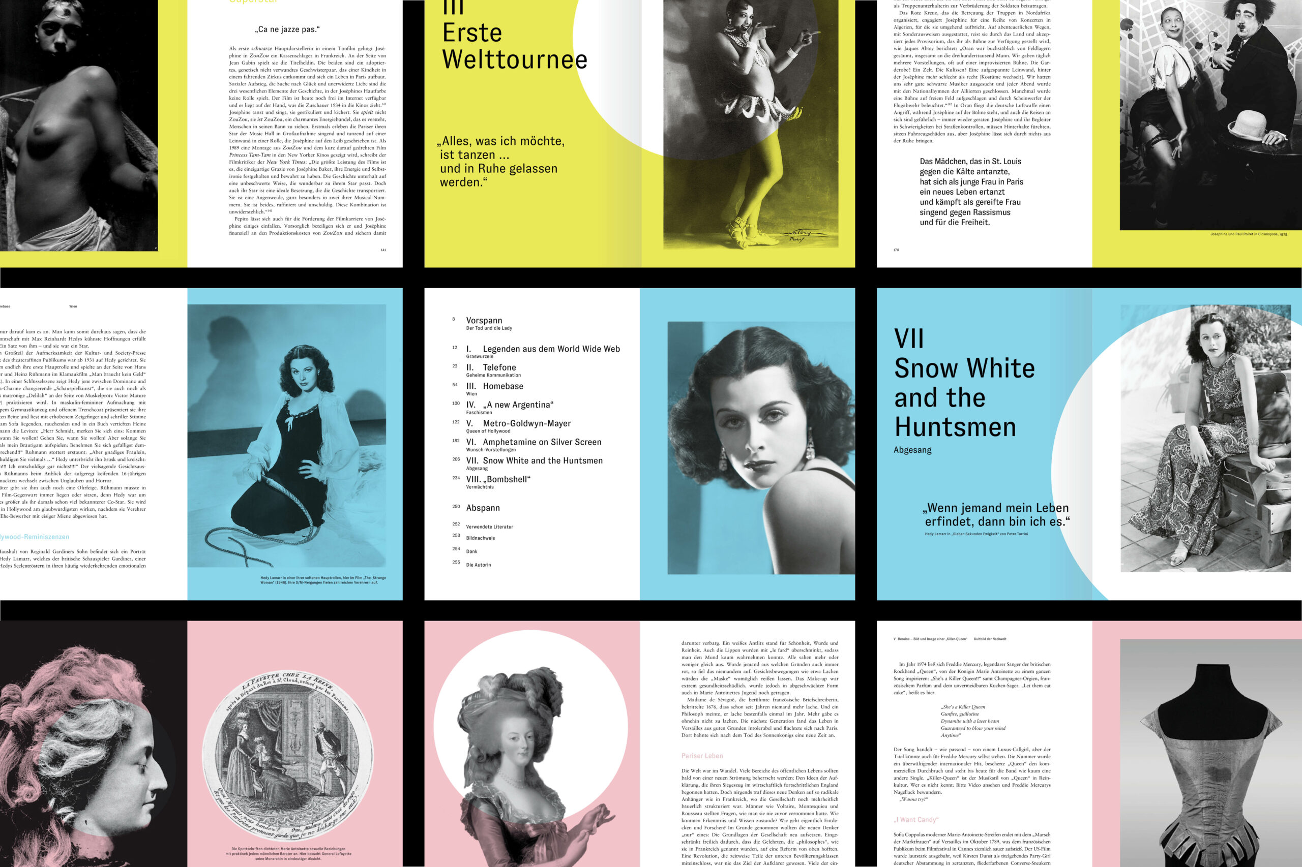
Frequently eclipsed by their male counterparts, forward-thinking women have played a pivotal role in shaping our world across history. A distinctive book series illuminates the stories of extraordinary female trailblazers, including the Austrian architect and emancipated resistance fighter Margarete Schütte-Lihotzky, the defiant empress Marie Antoinette, and the iconic movie star and tech inventor Hedy Lamarr, among numerous others yet to be explored.
⚑ SOLUTION
The book series seamlessly combines iconic figures with those ready to hit their well-deserved spotlight. And a literal spotlight serves as the simple yet striking identity element across all publications—from cover to layout—complemented by a vibrant duotone color concept that highlights individuality and controls production costs. The outcome is a collection of best-selling, accessible, and eye-catching hardcovers that boldly stand out in the saturated sector of biographies.
◐ ADDITIONAL CREDITS
Astrid Feldner (Creative direction)
CROSSFADING FUSION
Visual Identity
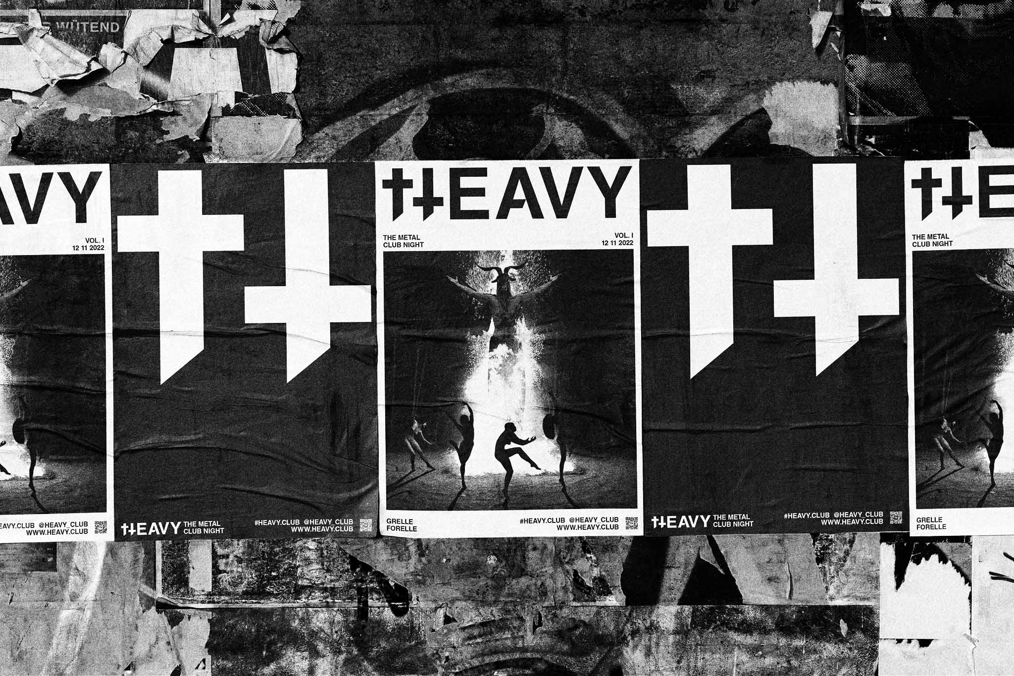
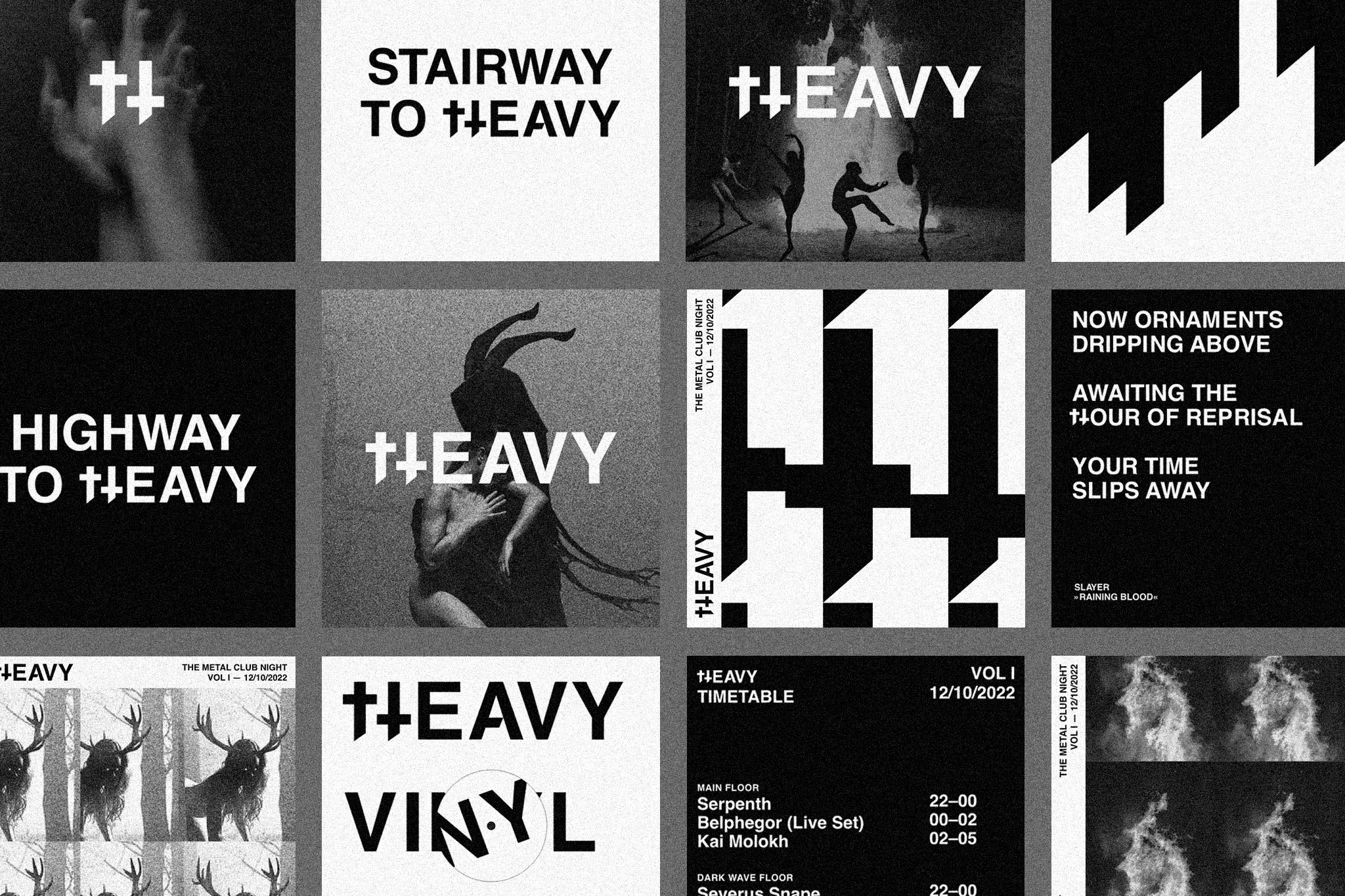
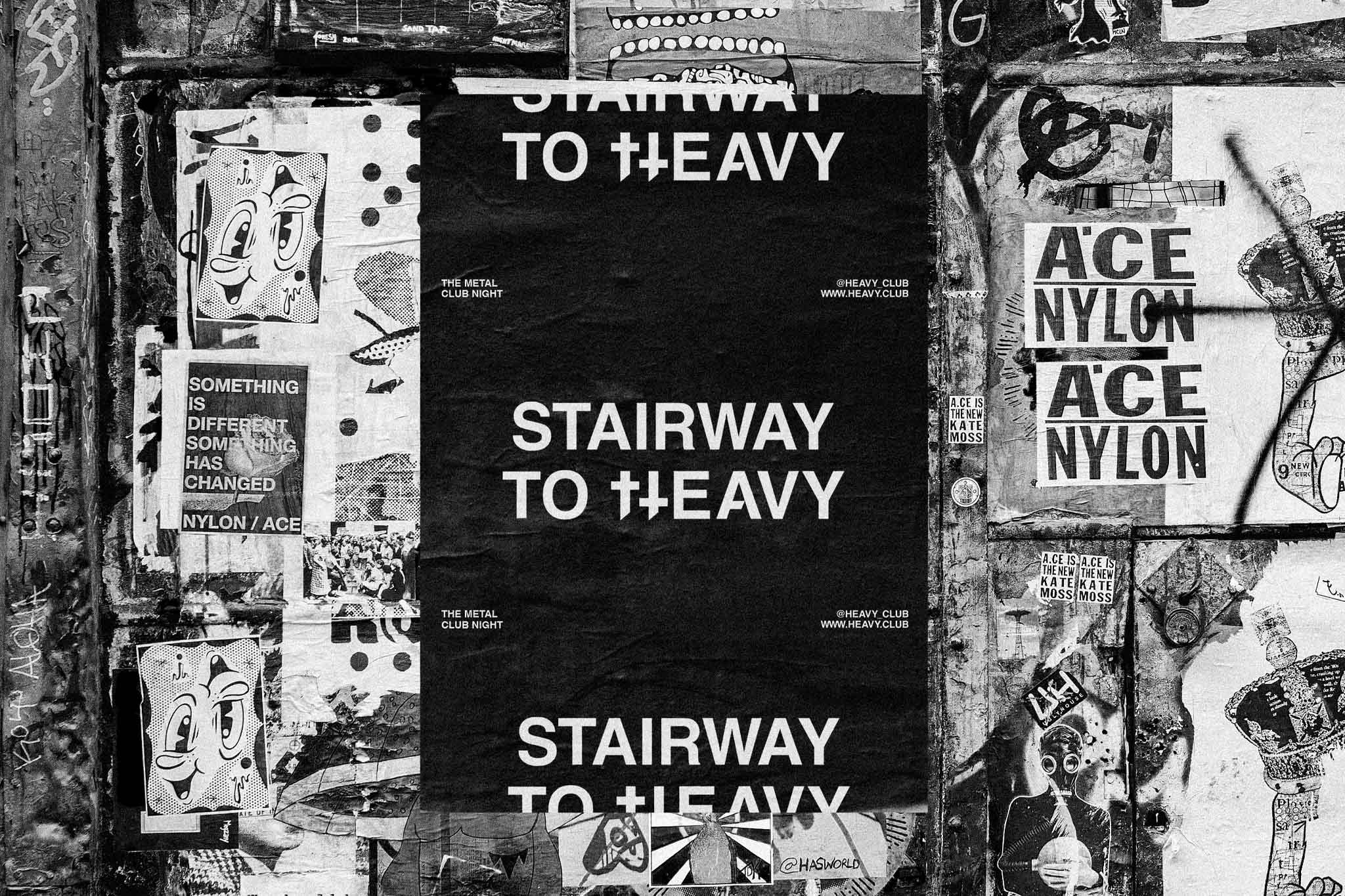
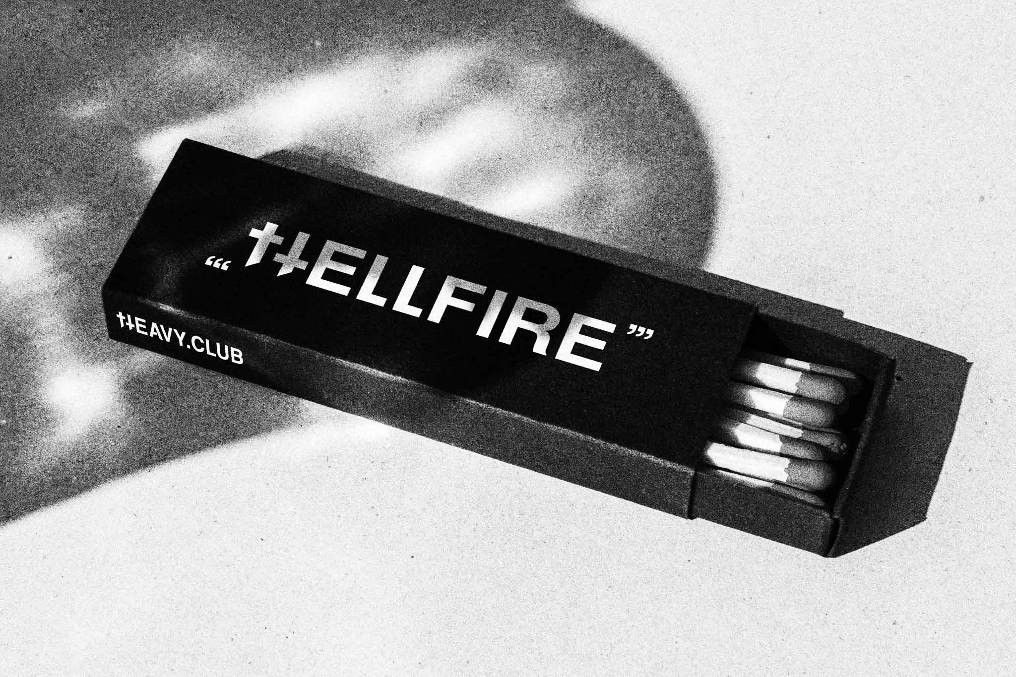
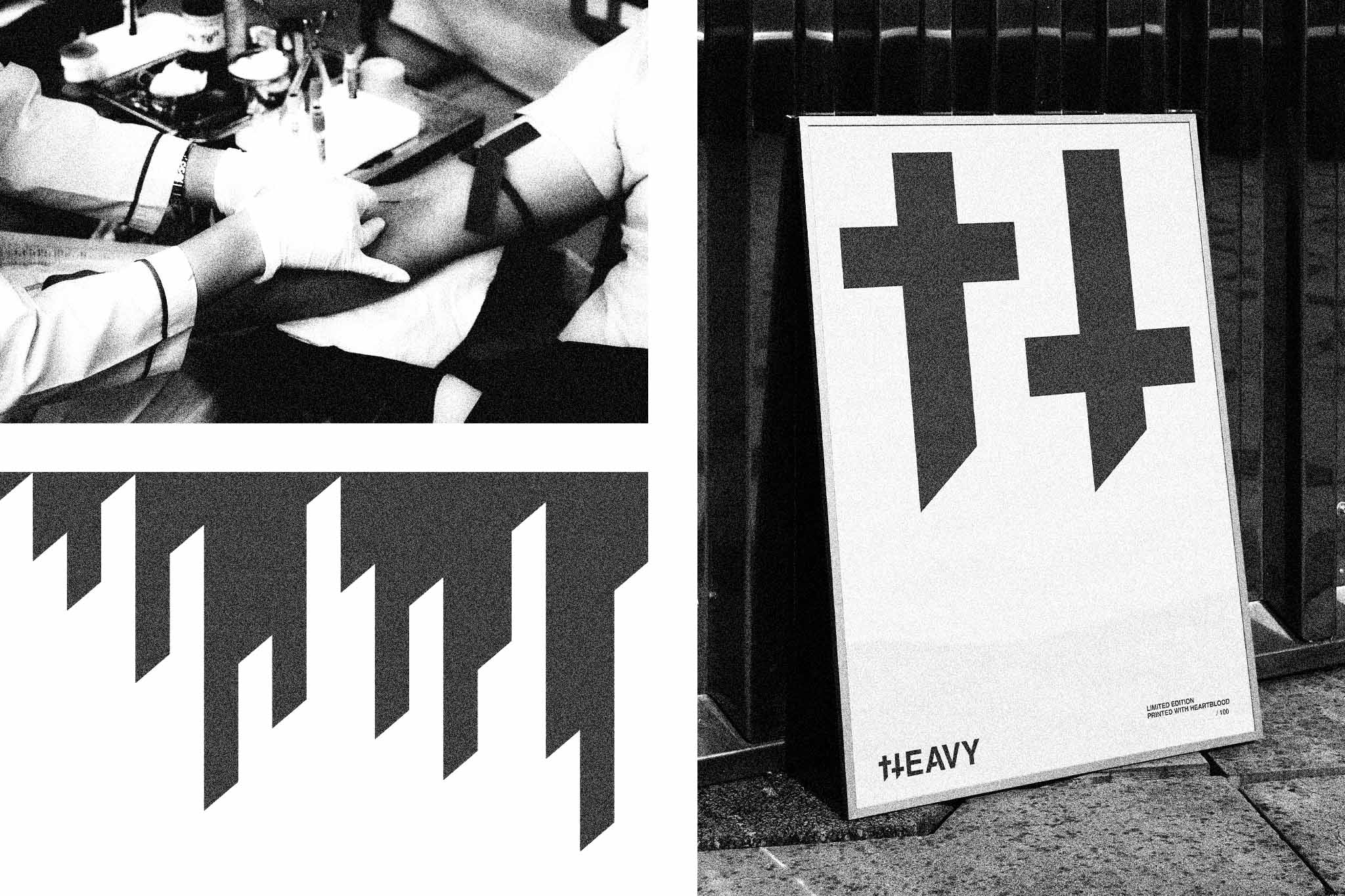
When Metal culture crashes electronic music clubs, it's gonna be HEAVY. Designed at Bleed.
More info
▲ SETTING
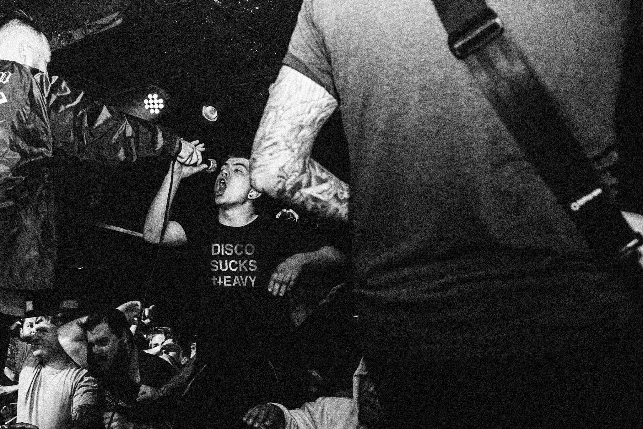
The mission of Vienna-based club night HEAVY is to celebrate metal culture in electronic clubs, fusing two polarities under one strong label. In order to speak to an audience from both camps, the pioneering venture searched for an identity that lives in both (under)worlds. Beyond the club experience, HEAVY also aims to expand to a fashion label, offering exclusive and sustainably produced pieces and merch in cooperation with designers and artists.
⚑ SOLUTION
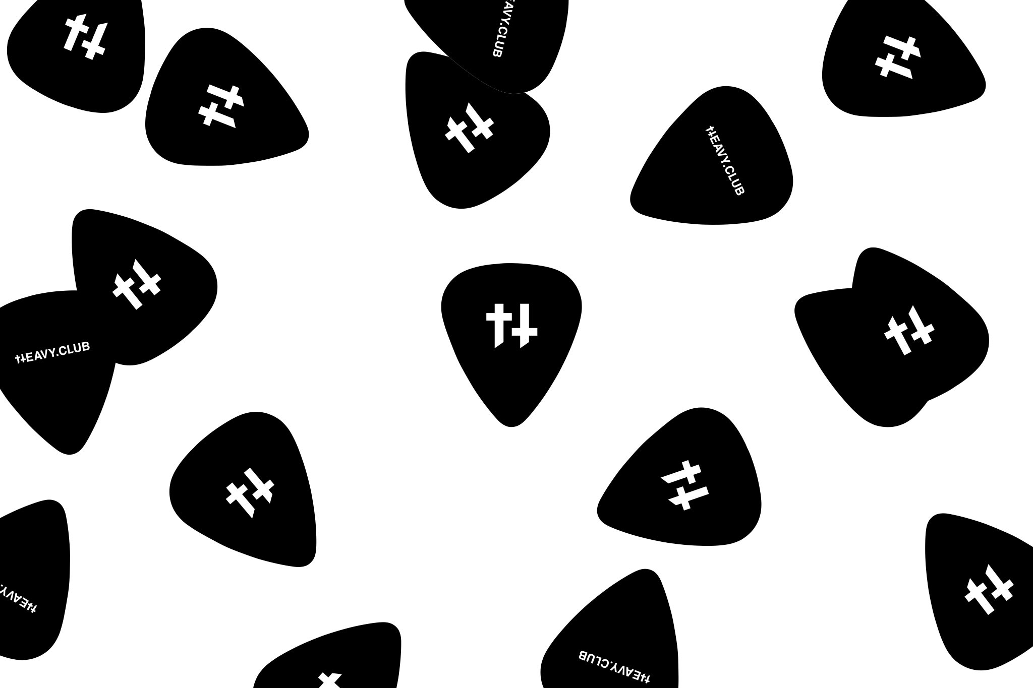
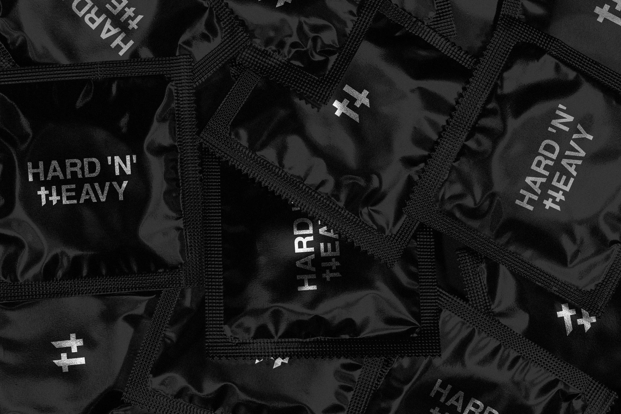
The design concept takes the »cross«-boundary aspect literally, and introduces an icon inspired by mixing music in club settings. By incorporating the transition between music scenes and genres the so-called »HEAVY cross-fader« introduces a strong rigorous aesthetic, and works as an interactive element to modulate metal and electronic sounds. In its totality the design performs on all classic and digital applications, as well as on merch, motion visual, and limited editions screen printed with initiators own blood.
◐ ADDITIONAL CREDITS
Astrid Feldner (Creative direction), Daniel Bergsnes Nerheim (Motion design), Slutfocate (Poster artwork)
RE: ACTION
Editorial design
An anthology for the remarkable students work of Studio Hani Rashid at University of Applied Arts Vienna. Designed at Bleed.
More info
▲ SETTING
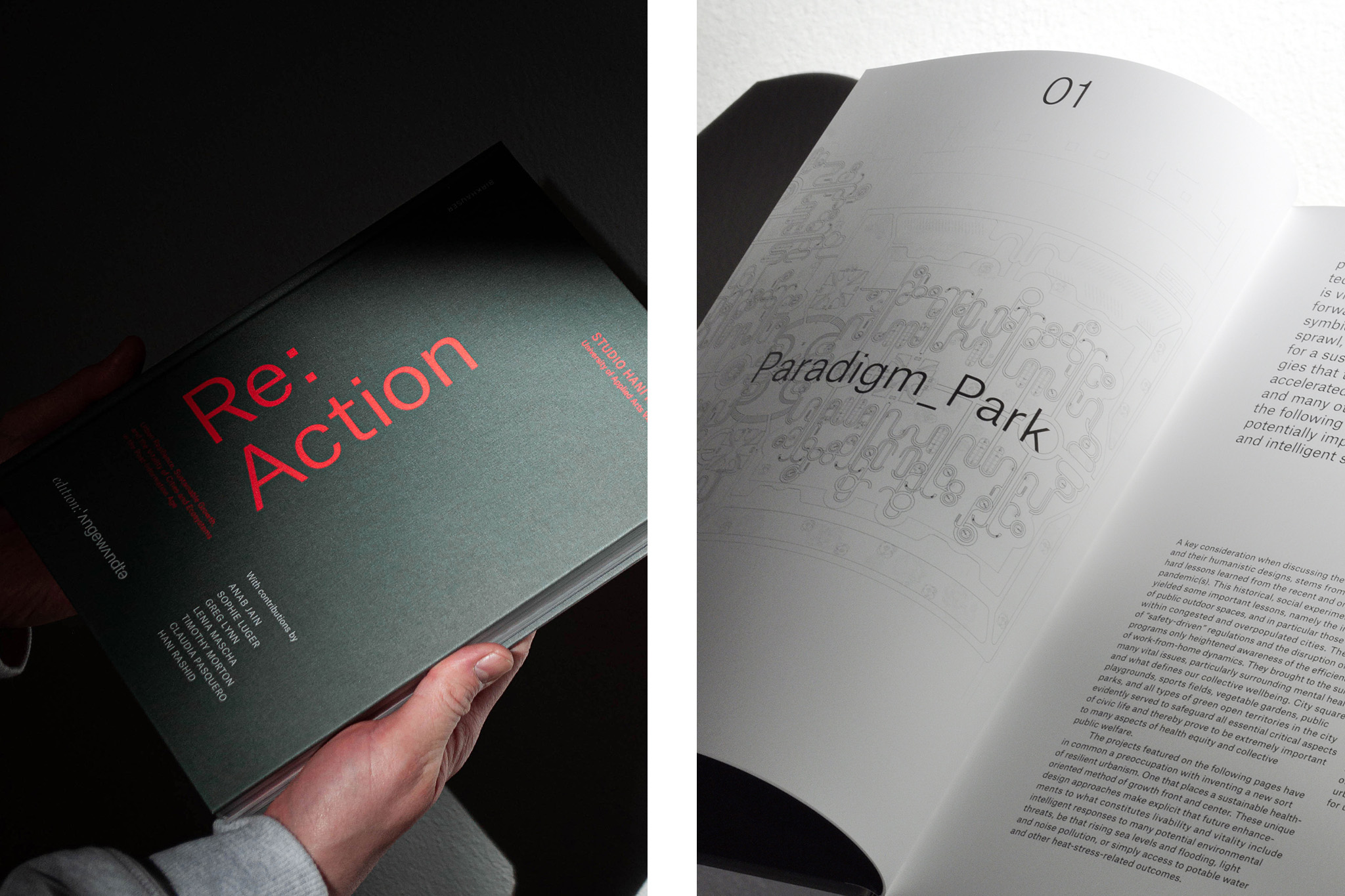
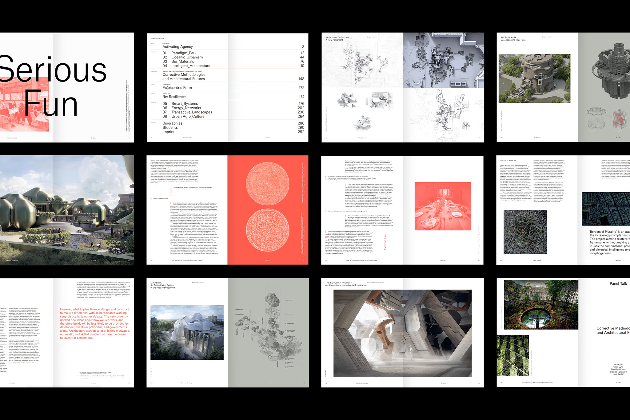
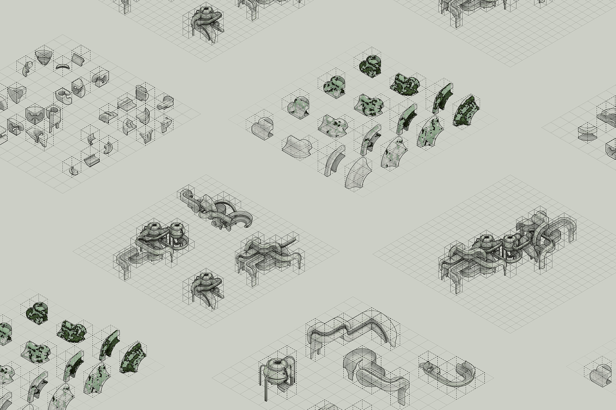
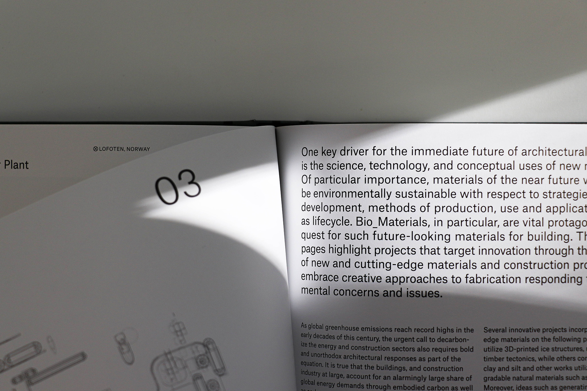
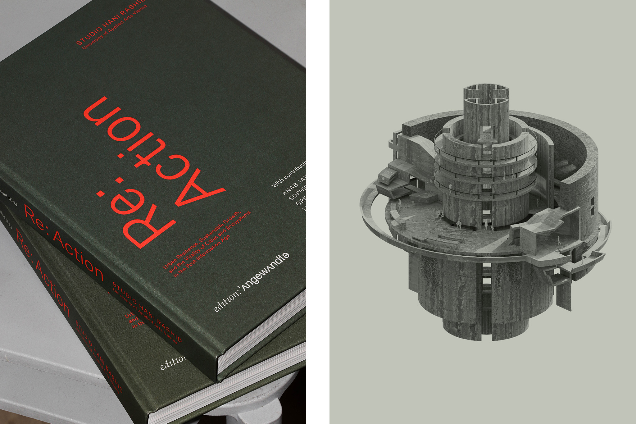
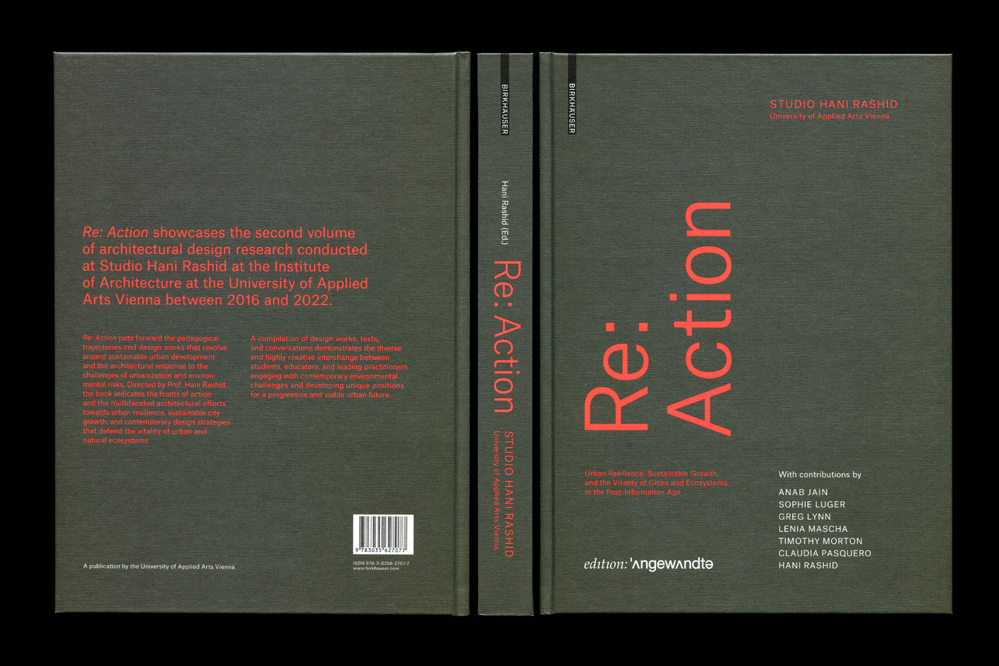
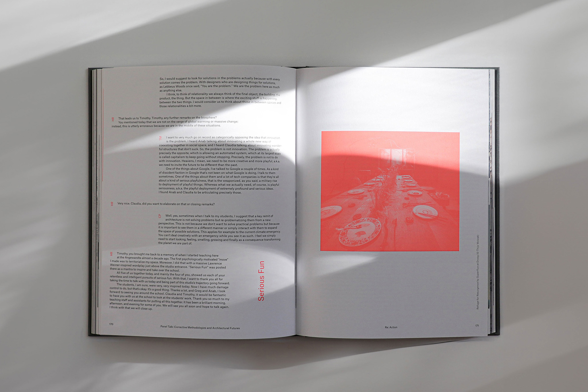
Re: Action showcases the second volume of architectural design research conducted at Studio Hani Rashid at the University of Applied Arts Vienna between 2016 and 2022. Its aim is to indicate the fronts of action and the multifaceted architectural efforts towards urban resilience, sustainable city growth and contemporary design strategies that defend the vitality of urban and natural ecosystems.
⚑ SOLUTION
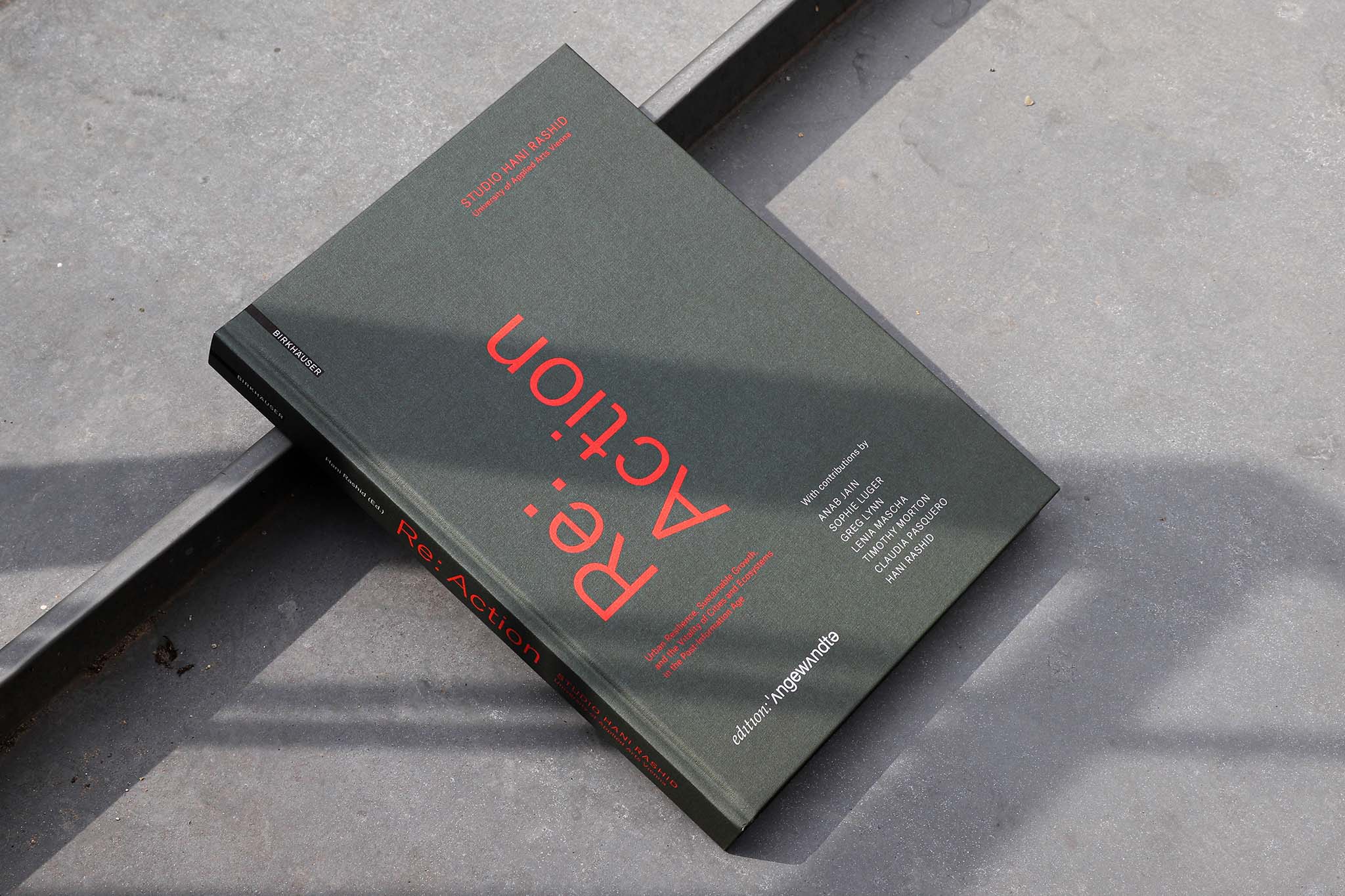
The book invites readers to explore its contents with a special haptic cover material. An earthy green shade signifies the sustainable spirit of the projects, extending from the cover to the technical line drawings in the interior. The layout, featuring a floating image grid, brings together different topics and visual content in order to display and inspire. The theoretical parts, such as introductions, essays, and panel discussions, are set apart from the rest through consistent typography and a duotone color scheme. Neon red spot color adds dynamism in line with the book's progressive title.
◐ ADDITIONAL CREDITS
Astrid Feldner (Creative direction), Image credits: [$$$]_Art, an (Id)entity totem (© Dennis Schiaroli), Invocation for Hope by Superflux (© Stefan Lux), MEDIUS PAEDAGOGICUS (© Mohamed Abdelhady, Adham Sinan, Olja Radovanovi)
LESS WORK, MORE FLOW
Identity, Lookbooks, Art Direction
Individual office spaces for Neudoerfler.
Designed at Bleed, Photography by HEJM & Daniel Gebhart De Koekkoek
More info
▲ SETTING
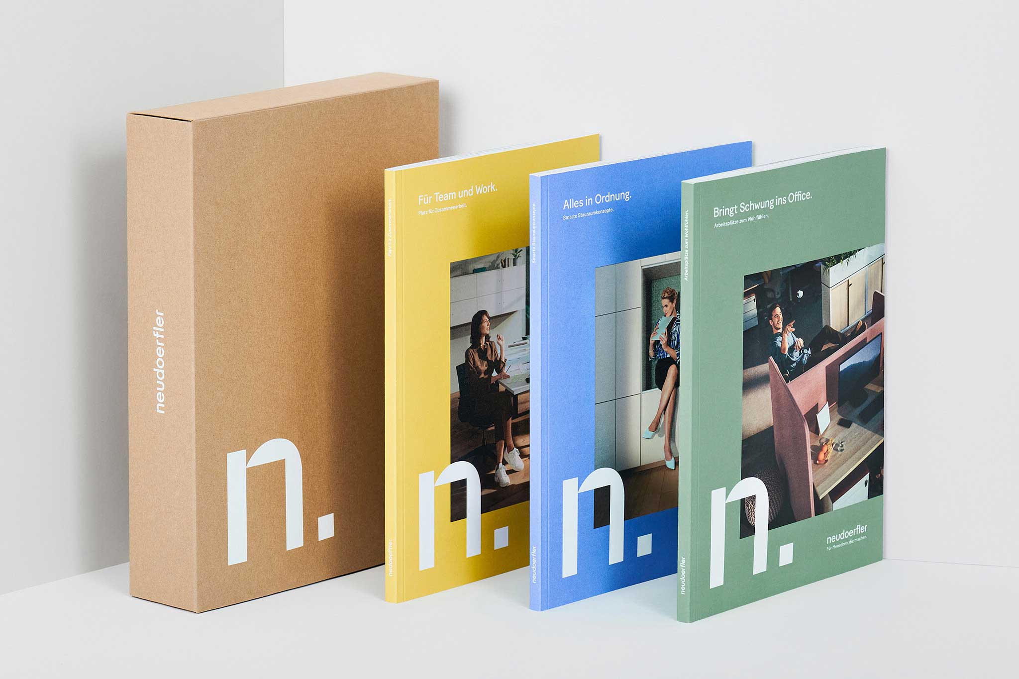
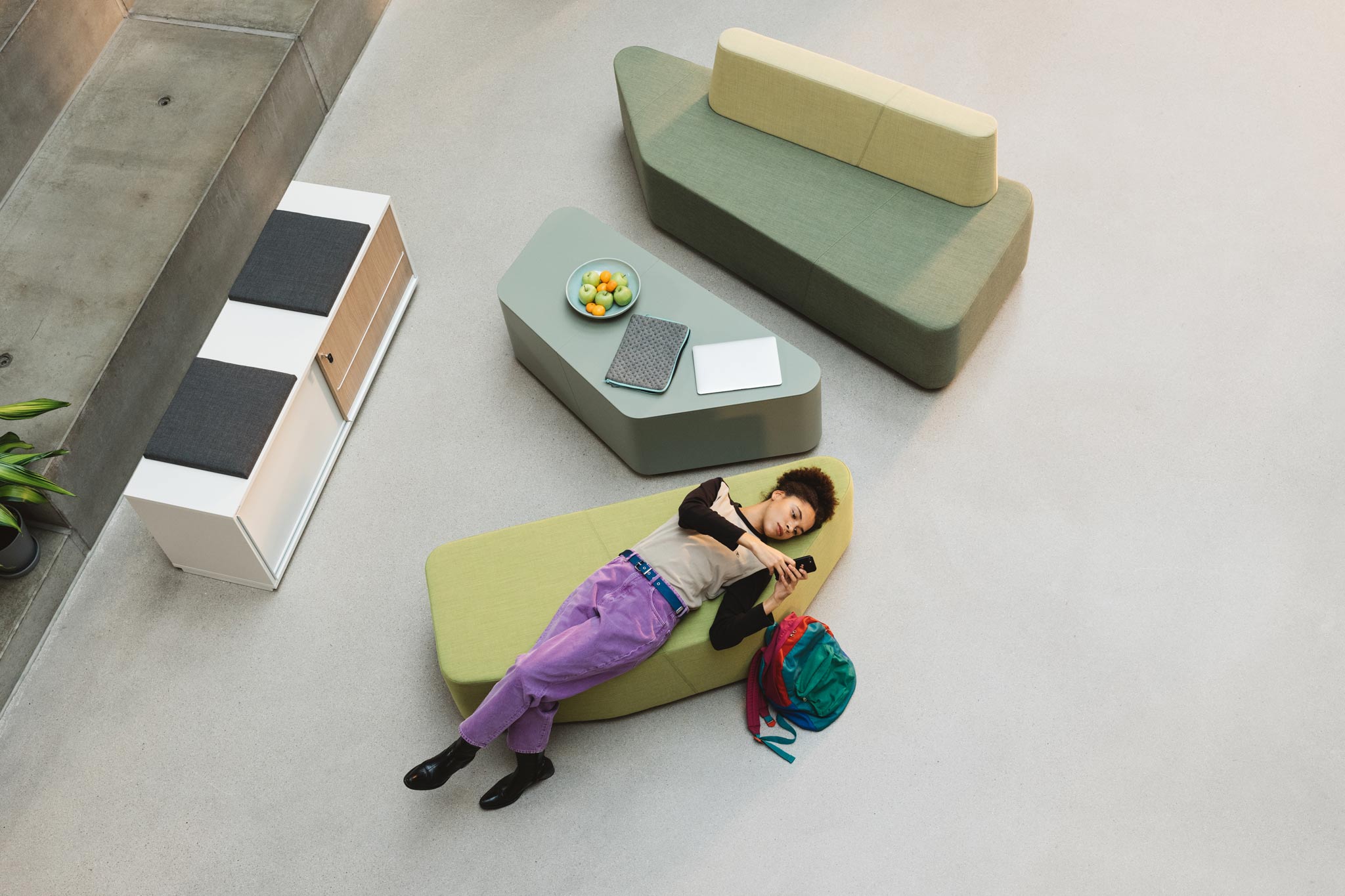
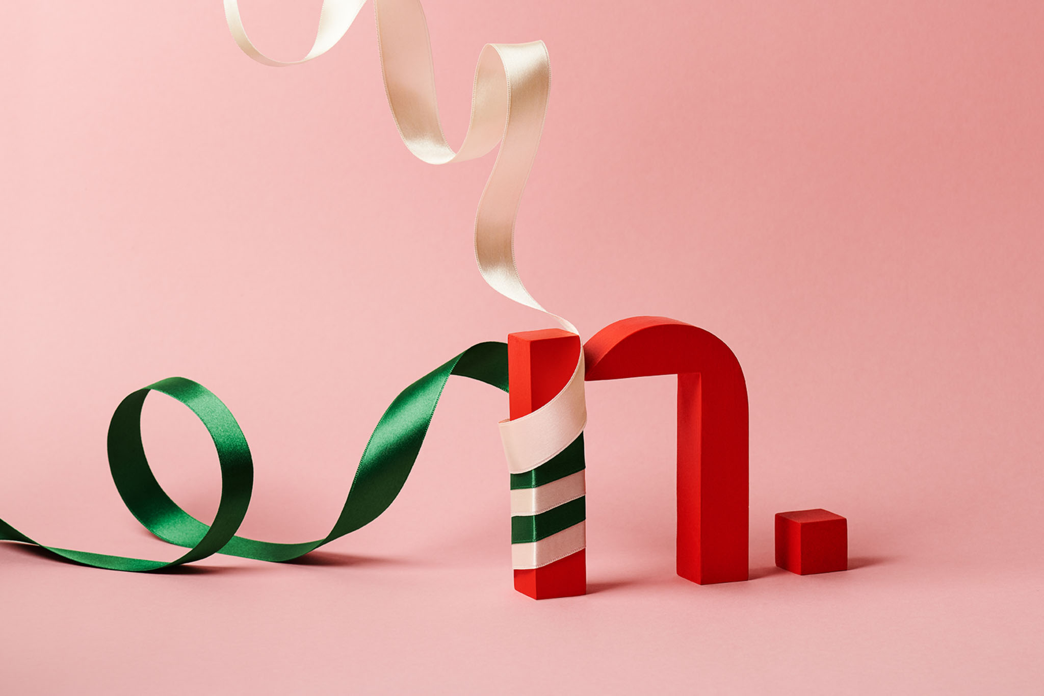
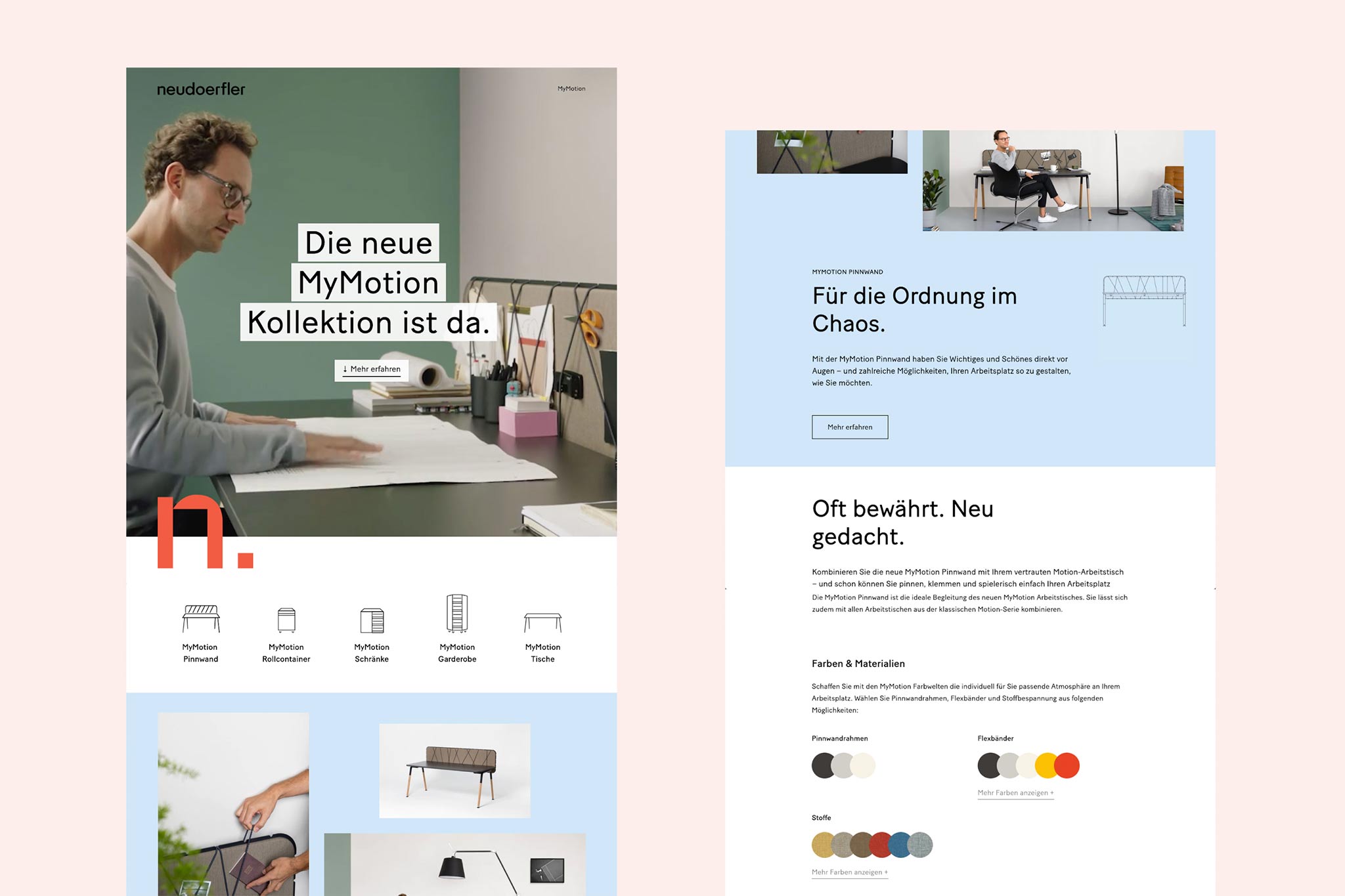
Furniture company Neudoerfler has provided Austrian customers with high-quality workspace solutions for more than 70 years. After a long overdue refreshment of its brand, a completely new visual identity was necessary to communicate the new brand values—close to the customers, outstanding service, and smart innovation.
⚑ SOLUTION
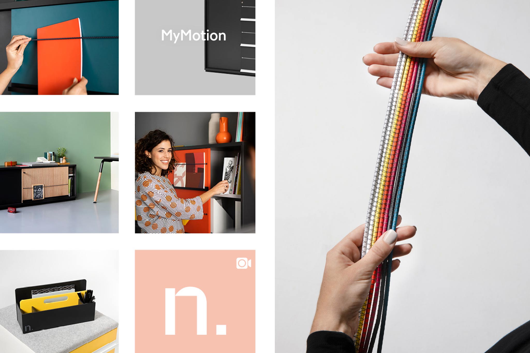
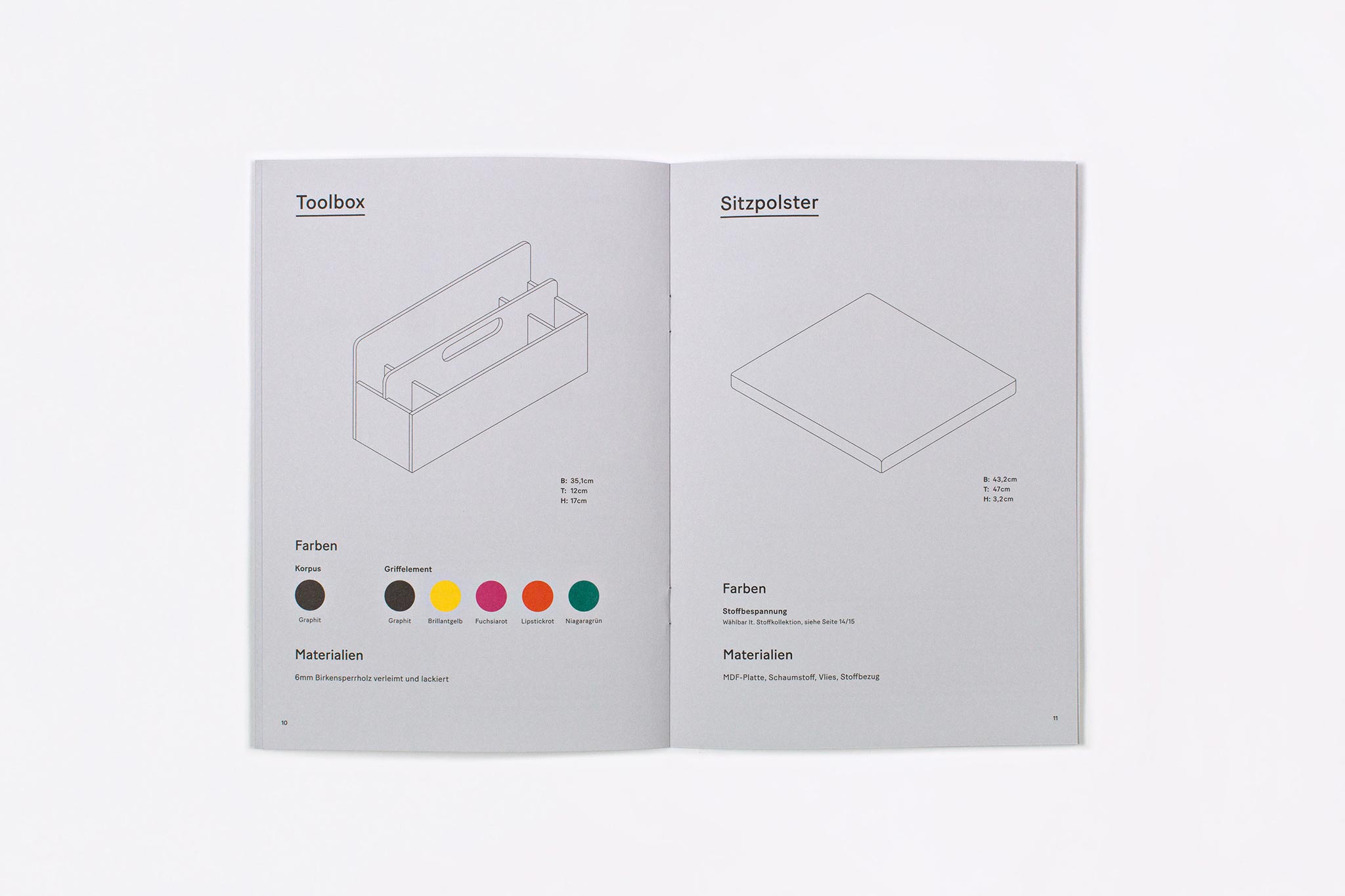
The brand identity focuses on people and their individual work environments with a vivid friendly design. The catalogues, with a mix of look-book and product guide, use a modular colour system. The strong human-centred image concept, and the overall brand evolution helped Neudoerfler to shift from a traditional company to a modern Austrian brand with a bright outlook for the future.
◐ ADDITIONAL CREDITS
Astrid Feldner (Creative Direction), Madeleine Eriksen (Interaction design), Daniel Gebhart De Koekkoek, HEJM, MEDIUMLARGE (Photography), PRESENT PERFECT (Photo production)
⊙ AWARDS
European Design Awards 2019
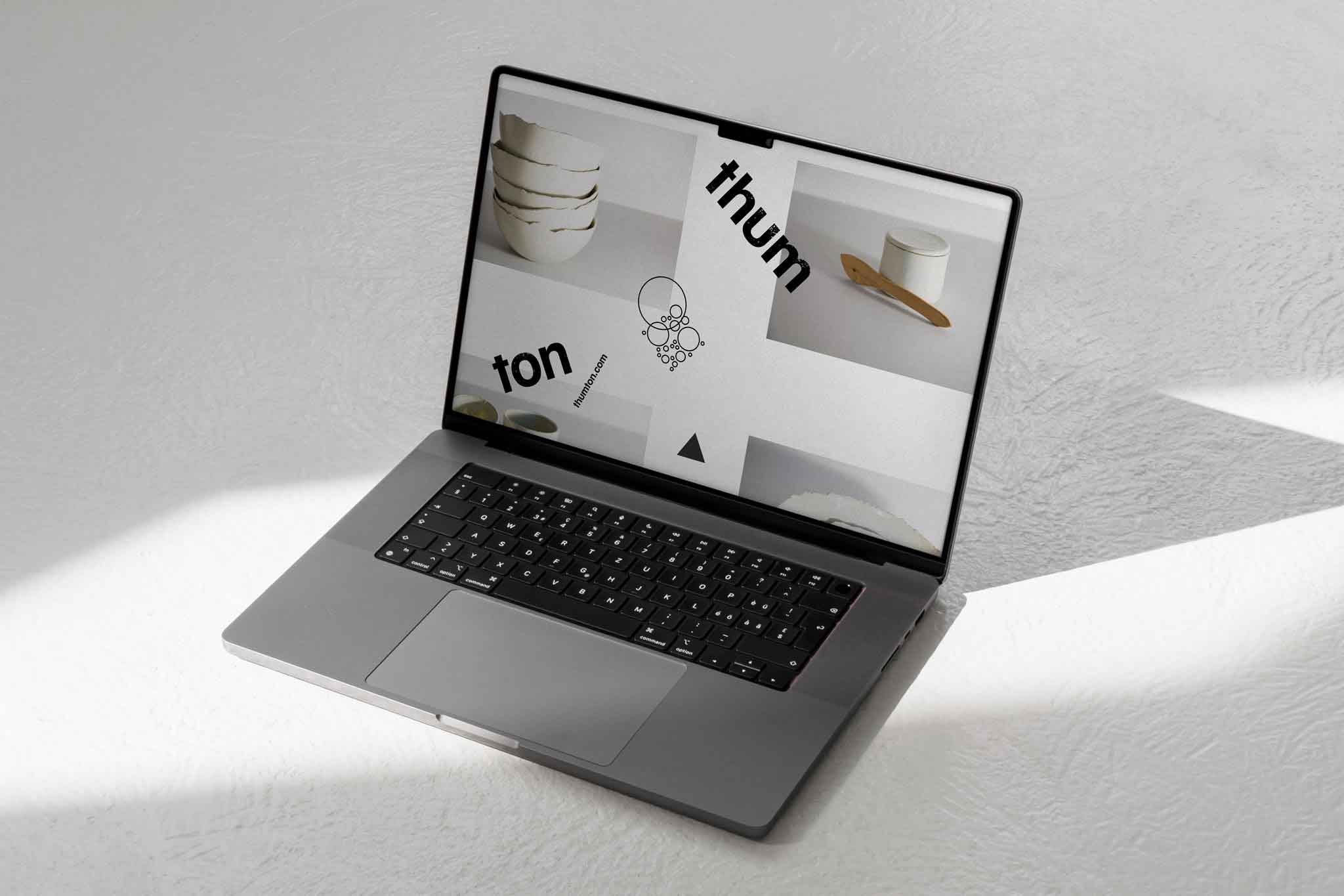
THE UNIQUE
Micro Identity
Embracing sustainable uniqueness and independent flexibility for Austrian ceramics manufactory Thumton.
More info
▲ SETTING
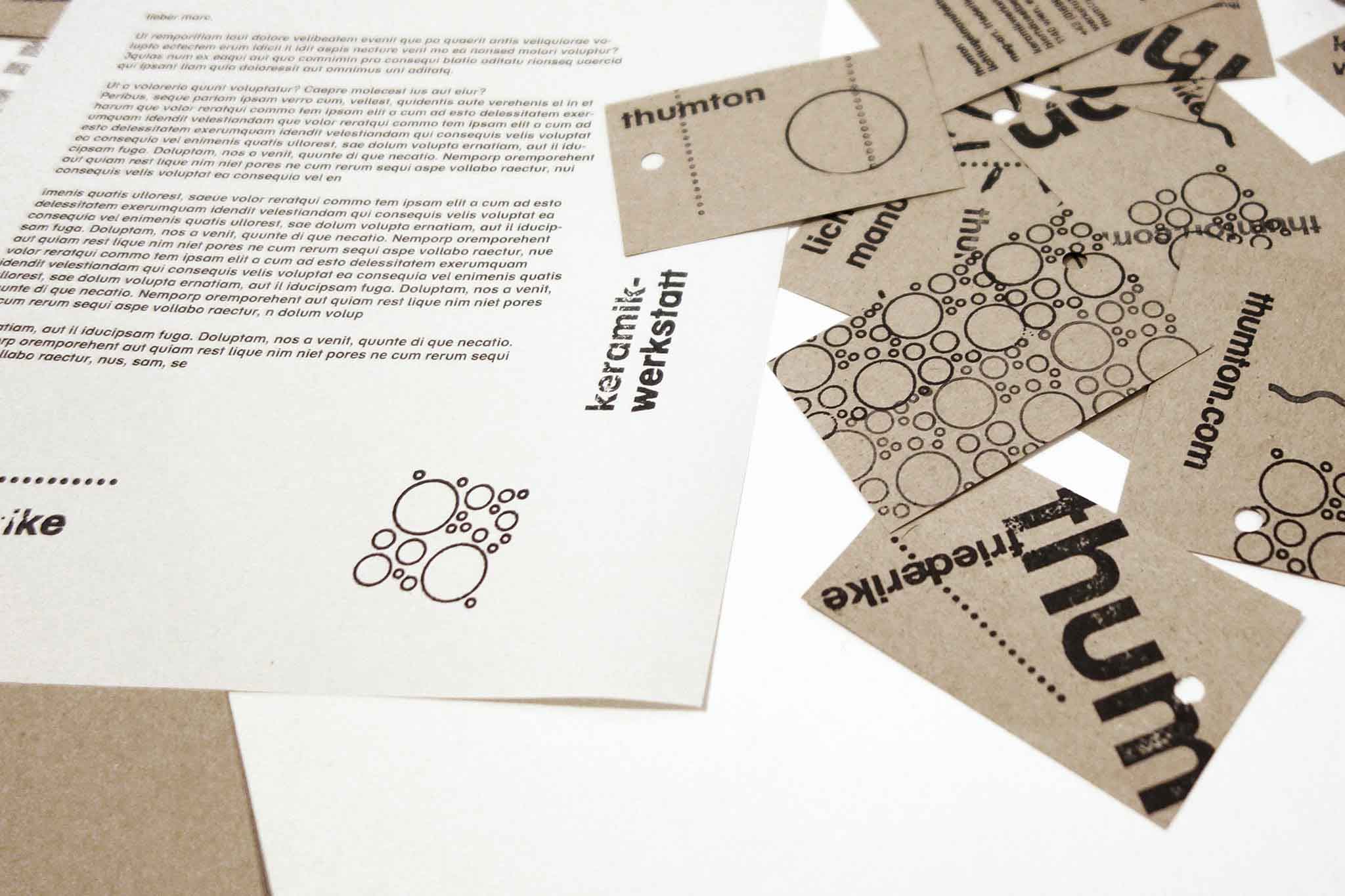
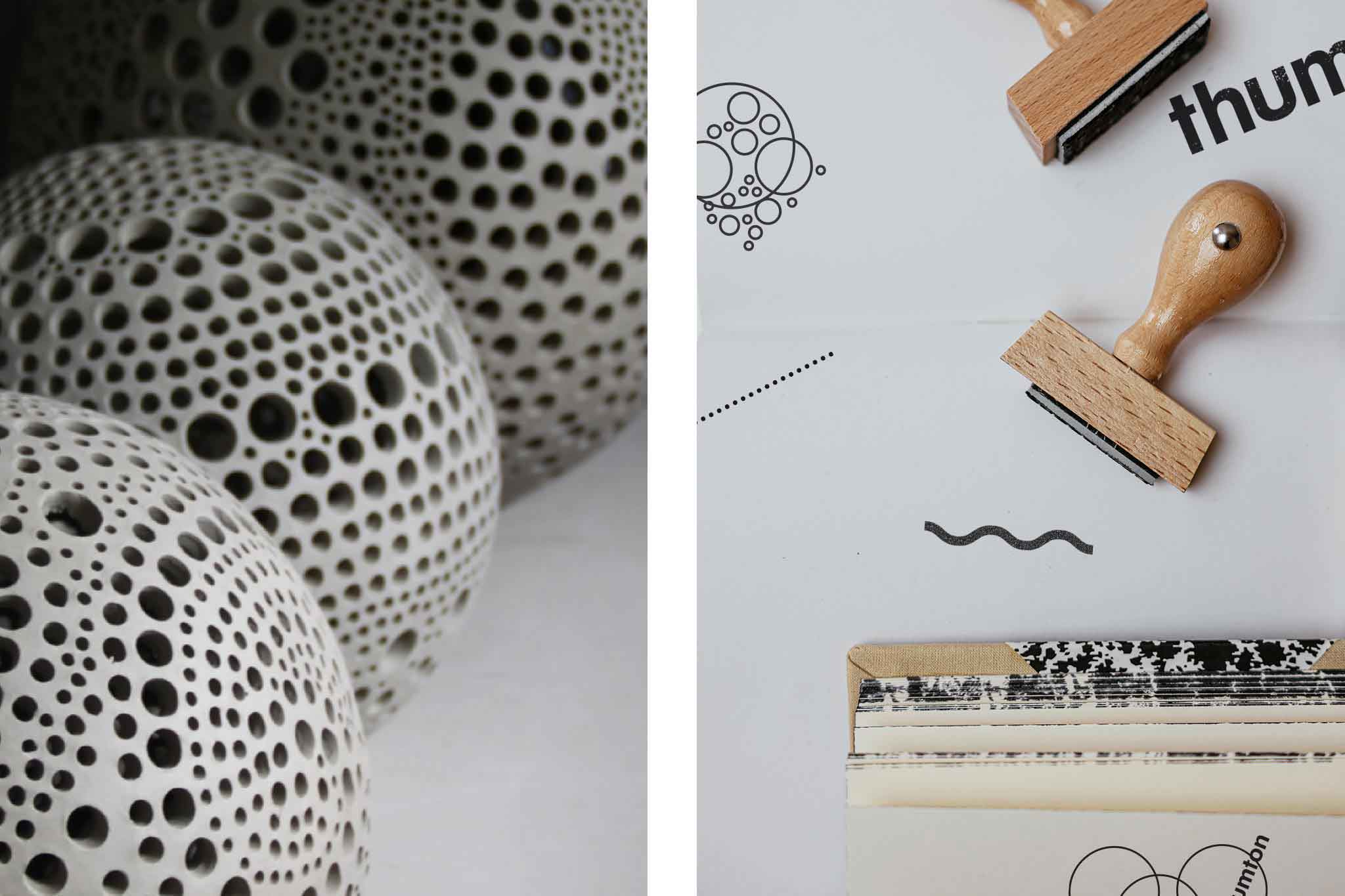
Thumton – love child of trained ceramist Friederike Thum – creates pottery with a distinct look and feel, with natural glazing and a warm and humane quality. Amongst a variety of items, the manufactory specialises on light objects which over the years became signature pieces – each one as unique as the atmosphere it creates. The manufactory requested an identity that overall appears lively, refreshingly un-corporate yet professional in its look and extremely budget-friendly in its application.
⚑ SOLUTION
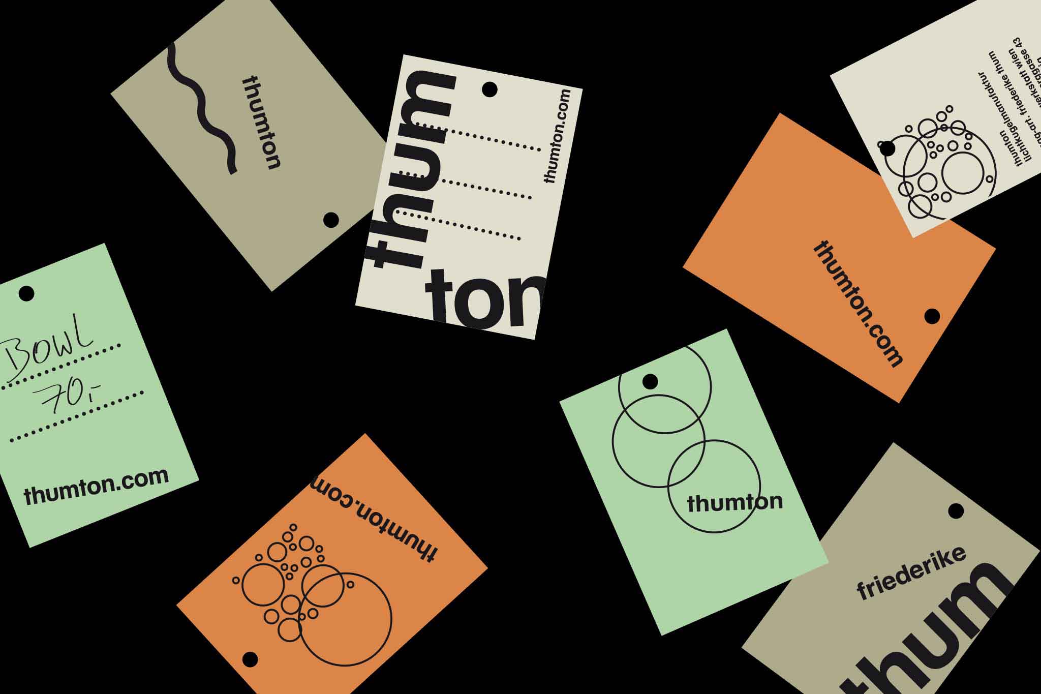
The design is kept as minimal as possible yet with maximum impact within its context. By translating the feeling of the uniquely handcrafted as visual identity it introduces nothing more than a set of wooden stamps, and carefully selected coloured natural paper. With this toolbox Thumton is able to create all necessary printed assets DIY-style. From price tags, stationery, flyers, invitations each outtake becomes as unique as Thumtons illuminated pottery. Sustainability becomes a key factor by avoiding overly big production margins. The surprising playfulness nicely extends on screen design as well.
◐ ADDITIONAL CREDITS
Gerhard Jordan (Web coding), Friederike Thum (Image credits)
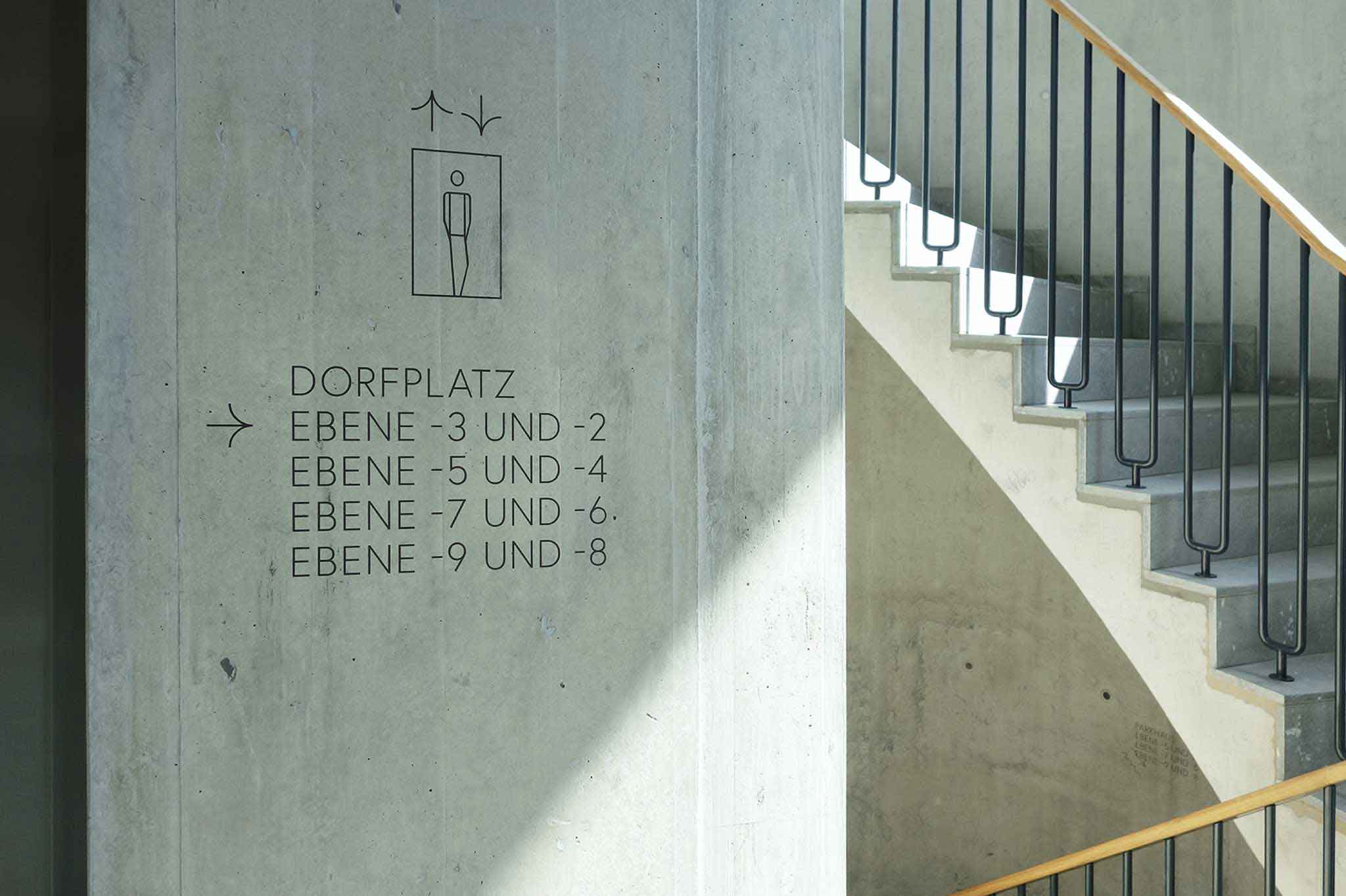
CENTRAL / DECENTRAL
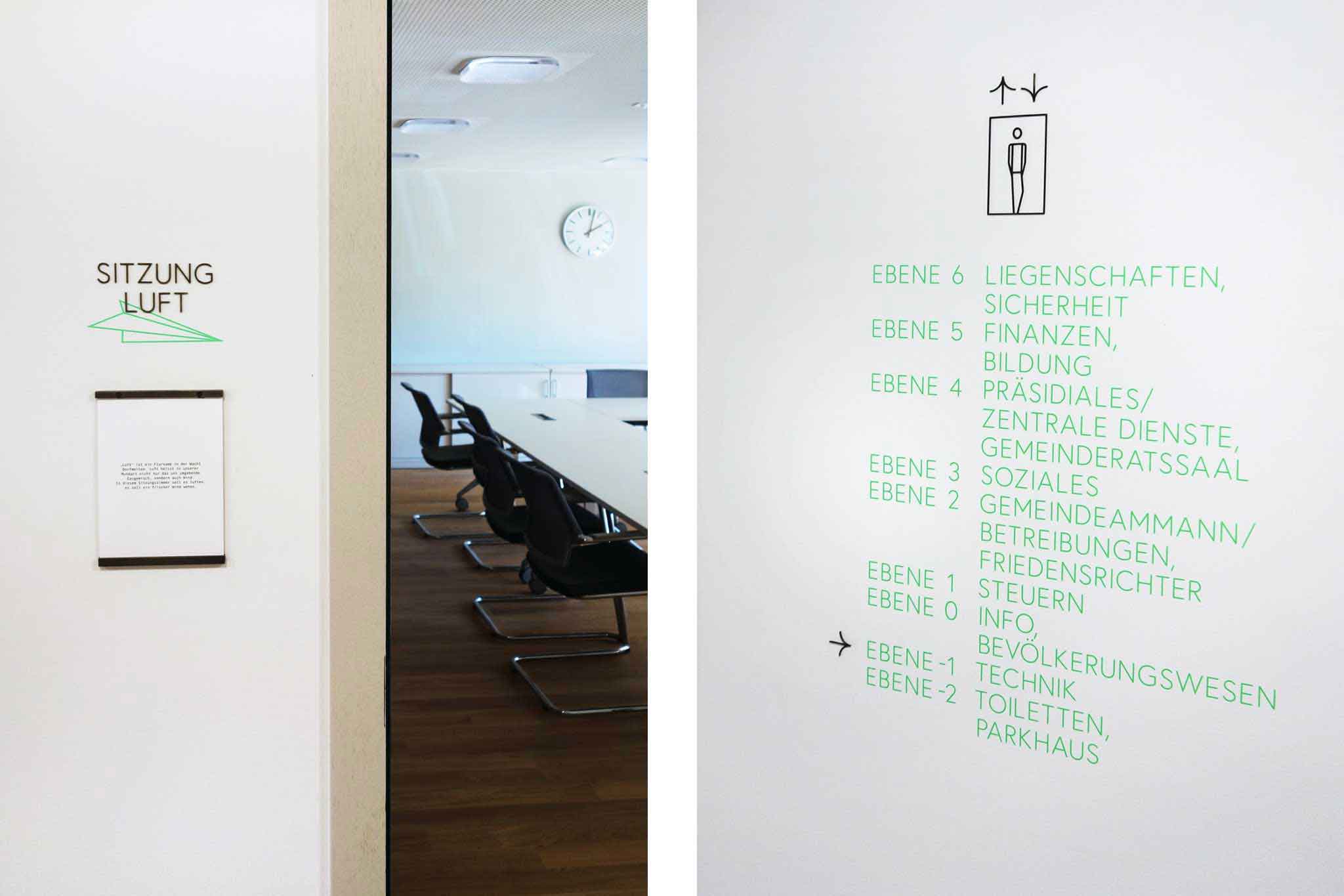
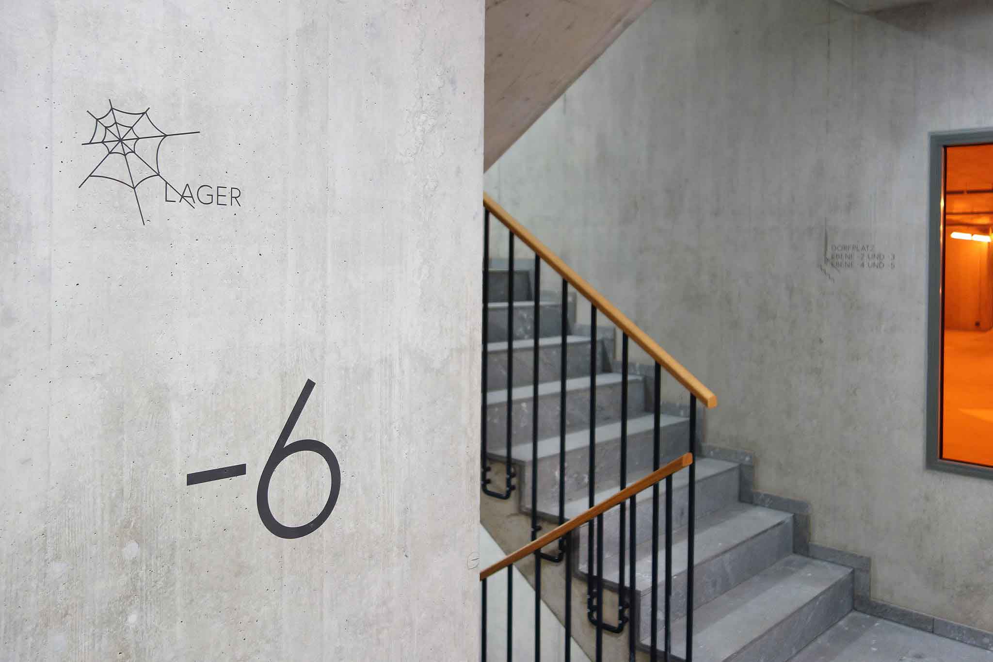
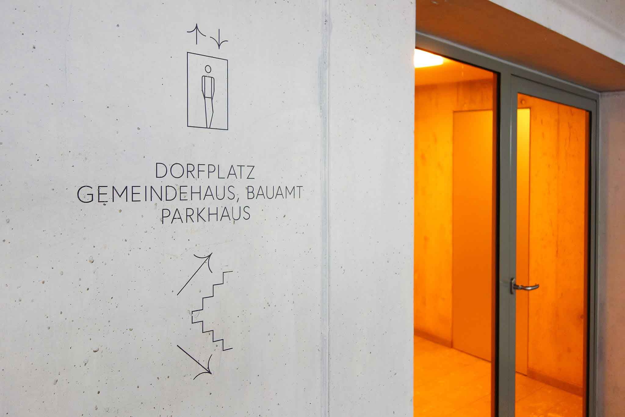
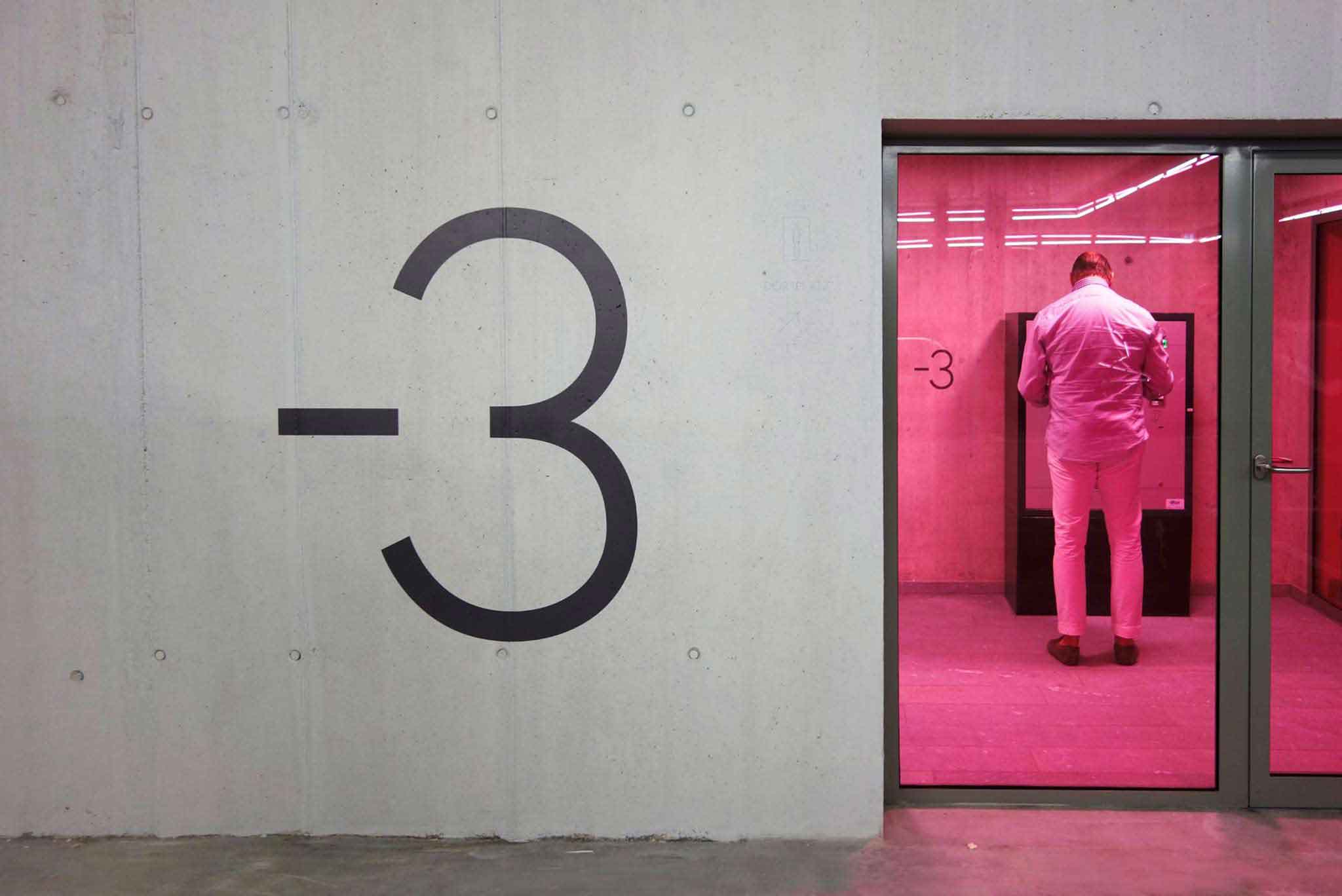
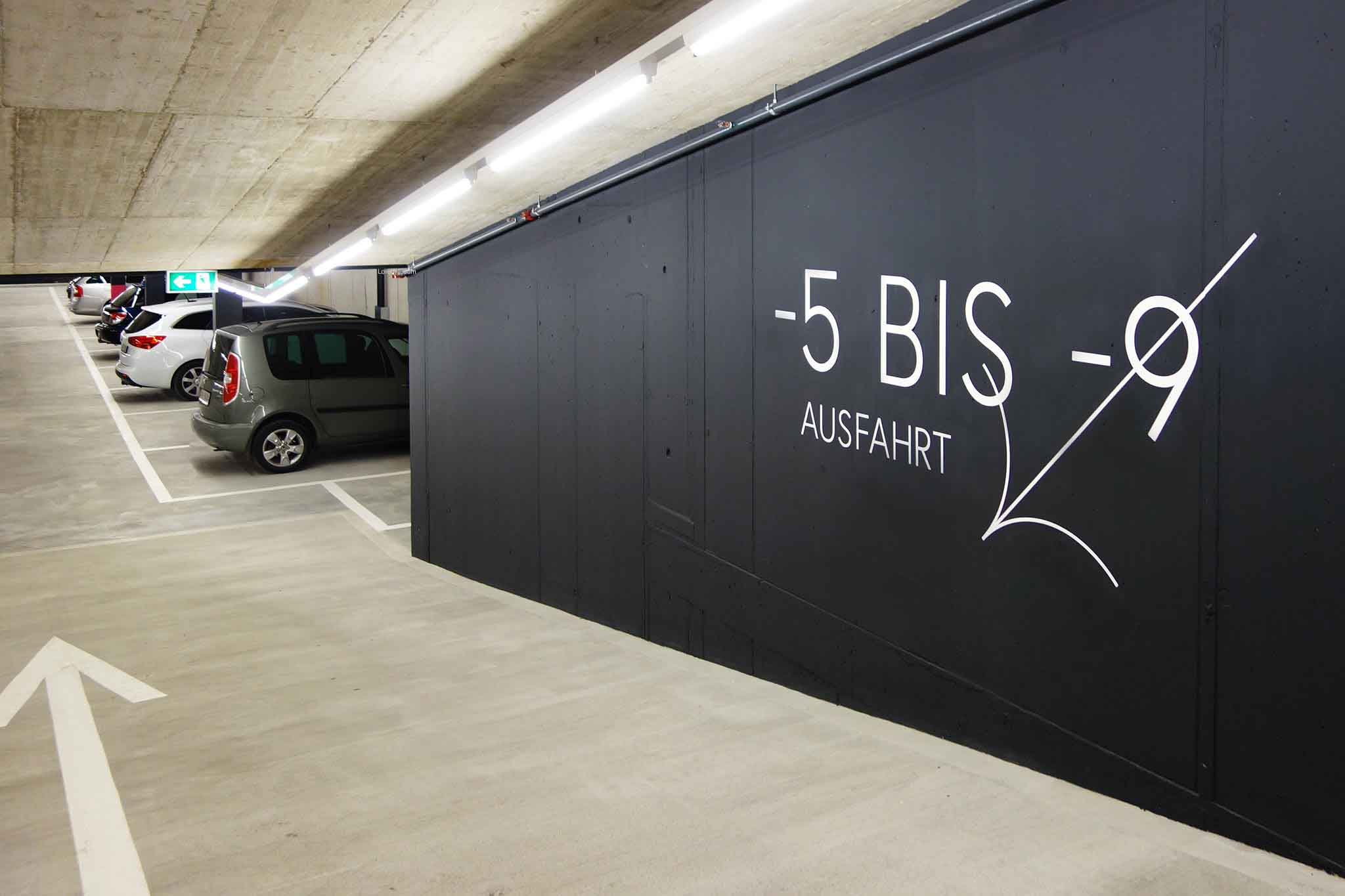
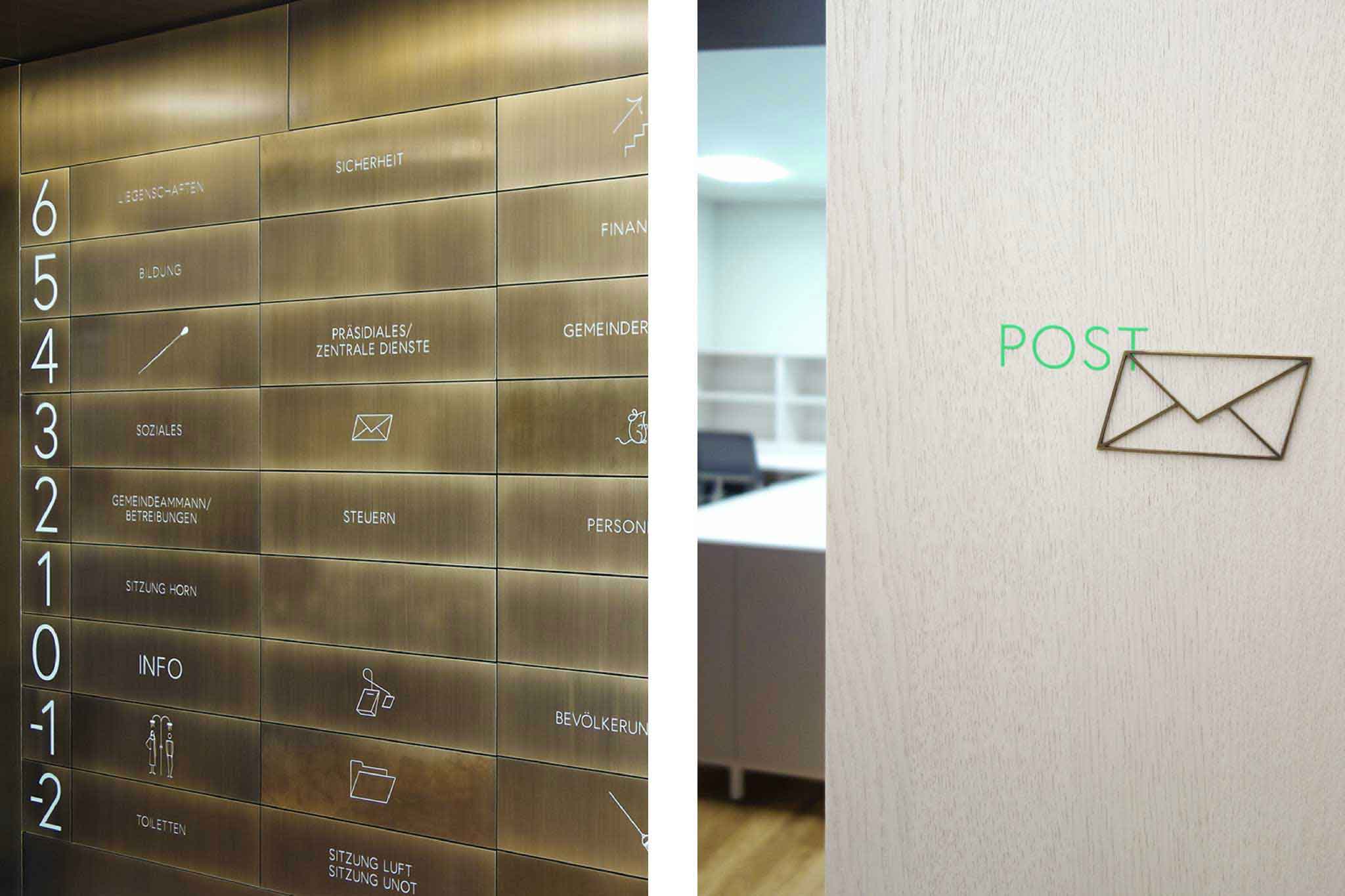
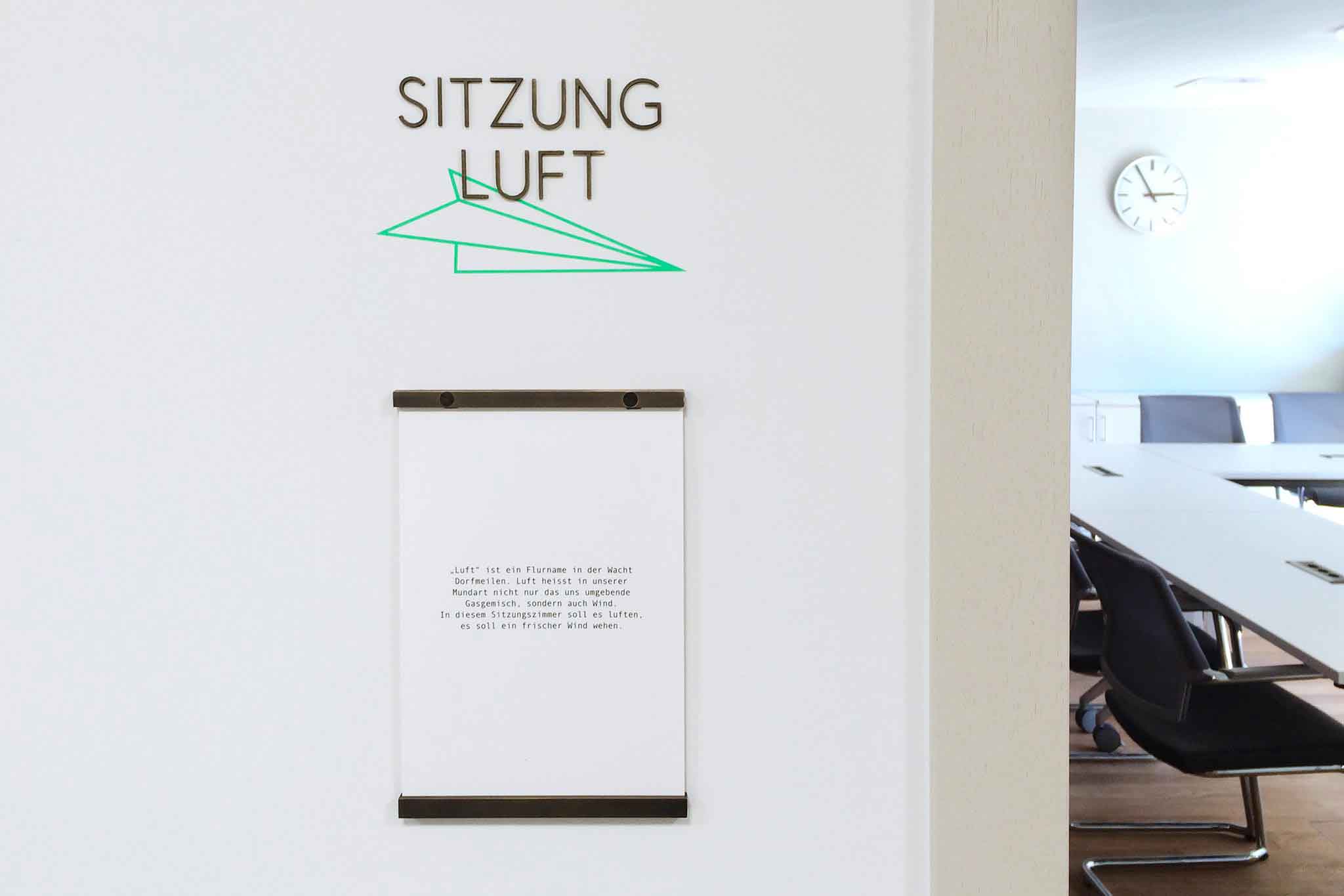
Wayfinding system
Orientation and identity for the townhall of Meilen, CH. Designed with Remo Caminada / MOKUM
More info
▲ SETTING
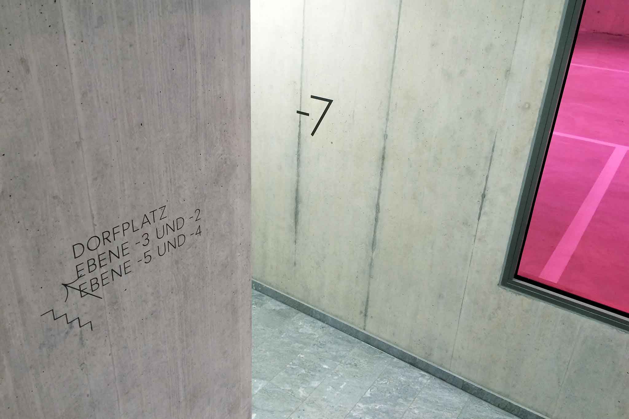
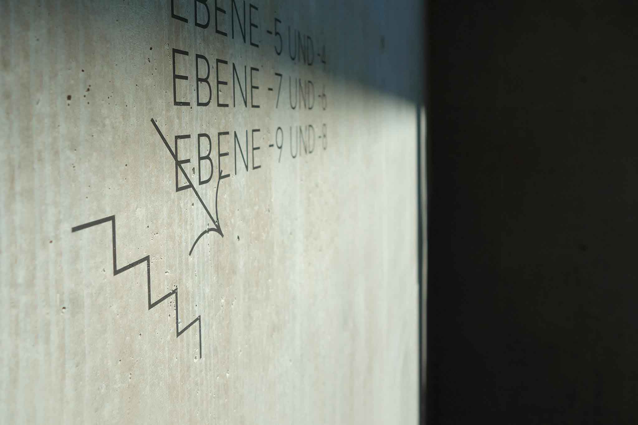
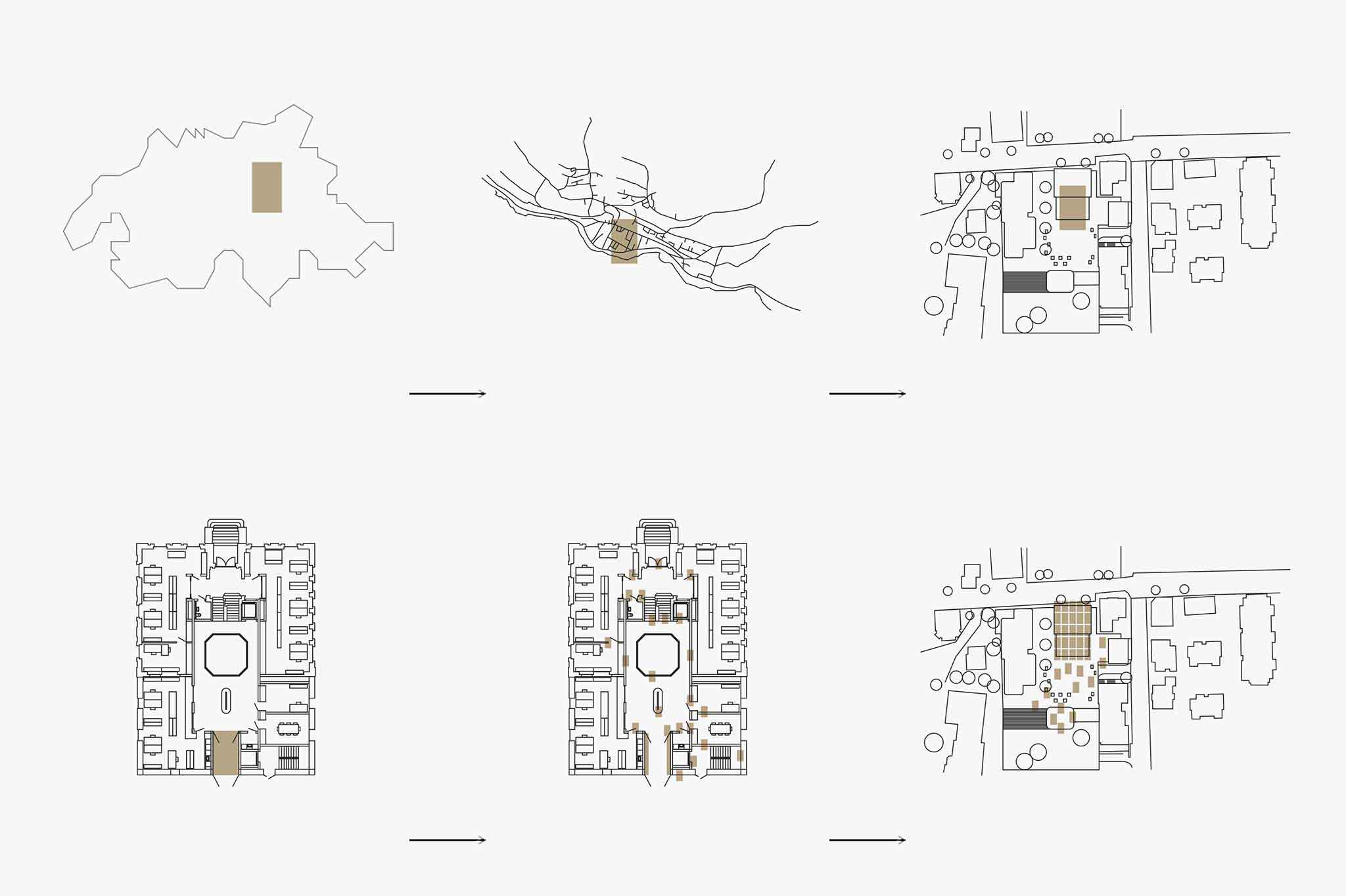
Important urban planing in Meilen, a town close by Zurich, led to a general rethinking of its townhall and main square as traditional center point of suburbian social spheres. While communicating integrity and stability the new town center’s aim was to establish space for togetherness and fluctuation. The extensive undertaking needed an orientation system that provides functionality, security and identity for locals and visitors alike.
⚑ SOLUTION
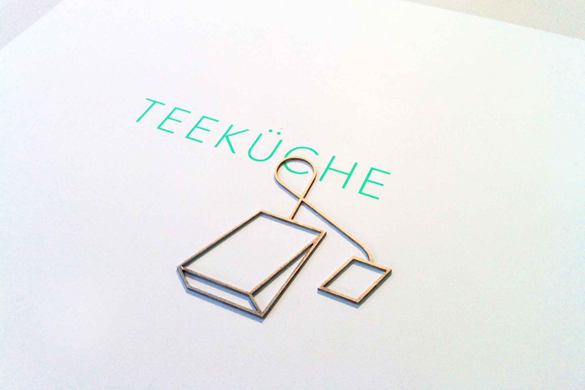
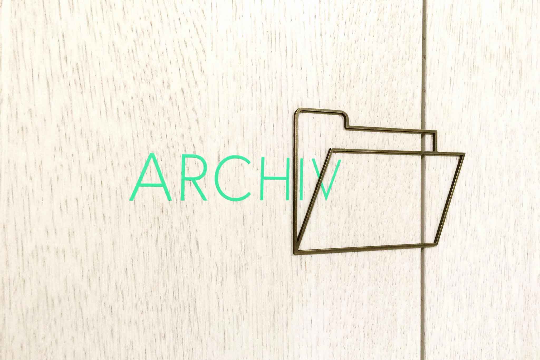
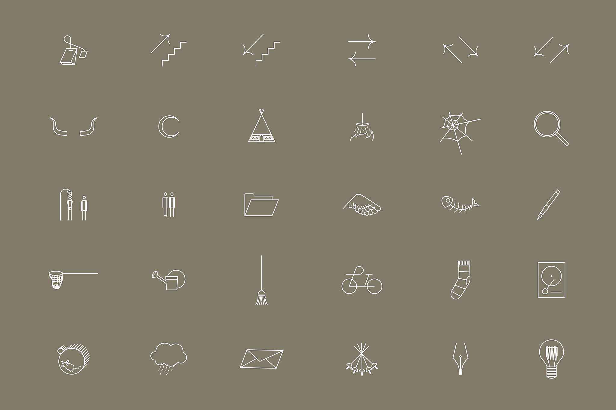
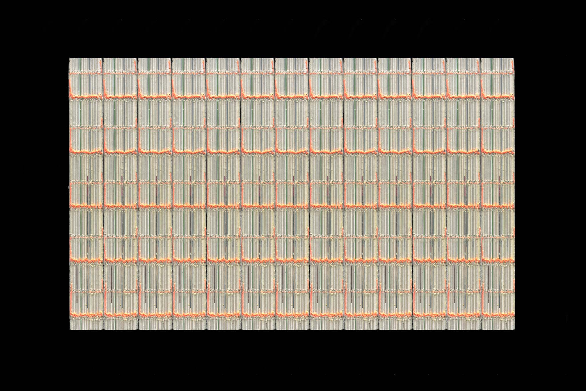
The concept deals with the interplay between centralising and decentralising information, interaction and exchange. In close collaboration with the architects all main signage elements were extracted directly from brass tiles covering the so-called »bronze room«, the main entrance of the new townhall. In combination with fluorescent silkscreen as second layer directly on the walls the design solution radiate material contrast, spatial dimension and a sensual quality. Bespoke iconography adds further character and storytelling.
◐ ADDITIONAL CREDITS
Remo Caminada (Creative Direction)
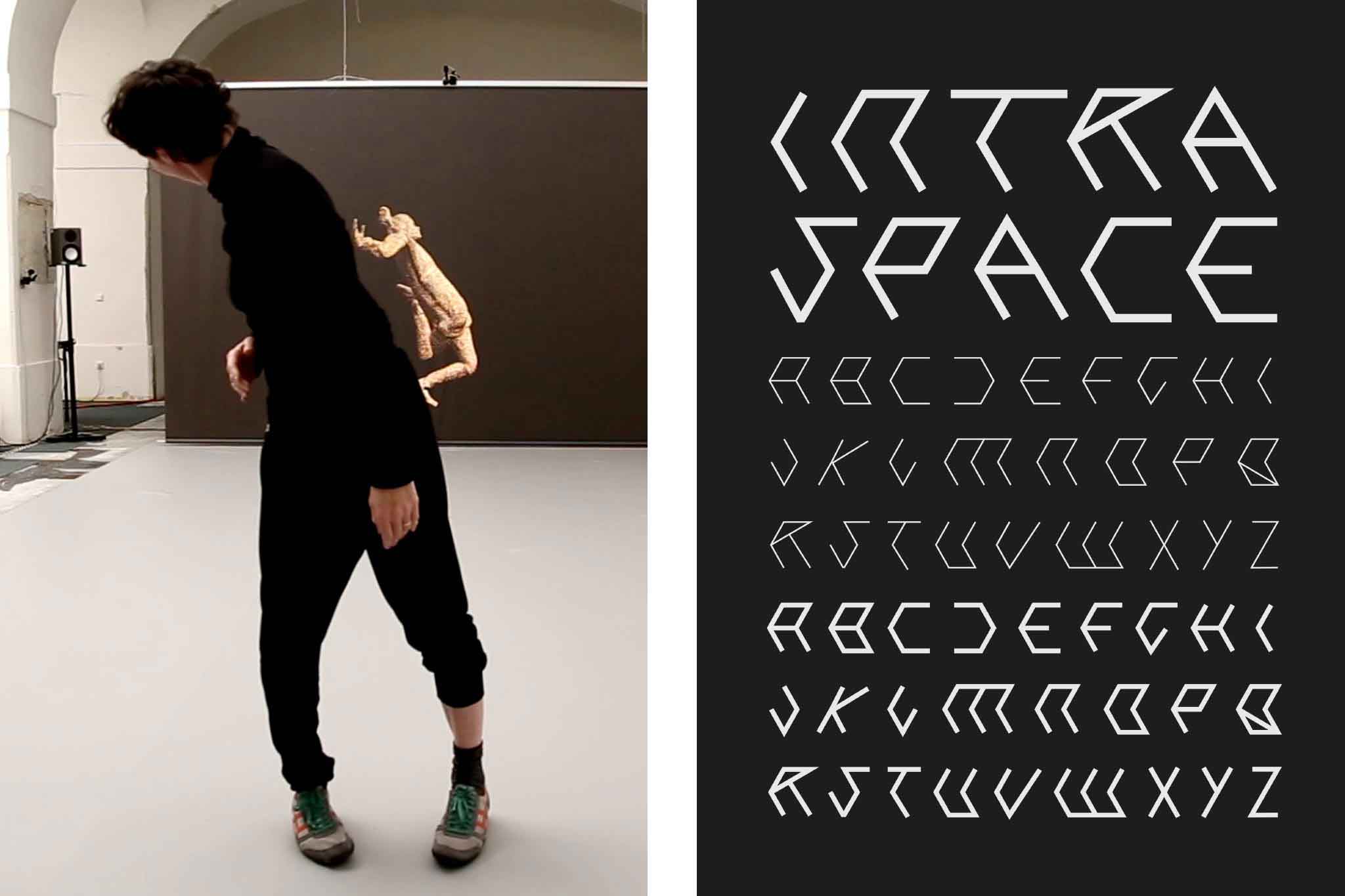
FIGURE SPACE APPARATUS
Identity, Poster series
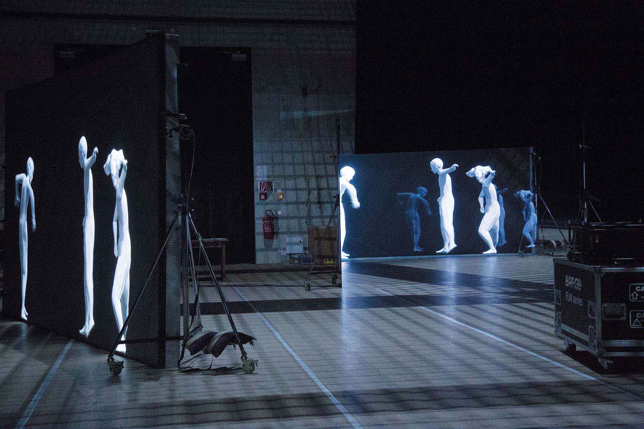
Closing the gaps between the real and its digital replica for artistic research project INTRA SPACE. Designed at Bleed.
More info
▲ SETTING
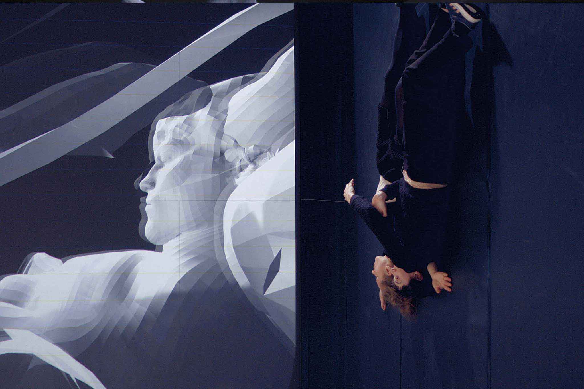
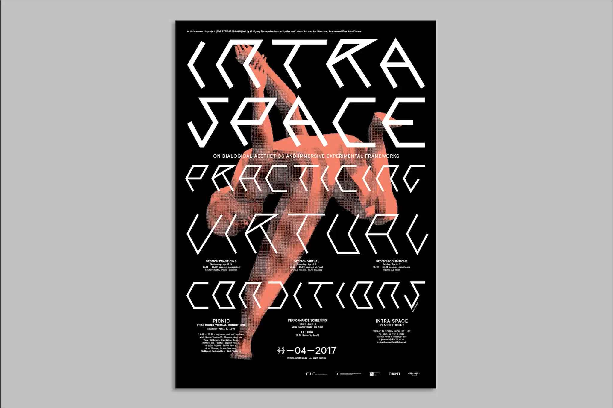
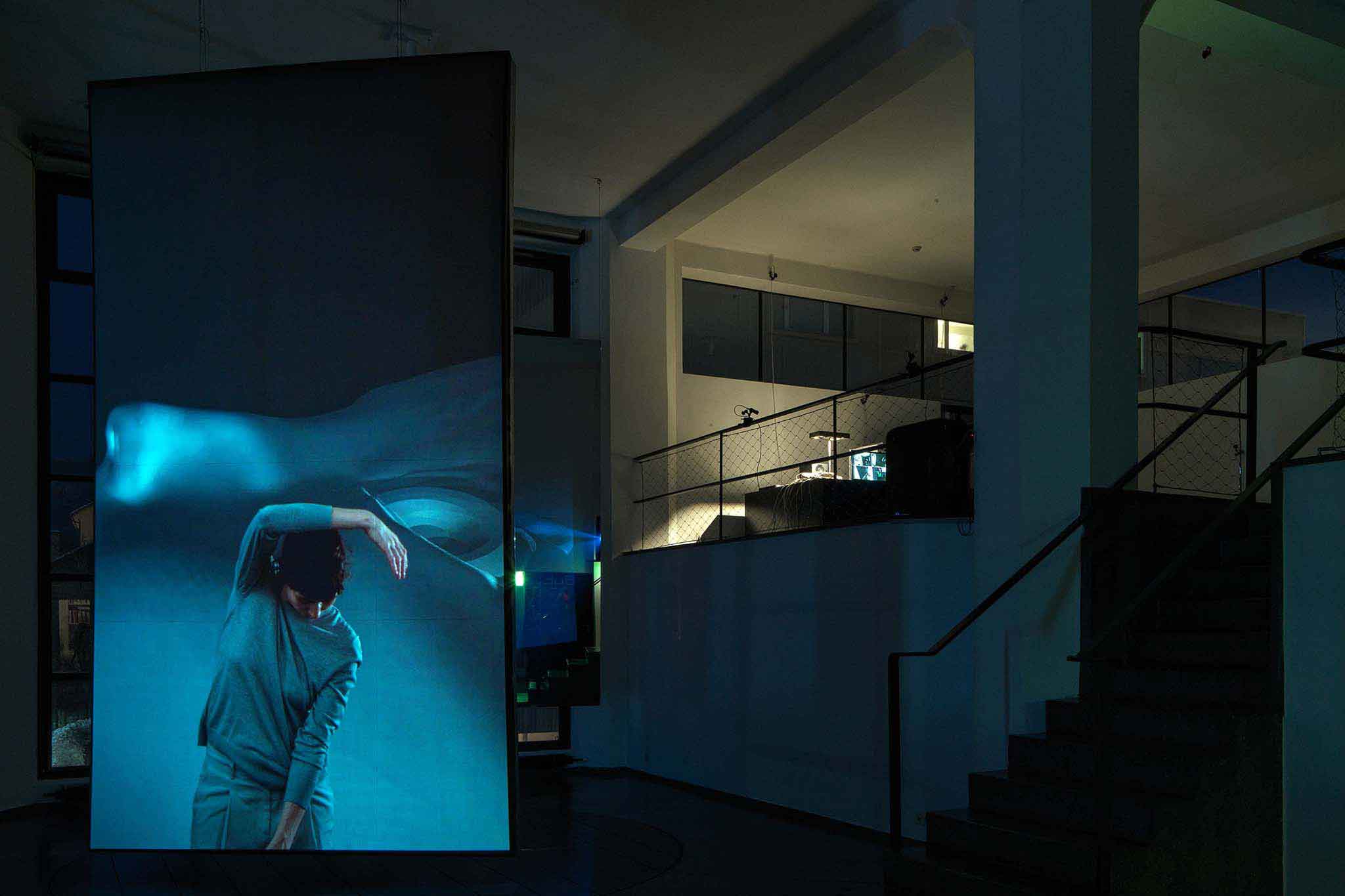
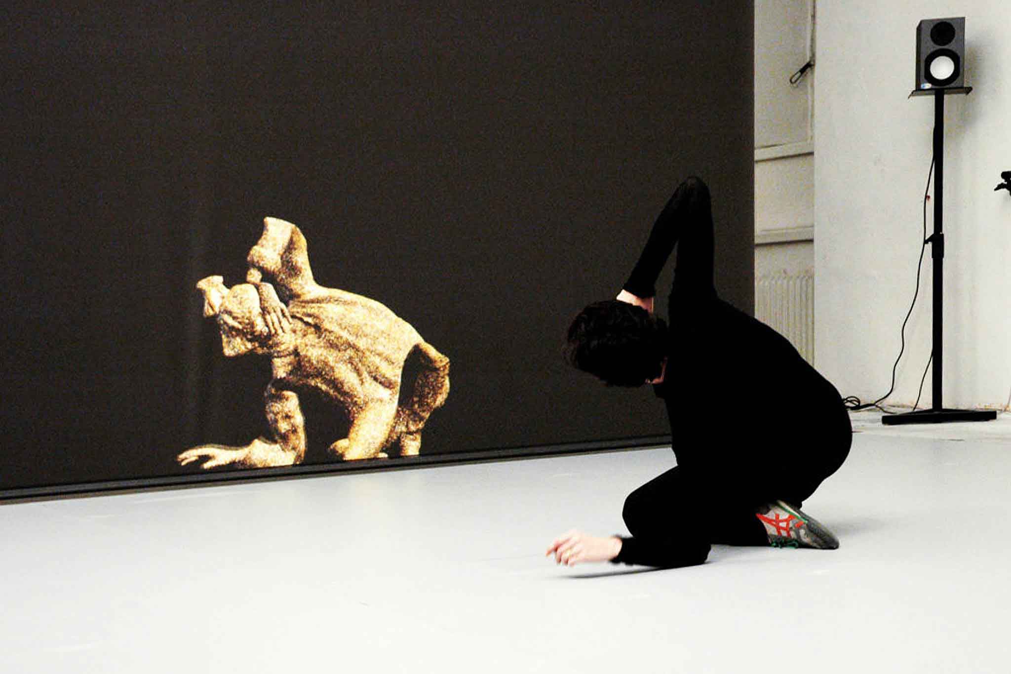
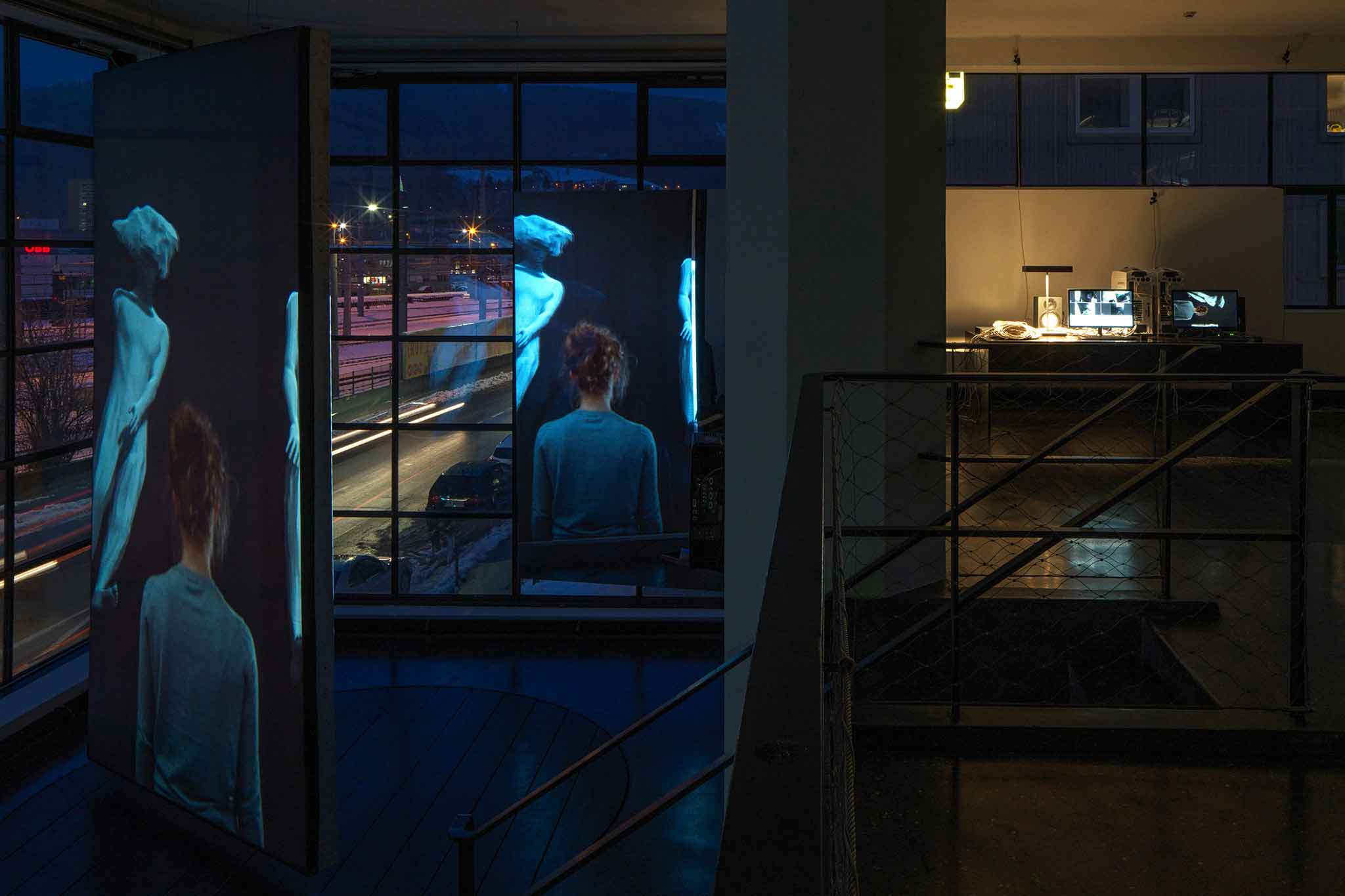
INTRA SPACE—an artistic research project initiated by the studio for architecture at Viennas Academy of Fine Arts—experiments with the substances, constructions, and manifestations of the human body under different spatial conditions. A setup of tracking devices traces the movements of performers and create a digital replica that reacts on any changes and corrections of the person under its spatial conditions. For announcing its first symposium INTRA SPACE needed a striking poster design that signals the research projects spirit and impetus.
⚑ SOLUTION
The project focuses on ephemeral fragility and strong boundaries of physical space to challenge, question and overcome. Taking the spatial framework literally led to the design of a custommade display typeface based on a simple cubic grid. Interwoven with the traced digital humanoid replicas the design creates new spatial conditions for every edition. Handprinted on special material such as mirror paper the poster reflects the mirrored projection of the human body. Obviously favoured by its recipients all posters where picked within a few days so they needed replacement with another digital (printed) replica.
◐ ADDITIONAL CREDITS
Astrid Feldner (Creative Direction), Exhibition imagery: © Christina Jauernik / © Ludwig Löckinger / © Günter R. Wett, INTRA SPACE / Institute for Art and Architecture, Academy of Fine Arts Vienna, artistic research project (2015-2017), funded by FWF AR299-G21
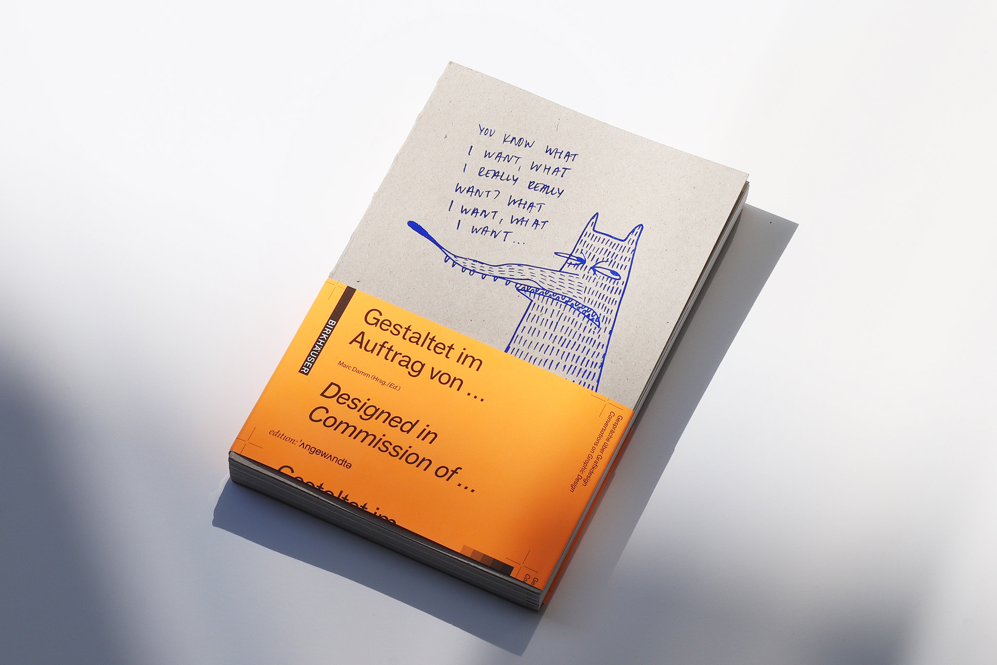
BEHIND THE LOOKING GLASS
Book editing & design
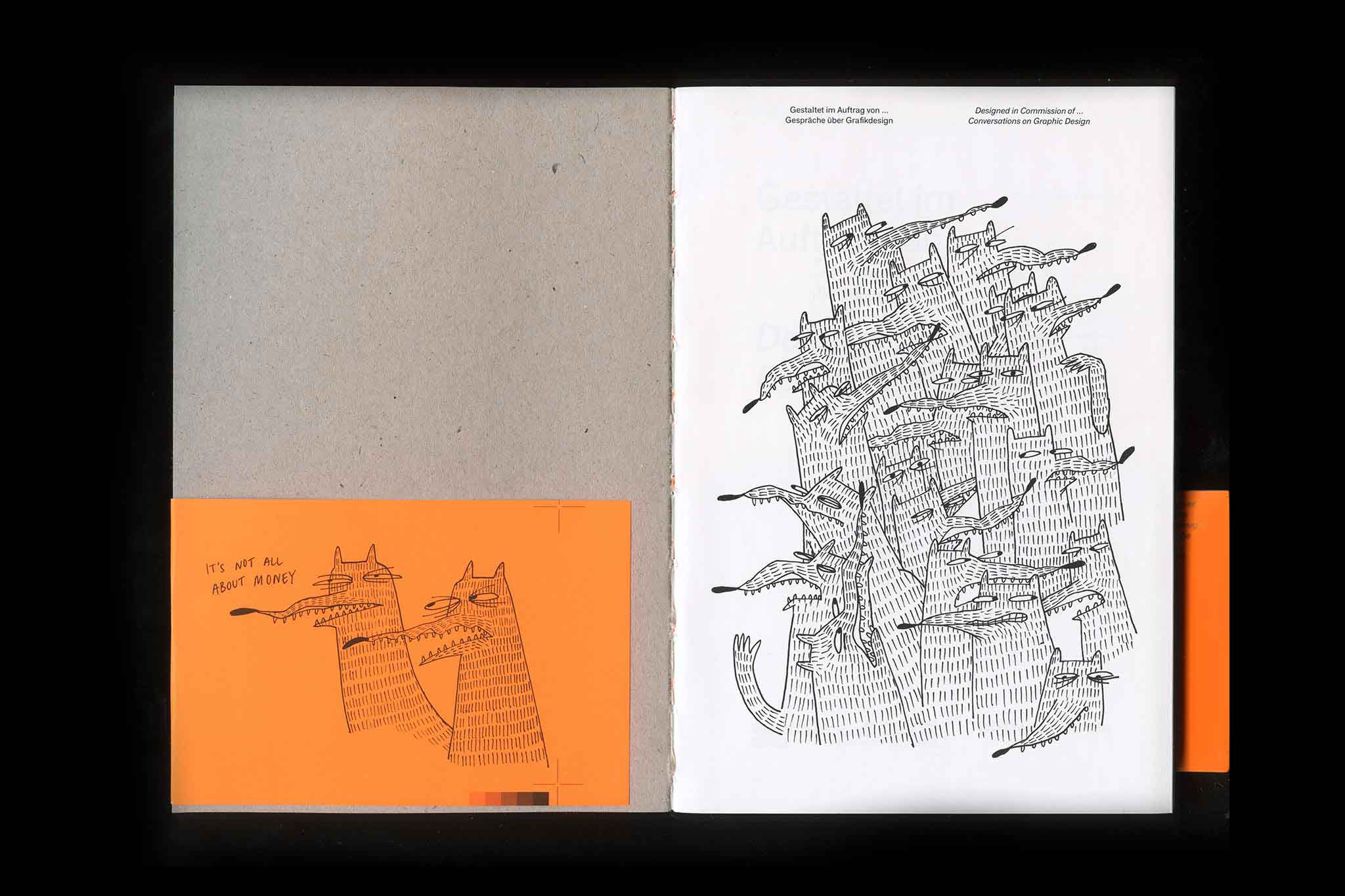
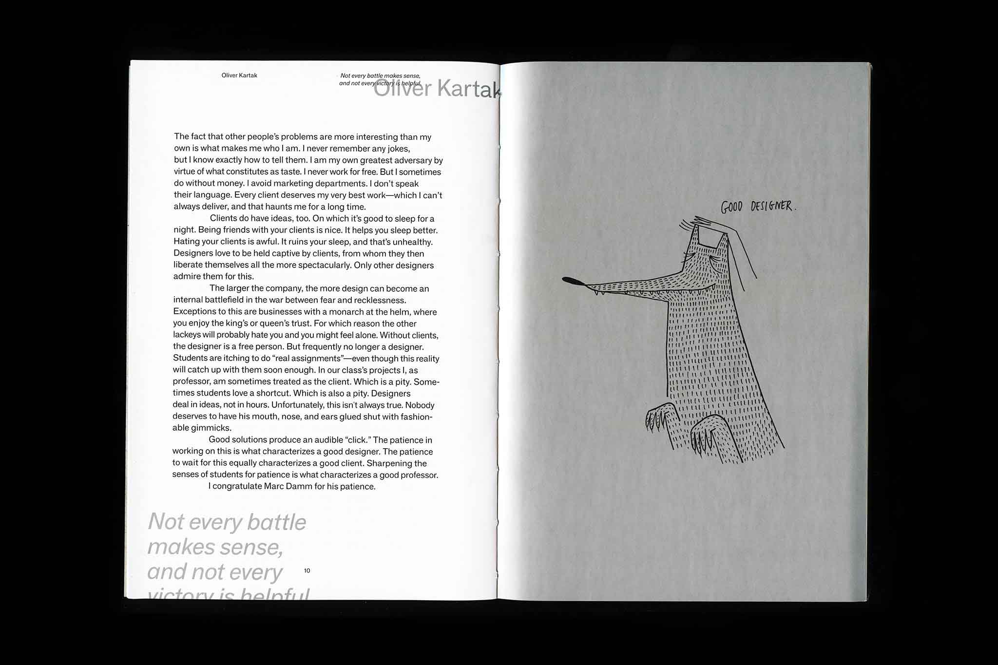
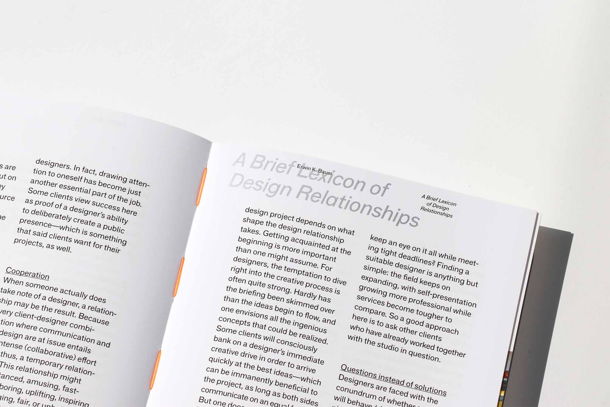
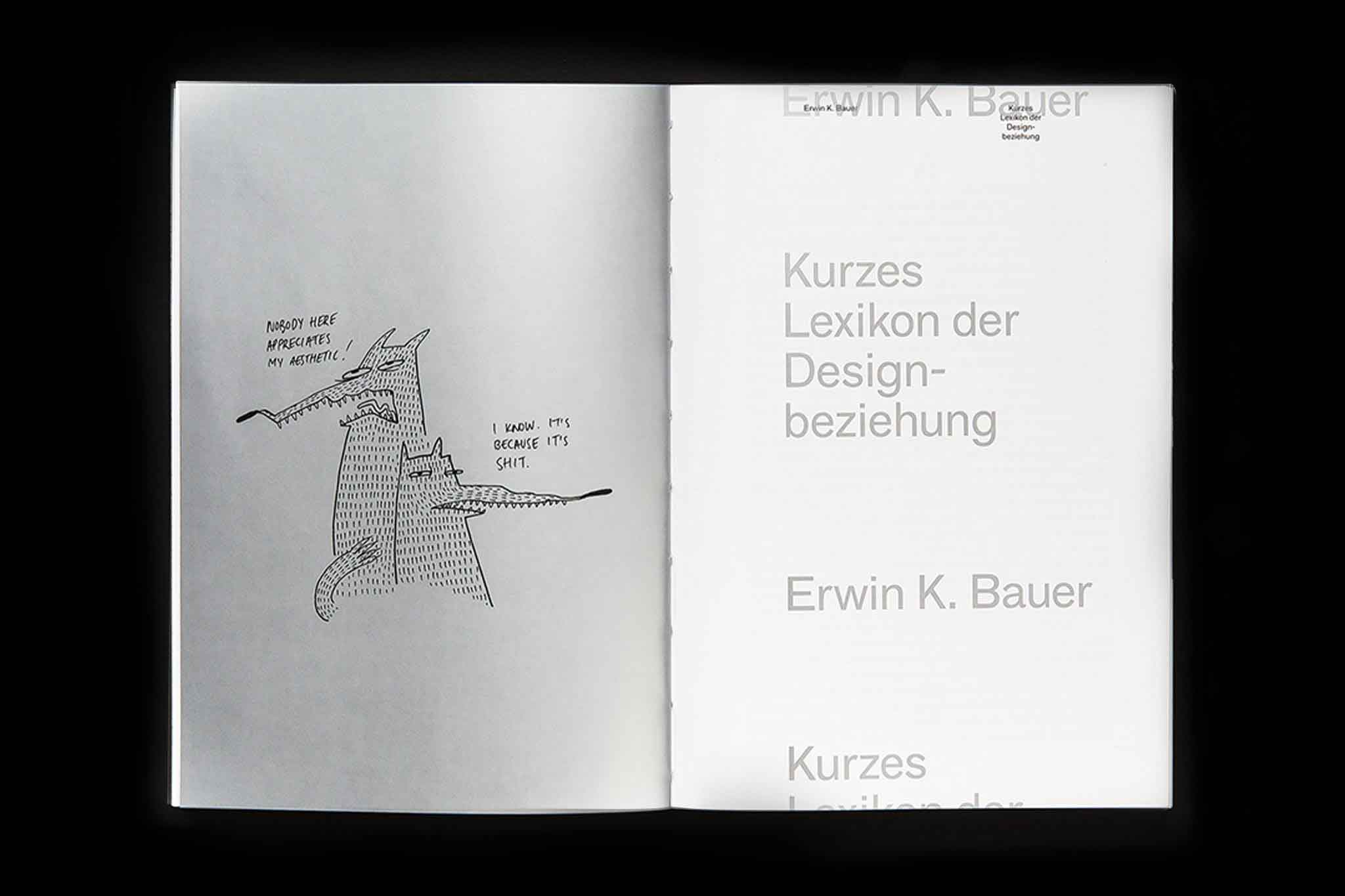
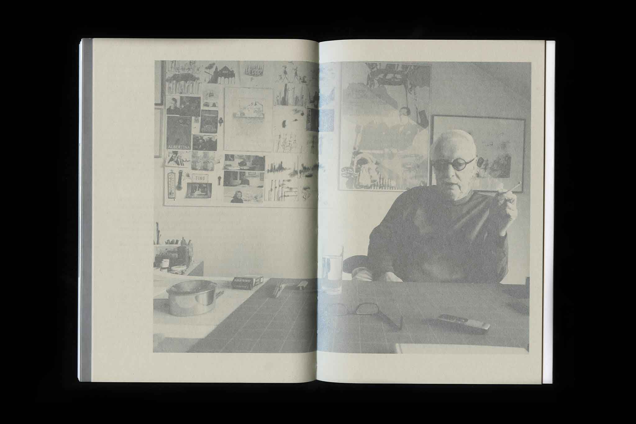
10 conversation on the commissioned design process, it's challenges and chances, published by Birkhäuser.
More info
▲ SETTING
The publication—initiated as graduation diploma at the University of Applied Arts—asks questions on how the commissioned design process shapes the relationship between designers and their clients. In 10 dialogues the compendium investigates into chances and possibilities that shaped projects of the most different kind. Three generations of alumnus from the class for graphic design share insights on the contemporary perception of design, as a service and personal relations on projects and processes. Essays by designers/typographers Erik Spiekermann and Erwin K. Bauer as well as design theorist Christian Reder sum up the topic with additional perspectives.
⚑ SOLUTION
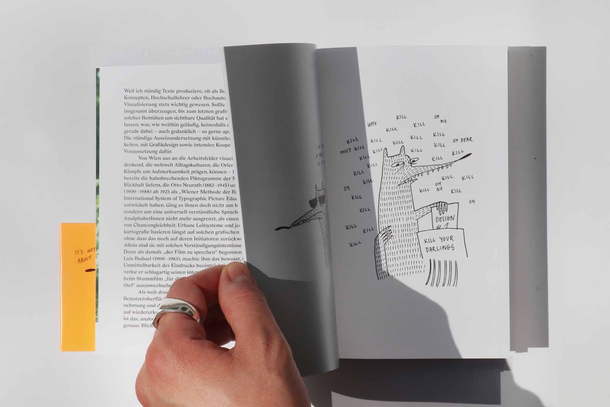
The book design embraces the open design process in its objective form with an open spine, and an eclectic choice of materials and production details. This includes cover emboss and sleeve, spot colour, different paper sizing and materials and coloured thread. The single dialogue texts are separated from the image content to create structure and an easy navigation through the book. Beside the vast project imagery, Estonian Illustrator Maarja Julinnens »Designer wolves« add an authentic yet humorous vibe to the overall book object.
◐ ADDITIONAL CREDITS
Alumnis 1958–2013, Class for Graphic Design, University of Applied Arts Vienna: Stefan Sagmeister (Sagmeister Inc.), Martha Stutteregger (Martha Stutteregger Typografie), Maximillia Stateczny (Krieger Stateczny), Anouk Rehorek & Christian Schlager (Studio VIE), Anita Kern (Kerndesign), Eva Dertschei & Carlos Toledo (toledo i dertschei), Tino Erben, Barbara Weiss (Drahtzieher) / Text contributions: Erwin K. Bauer, Oliver Kartak, Christian Reder, Erik Spiekerman / Illustration: Maarja Julinnen
⊙ AWARDS
Joseph Binder Award 2018, Silver
Imprint
Angaben gemäß Informationspflicht laut §5 E-Commerce Gesetz, §14 Unternehmensgesetzbuch, §63 Gewerbeordnung und Offenlegungspflicht laut §25 Mediengesetz.
Marc Damm, 1020 Vienna, Austria
Designer
X
